You are browsing:
Rob Hot Tips

Offer a demo down-sell

Hot Tip #65 is to offer a demo down-sell.

Phone calls aren’t for everyone. If your Landing Page suggests hopping on a call to secure a high-end sale, offer an alternative info package download.

📦 “Don’t want to jump on a call? Download our buyer’s guide

Kevin Mead shared the above did wonder for additional revenue.

Offering a beautifully presented alternative, to digest in their own time, is a courteous play your high-end customer will appreciate.
Open non-essential links in a new tab

Hot Tip #66 is to open non-essential links in a new tab.

Set links to documentation, support, privacy, and demos to open a new browser tab, keeping the primary Landing Page within a tab’s reach.

  • Or Don’t – A strong Counterargument by Jesse including several use-cases and additional UX reads. Always healthy to question UX decisions. I still vote for opening demos, support portals and blogs in new tabs – all 3 in my experience offer poor navigations to return to the primary page.

Seek hero images with negative space

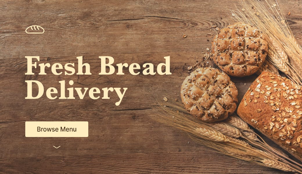
Hot Tip #67 is to seek for background images featuring negative space.

Negative space refers to the area of an image surrounding the main subject or object. This can be intentionally shot and cropped to provide a beautiful canvas for your copy — helping prevent overlapping elements:

Negative space reference

If you know your way around Photoshop, start by expanding your hero image canvas to the left or right. Then fill the newly created blank space using the Content-Aware fill option. It’s honestly magic.

  • Unsplash – Free stock image library with tags for “negative space” and “copy space”.
  • Stocksy – Premium stock image library with a useful “copy space” filter with 3 strengths.
  • Negative Inspiration – A collection of 1000+ Landing Pages I’ve curated featuring healthy whitespace (often associated with negative space elements).

Hint to scroll

Hot Tip #68 is to add a hint to scroll.

Sometimes, I see long-scrolling Landing Pages with spacious content above the fold, but no indication there is more information further down.

Here are 4 solutions:

  1. Add a subtle down arrow, positioned at the bottom of the introduction.
  2. Add a Learn More CTA button that kicks off the page scroll.
  3. Avoid a 100% window height introduction section, bringing the second section up.
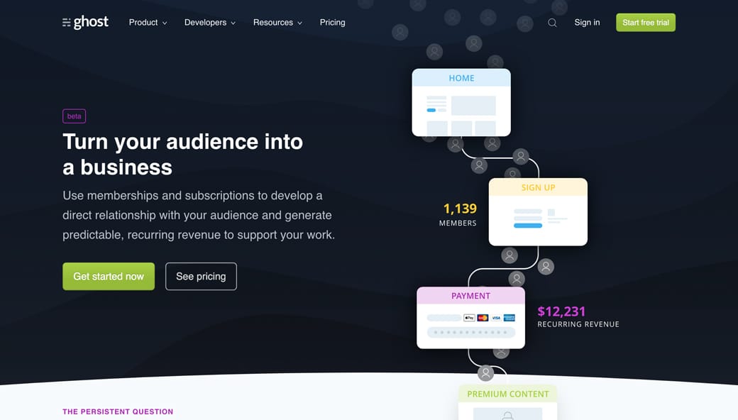
  4. Allow the hero elements to flow into the second section, suggesting storytelling.

The original Ghost Memberships Landing Page does point #4 really well:

Hint to scroll through flowing elements

The end.

There are no more Hot Tips to load in this archive.

Next