Integrate a sticky header navigation
Hot Tip #25 is to integrate a sticky header navigation if your Landing Page is long.
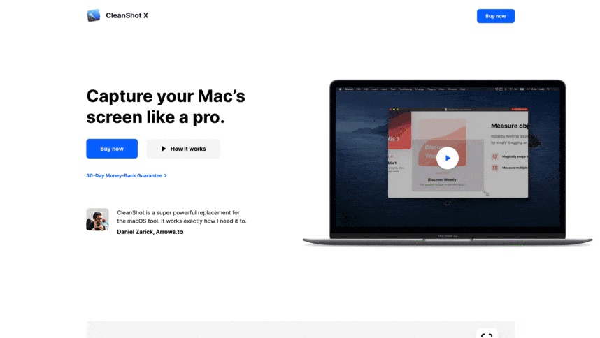
A sticky header can make it easier for visitors to navigate page sections and keeps that CTA button visible at all times.
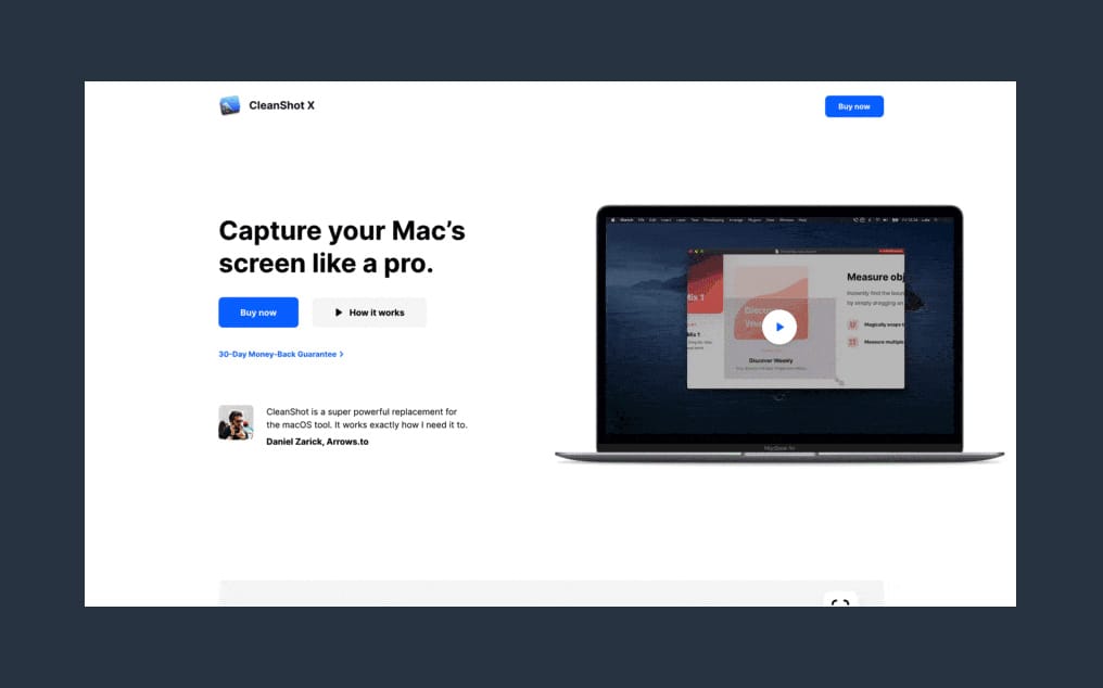
Hot Tip #25 is to integrate a sticky header navigation if your Landing Page is long.
A sticky header can make it easier for visitors to navigate page sections and keeps that CTA button visible at all times.
Hot Tip #26 is to use fewer fonts.
Multiple typefaces, each with a number of weights, add unnecessary load time to a Landing Page.
Consider pairing your primary typeface with a native system font to keep it lean.
A fast-loading Landing Page with a more organized typeset is classy and considerate.
Hot Tip #27 is to step into your visitor’s shoes.
📱 Load your Landing Page on mobile
💬 Read the text aloud
👆 Use the navigation
💳 Checkout successfully
Doing the above will expose conversion friction points in your Landing Page.
Once confident, see Hot Tip #18.
Hot Tip #28 is to space using ratios.
For example, set a base size of 8px, then define your padding using multiples of 8:
Tiny gaps = 8px
Small gaps = 16px
Medium gaps = 32px
Big gaps = 64px
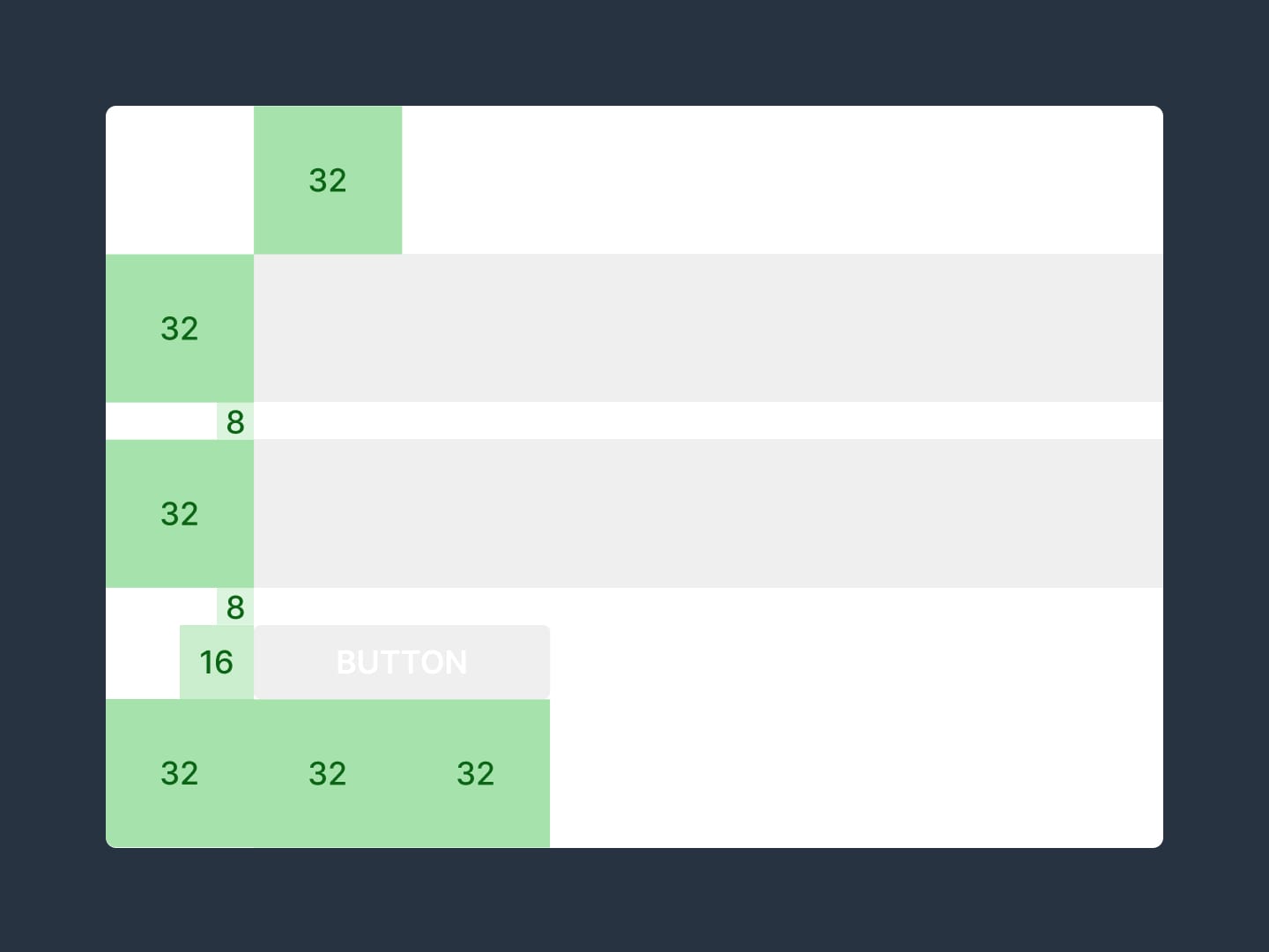
Using ratios aligns your content better and tightens up Landing Page design.