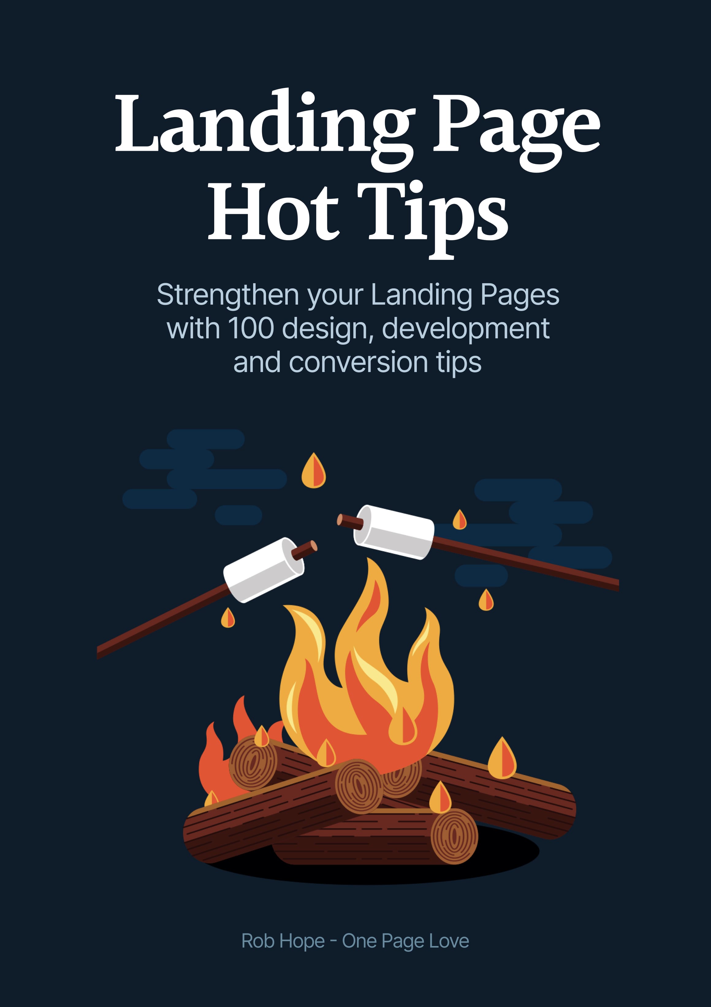
🔐 This Ebook link is private. Please share the book using: landingpagehottips.com

🔍 Looking for tip filters, downloads and checklists? Visit Extras

Landing Page Hot Tips by Rob Hope


Landing Page
Hot Tips

Edition v1.1


Author: Rob Hope
Editor: Scott Murcott
Producer: One Page Love


Hot Tips Fire


Share the book using:
landingpagehottips.com


Copyright ©2025 One Page Love
All rights reserved

First published: September 2020
Last updated: June 2025

978-1-64999-225-3 ISBN

978-1-64999-225-3

978-1-64999-225-3

Ebook Contents:

  1. Foreward
  2. Hot Tips
  1. Utilize customer testimonials
  2. Showcase testimonials from a similar demographic
  3. Fewer images, better images
  4. Spice up Call-To-Action buttons
  5. When in doubt, double the padding
  6. Empathize with the visitor’s problem
  7. Avoid center-aligned or justified paragraphs
  8. Replace, don’t add
  9. Set a single objective
  10. Create a text color hierarchy
  11. Remove your main nav
  12. Use footer for pre-sale
  13. Highlight USP among feature list/grid
  14. Offer more pricing tiers
  15. Use specific coupons
  16. Embed your lead forms
  17. If you market to everyone, it resonates with no one
  18. Sit with someone and see what it takes to convert
  19. Set a max-width typography (CPL)
  20. Highlight a testimonial from an opinion leader
  21. Avoid animation overkill
  22. Consider a color scheme
  23. Avoid the word cheap
  24. Create Haste
  25. Integrate a sticky header navigation
  26. Use fewer fonts
  27. Step into your visitor’s shoes
  28. Space using ratios
  29. Add personality
  30. Curate your FAQs
  31. Replace GIFs with video
  32. Offer an annual discount
  33. Deconstruct your About paragraph
  34. Run a regular speed test
  35. Put your name on it
  36. Align with a grid
  37. Add a splash of color
  38. Invest in an icon library
  39. Place copy before images on mobile
  40. Offer a free teaser
  41. Code your own social share buttons
  42. Add Open Graph meta tags
  43. Emphasize time-saving
  44. Tighten your big type
  45. Don’t neglect Retina optimization
  46. Remove the obstacles to demo
  47. Lower the risk to commit
  48. Keep brand capitalization consistent
  49. Keep vertical spacing even
  50. Suggest a pricing option
  51. Increase demand by limiting supply
  52. Add social proof
  53. Focus on solving copy first
  54. Consider dark mode
  55. Align your marketing
  56. Increase the contrast of your button text
  57. Only A/B test high traffic pages
  58. Minimize the options
  59. Try font smoothing
  60. Liven with illustrations
  61. Trim the fat
  62. Include an email within error messages
  63. Add a radial burst behind product imagery
  64. Delay the chatbot
  65. Offer a demo down-sell
  66. Open non-essential links in a new tab
  67. Seek hero images with negative space
  68. Hint to scroll
  69. Make it accessible
  70. Demo in-page
  71. Don’t shortcut hosting
  72. Reassure during checkout
  73. Personalize the success message
  74. Steer clear of a header carousel
  75. Boost confidence with payment method logos
  76. Soft launch with a discount
  77. Implement smooth scroll
  78. Define a visual hierarchy
  79. Remove inactive social media accounts
  80. Wrap it in a device
  81. Define container width
  82. Prove you are established
  83. Strategically position testimonials
  84. Focus on people, not search engines
  85. Show them how it works
  86. Include an explainer video
  87. Focus on form UX
  88. Consider a lifetime discount
  89. Focus on benefits, not features
  90. Alternate section background colors
  91. Bring it to life
  92. Keep it positive
  93. Emphasize the value
  94. Consider parity pricing
  95. Reuse winning templates
  96. Don’t get too fancy
  97. Reinvest your profits
  98. Test new narratives
  99. Make it fast
  100. Don’t forget the why
  101. Start from the beginning, again
  102. Book Credits
  1. Credits
  2. Extras (Filters, Audiobook, Checklists)

Link Disclosure: this book contains a handful of affiliate links for products or services I've used in the past. Often the link unlocks a discount for you or/and a small kick back for me.

Foreward

It Depends.

Ha! The best and worst advice one can give.

Context is everything when it comes to Landing Page optimization.

  1. Who is your target demographic?
  2. What is their problem?
  3. How does your offering solve it?

Every Landing Page has a different objective. So before we get going, you need answer those three questions and set them in stone.

Got your answers? Great.

Now what would your target demographic need to see and read in a Landing Page to be persuaded to go all the way?

Unsure? No problem. That's why I created this book.

One hundred tips can be overwhelming. So to get the most out of this book, I recommend reading a handful at a time, digesting the info, and then implementing the lessons that resonate the most with you.

The goal of the book is not to turn a Landing Page into a money-maker overnight. It's for you to strengthen your current and future Landing Pages through understanding.

And context.

Wishing you the strongest of Landing Pages.

Rob Hope

Signature

Signature

Code your own social share buttons

Hot Tip #41 is to code your own social share buttons.

Embedding a crowd of social share buttons adds unnecessary requests to your Landing Page load.

I’d vote for removing them completely. If you must have them, consider hard-coding the buttons with fun pre-composed text.

Mamma mia! This free set of restaurant icons by @iconfinder is deeelicious 🍕

  • Share Link Creator – My go-to-tool for populating social share links in my Landing Pages. I used this tool for the links below this. Kick off the Tweet link to see it in action.

Add Open Graph meta tags

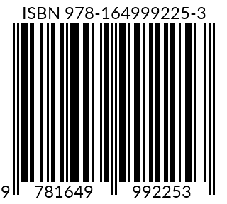
Hot Tip #42 is to add Open Graph meta tags.

These tags add images — plus text alongside them — to Landing Page links shared on social media.

Simply put, meta tags with optimized links are clicked more than those without them. 15 minutes invested here is worth it.

This is what the Hot Tips Landing Page looks like when shared on Twitter. Note the additional ‘Subscribe Free’ I added to the description to answer the potential doubt:

Meta Tag Preview
  • Metatags.io – A great tool to generate them and to see how your Landing Pages look on all platforms.

Emphasize time-saving

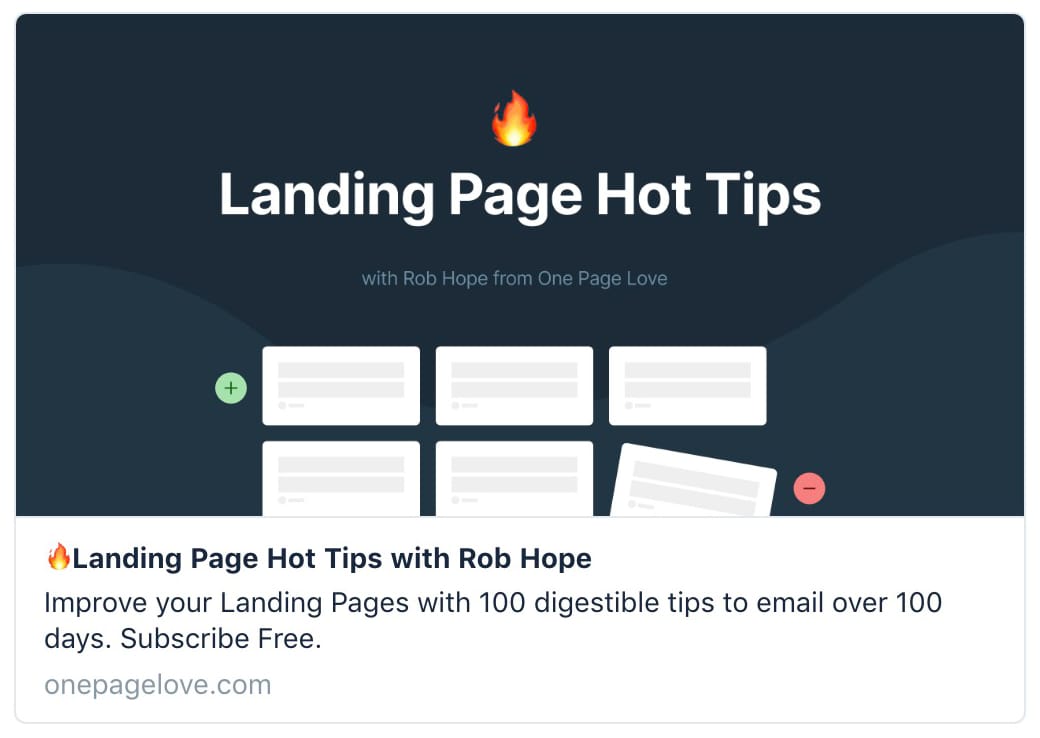
Hot Tip #43 is to emphasize time-saving.

Most SaaS offerings are trying to streamline our operations and save us time in one way or another.

Note how the first 3 features (out of 9) in the original Ghost Membership Landing Page are all related to time-saving:

Ghost Membership feature table

I’d argue time is the most valuable commodity we have.

How are you telling your Landing Page visitors they are one payment away from saving themselves time?

Tighten your big type

Hot Tip #44 is to tighten your big typography.

Font Kerning and Tracking is a tricky subject as not all typefaces need it. That said, it’s a good idea to experiment with your bigger fonts.

Kerning is adjusting the space between 2 letters in a word. Tracking is adjusting the space between all the letters in the word.

Here is a Font Tracking example:

Tracking demo

Tracking demo

Reducing the spacing between characters in your big intro copy can really tighten your Landing Page design.

  • Leading vs Kerning vs Tracking – Decent article on Creative Market showcasing the differences between Leading, Kerning and Tracking.
  • 10 Kerning Tips – An older but solid piece by Rebecca Creger with 10 kerning tips for improving your typography.

The end.

There are no more Hot Tips to load in this archive.

Next