Landing Page
Hot Tips
Edition v1.1
Author: Rob Hope
Editor: Scott Murcott
Producer: One Page Love

🔐 This Ebook link is private. Please share the book using: landingpagehottips.com
🔍 Looking for tip filters, downloads and checklists? Visit Extras
Share the book using:
landingpagehottips.com
Copyright ©2026 One Page Love
All rights reserved
First published: September 2020
Last updated: March 2026
978-1-64999-225-3 ISBN

Link Disclosure: this book contains a handful of affiliate links for products or services I've used in the past. Often the link unlocks a discount for you or/and a small kick back for me.
Ha! The best and worst advice one can give.
Context is everything when it comes to Landing Page optimization.
Every Landing Page has a different objective. So before we get going, you need answer those three questions and set them in stone.
Got your answers? Great.
Now what would your target demographic need to see and read in a Landing Page to be persuaded to go all the way?
Unsure? No problem. That's why I created this book.
One hundred tips can be overwhelming. So to get the most out of this book, I recommend reading a handful at a time, digesting the info, and then implementing the lessons that resonate the most with you.
The goal of the book is not to turn a Landing Page into a money-maker overnight. It's for you to strengthen your current and future Landing Pages through understanding.
And context.
Wishing you the strongest of Landing Pages.


Hot Tip #61 is to trim the <head> fat.
Start by opening up your Landing Page source code view. In Google Chrome: File > View > Developer > View Source. Other browsers will be similar.
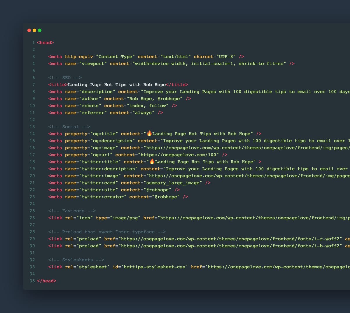
Copy all of the code between the opening and closing <head> tag and paste it into a text editor.
Use this checklist, starting from the top:
This can (and will) uncover scripts, font weights, and code snippets that add nothing but load time to your visitor’s experience.
As tedious as it sounds, your future Landing Pages will benefit from knowing what is behind them.
Hot Tip #62 is to include a support email address within your error messages.
If your Landing Page payment integration offers message customization, include a support email address for when a problem persists:
🚫
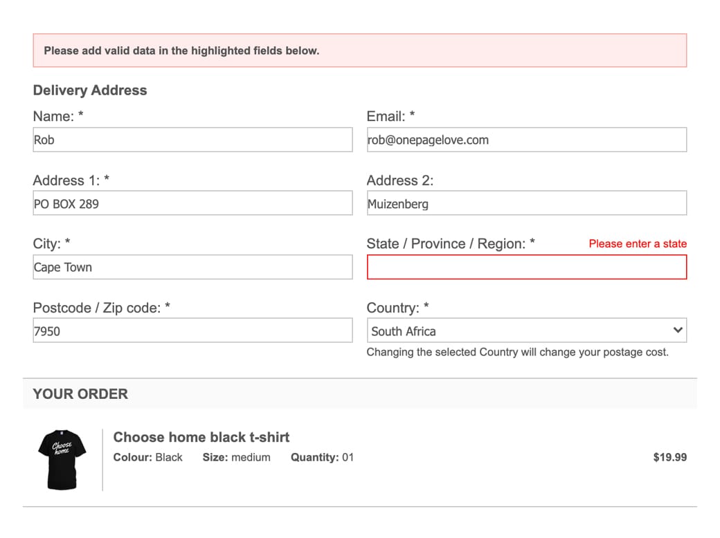
✅
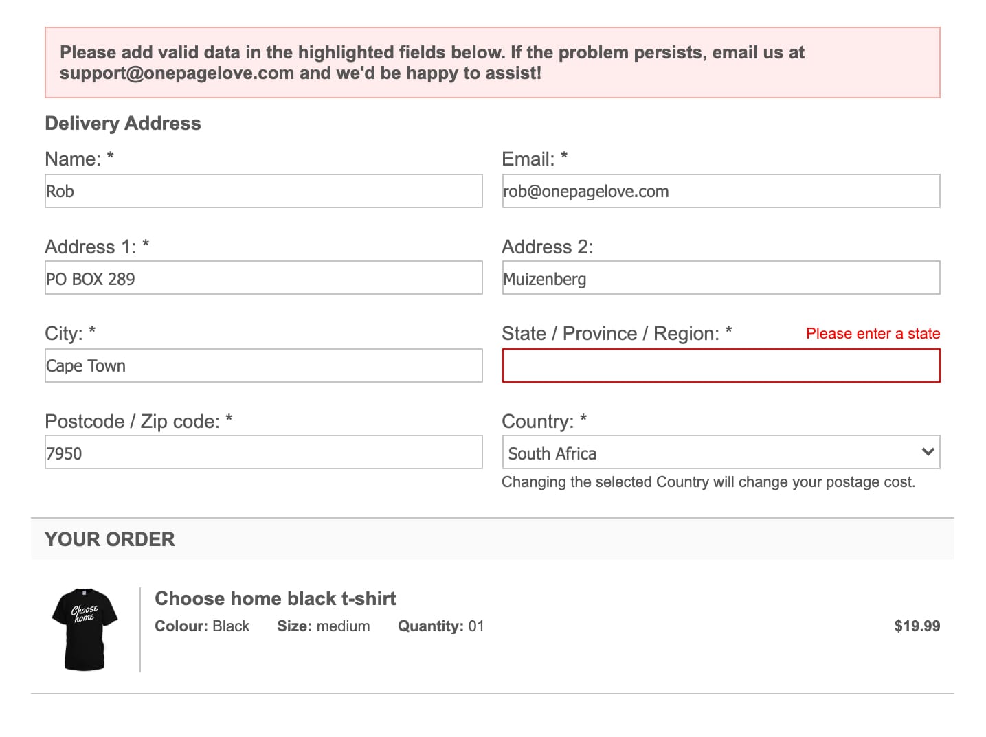
This can potentially convert dozens of disgruntled visitors into happy customers.
Hot Tip #63 is to add a radial burst behind your product imagery.
With only a few additional lines of CSS code, you can add another dimension to your Landing Page design.
The CSS Gradient tool can help generate the code for you online:

Here is the Hot Tip (Pre-Sale) Landing Page without a radial burst:
Here is the Landing Page with a radial burst:

With the addition of a drop-shadow on the image, a background radial burst can really add depth to the design, bringing your product imagery to life.
Hot Tip #64 is to delay your chatbot.
If you feel your Landing Page benefits from one, only kick that bugger off once your visitor has scrolled to the pricing table, FAQs, or footer.
A corner chat notification on arrival wrecks concentration, and we can’t afford to distract visitors while they decipher what we do.