🔐 This Ebook link is private. Please share the book using: landingpagehottips.com

🔍 Looking for tip filters, downloads and checklists? Visit Extras

Landing Page Hot Tips by Rob Hope


Landing Page
Hot Tips

Edition v1.1


Author: Rob Hope
Editor: Scott Murcott
Producer: One Page Love


Hot Tips Fire


Share the book using:
landingpagehottips.com


Copyright ©2025 One Page Love
All rights reserved

First published: September 2020
Last updated: July 2025

978-1-64999-225-3 ISBN

978-1-64999-225-3

978-1-64999-225-3

Ebook Contents:

  1. Foreward
  2. Hot Tips
  1. Utilize customer testimonials
  2. Showcase testimonials from a similar demographic
  3. Fewer images, better images
  4. Spice up Call-To-Action buttons
  5. When in doubt, double the padding
  6. Empathize with the visitor’s problem
  7. Avoid center-aligned or justified paragraphs
  8. Replace, don’t add
  9. Set a single objective
  10. Create a text color hierarchy
  11. Remove your main nav
  12. Use footer for pre-sale
  13. Highlight USP among feature list/grid
  14. Offer more pricing tiers
  15. Use specific coupons
  16. Embed your lead forms
  17. If you market to everyone, it resonates with no one
  18. Sit with someone and see what it takes to convert
  19. Set a max-width typography (CPL)
  20. Highlight a testimonial from an opinion leader
  21. Avoid animation overkill
  22. Consider a color scheme
  23. Avoid the word cheap
  24. Create Haste
  25. Integrate a sticky header navigation
  26. Use fewer fonts
  27. Step into your visitor’s shoes
  28. Space using ratios
  29. Add personality
  30. Curate your FAQs
  31. Replace GIFs with video
  32. Offer an annual discount
  33. Deconstruct your About paragraph
  34. Run a regular speed test
  35. Put your name on it
  36. Align with a grid
  37. Add a splash of color
  38. Invest in an icon library
  39. Place copy before images on mobile
  40. Offer a free teaser
  41. Code your own social share buttons
  42. Add Open Graph meta tags
  43. Emphasize time-saving
  44. Tighten your big type
  45. Don’t neglect Retina optimization
  46. Remove the obstacles to demo
  47. Lower the risk to commit
  48. Keep brand capitalization consistent
  49. Keep vertical spacing even
  50. Suggest a pricing option
  51. Increase demand by limiting supply
  52. Add social proof
  53. Focus on solving copy first
  54. Consider dark mode
  55. Align your marketing
  56. Increase the contrast of your button text
  57. Only A/B test high traffic pages
  58. Minimize the options
  59. Try font smoothing
  60. Liven with illustrations
  61. Trim the fat
  62. Include an email within error messages
  63. Add a radial burst behind product imagery
  64. Delay the chatbot
  65. Offer a demo down-sell
  66. Open non-essential links in a new tab
  67. Seek hero images with negative space
  68. Hint to scroll
  69. Make it accessible
  70. Demo in-page
  71. Don’t shortcut hosting
  72. Reassure during checkout
  73. Personalize the success message
  74. Steer clear of a header carousel
  75. Boost confidence with payment method logos
  76. Soft launch with a discount
  77. Implement smooth scroll
  78. Define a visual hierarchy
  79. Remove inactive social media accounts
  80. Wrap it in a device
  81. Define container width
  82. Prove you are established
  83. Strategically position testimonials
  84. Focus on people, not search engines
  85. Show them how it works
  86. Include an explainer video
  87. Focus on form UX
  88. Consider a lifetime discount
  89. Focus on benefits, not features
  90. Alternate section background colors
  91. Bring it to life
  92. Keep it positive
  93. Emphasize the value
  94. Consider parity pricing
  95. Reuse winning templates
  96. Don’t get too fancy
  97. Reinvest your profits
  98. Test new narratives
  99. Make it fast
  100. Don’t forget the why
  101. Start from the beginning, again
  102. Book Credits
  1. Credits
  2. Extras (Filters, Audiobook, Checklists)

Link Disclosure: this book contains a handful of affiliate links for products or services I've used in the past. Often the link unlocks a discount for you or/and a small kick back for me.

Foreward

It Depends.

Ha! The best and worst advice one can give.

Context is everything when it comes to Landing Page optimization.

  1. Who is your target demographic?
  2. What is their problem?
  3. How does your offering solve it?

Every Landing Page has a different objective. So before we get going, you need answer those three questions and set them in stone.

Got your answers? Great.

Now what would your target demographic need to see and read in a Landing Page to be persuaded to go all the way?

Unsure? No problem. That's why I created this book.

One hundred tips can be overwhelming. So to get the most out of this book, I recommend reading a handful at a time, digesting the info, and then implementing the lessons that resonate the most with you.

The goal of the book is not to turn a Landing Page into a money-maker overnight. It's for you to strengthen your current and future Landing Pages through understanding.

And context.

Wishing you the strongest of Landing Pages.

Rob Hope

Signature

Signature

Focus on benefits, not features

Hot Tip #89 is to focus on the benefits, not the features.

As the proud owner of a product or service, it’s natural to want to climb up the tallest building and let the world know how damn awesome the technical features are.

Unfortunately, our Landing Page visitor isn’t impressed by technical features, nor do they resonate with them. What they do care about is if our offering can help them.

Focus on the benefits of choosing you, not the product or service attributes:

  • Focus on how your calendar app saves them time, not how it uses cutting-edge technology.
  • Focus on how your course will elevate their career, not how well-attended it is.
  • Focus on how your sunscreen allows hours of fun in the sun, not how much R&D went into it.

“Your customers don’t care about your product, they care about their problems.” – Sahil Lavingia

Alternate section background colors

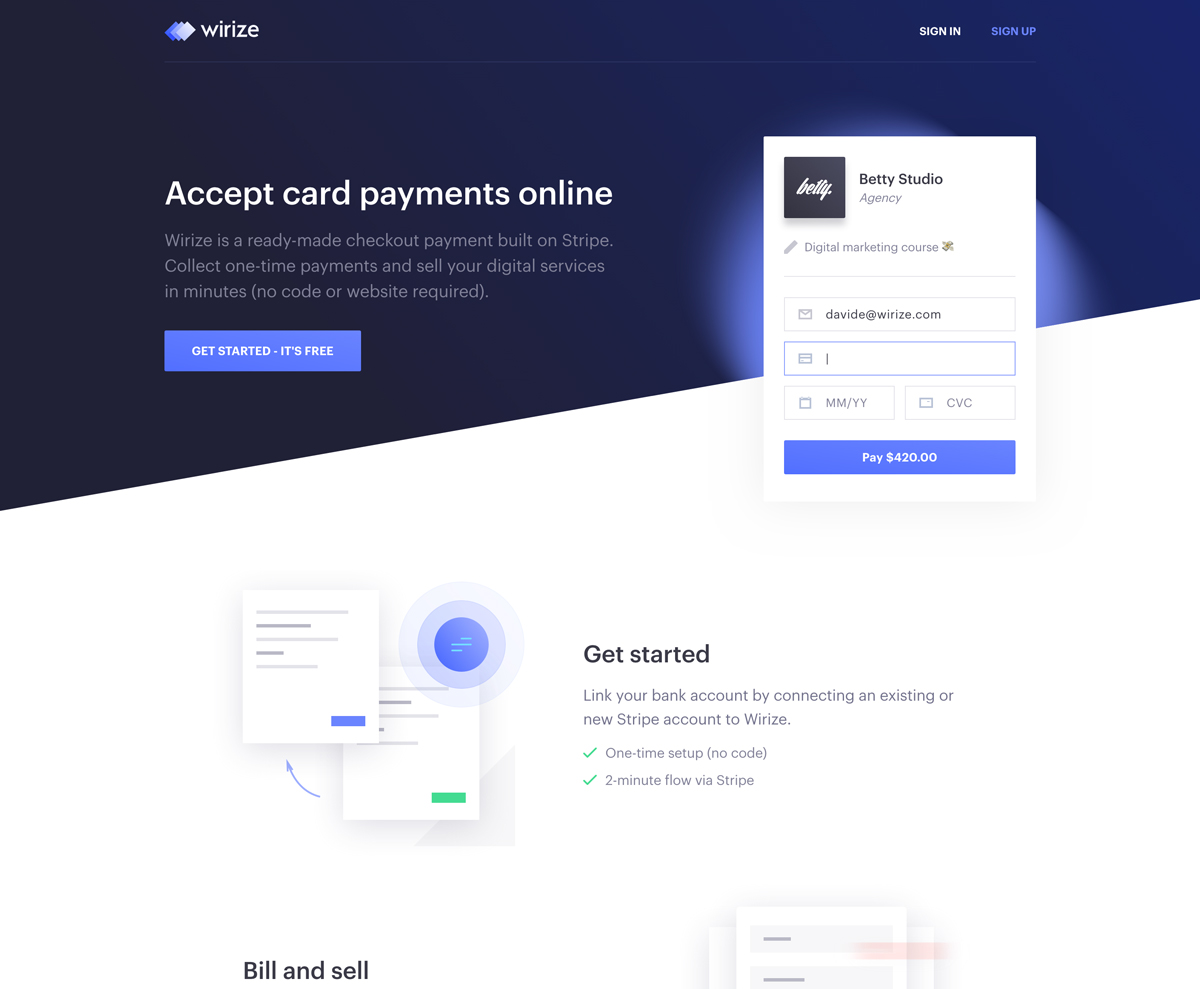
Hot Tip #90 is to alternate section background colors.

Consider a slightly darker or lighter background color for every alternate Landing Page section. This design tip will also help contain section content better as a visitor scrolls.

Landing Page background color reference Wavy Line reference

To add spice, why not experiment by separating sections using wavy lines (above) or diagonal lines (below).

Diagonal Line reference Diagonal Line reference
  • Wavy Line References – A collection of 10+ Landing Pages I’ve curated featuring wavy line separators.
  • Diagonal Line References – A collection of 30+ Landing Pages I’ve curated featuring diagonal line separators.
  • BGJar – Free online tool to create SVG wavy lines.

Bring it to life

Hot Tip #91 is to bring it to life.

Skeuomorphism is the design concept of making digital items resemble their tangible real-world counterpart.

If you are selling a book, consider using a book mock-up template to bring it to life in your Landing Page:

Book Cover reference

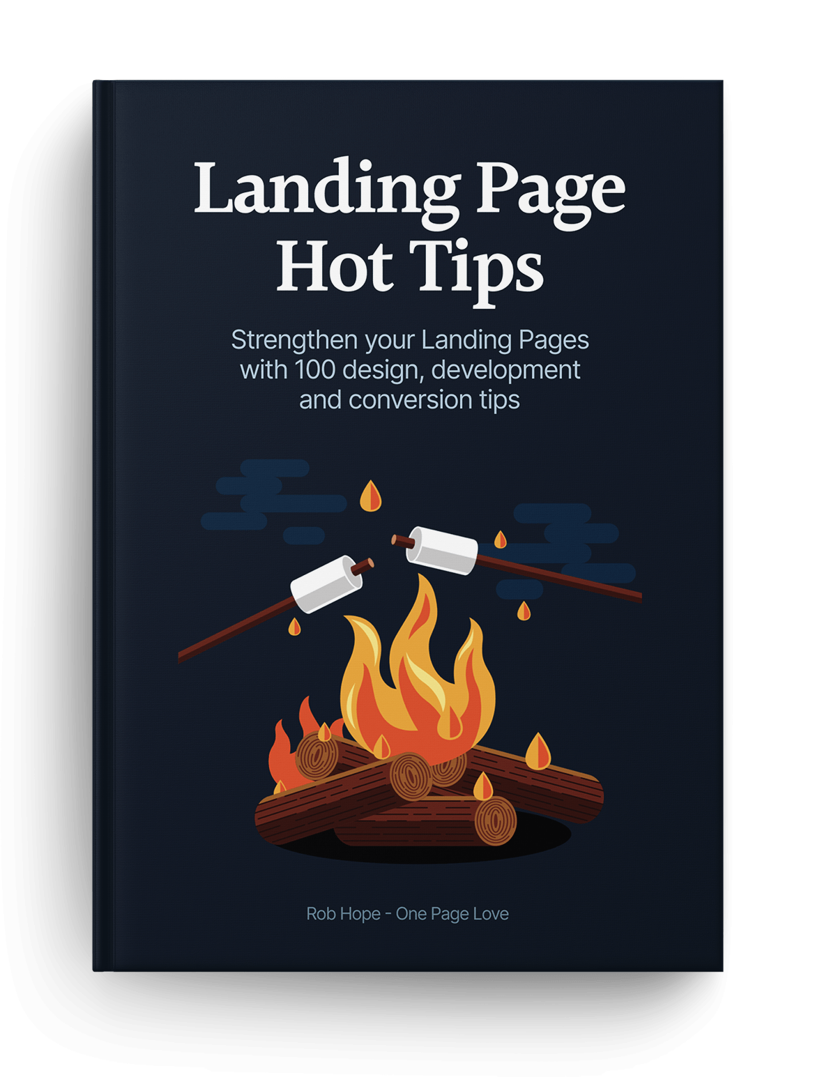
I grabbed this book template from Creative Market and it made a huge difference to the Hot Tips Landing Page design.

Selling a print? Why not put it in a frame and overlay a leaf to really bring it to life:

Print reference

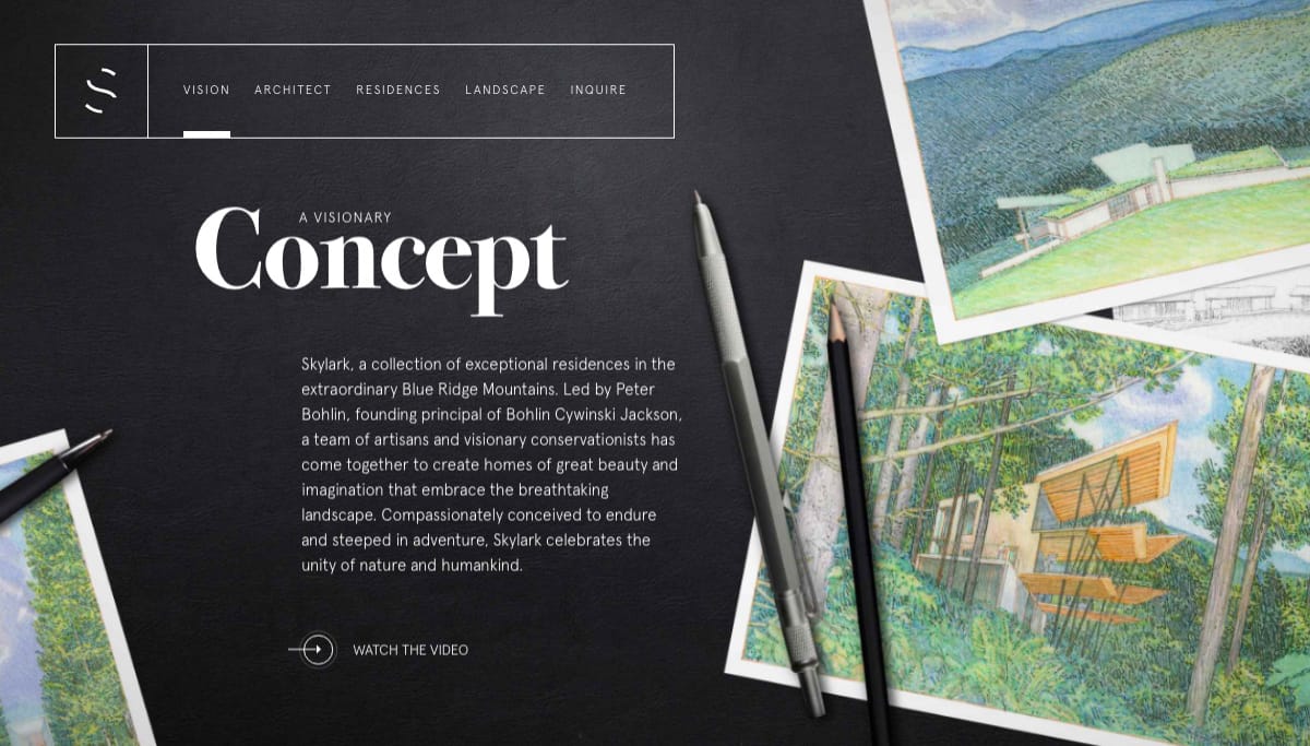
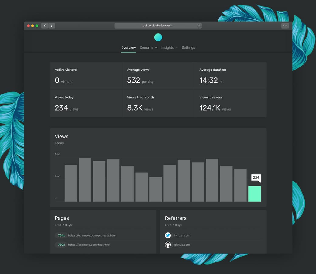
Pre-selling property? Give it life with an aerial view of the desk and the beautiful plans strewn across it:

Print reference

Another trick to bring your offering to vibrant life is to add a subtle drop shadow behind the image, product mock-up, or browser screenshot:

Drop shadow design reference

The above subtleties aren’t noticeable at first but collectively mold into a beautiful Landing Page design, like this:

Drop shadow design reference
  • Unboxshot – A service specializing in stop-motion unboxing animations for your products. Instant delight in your Landing Page.
  • Depth Inspiration – A collection of 50+ Landing Pages I’ve curated featuring a perception of depth within the page.
  • Aerial View Inspiration – A collection of 80+ Landing Pages I’ve curated with aerial view shot.
  • Creative Market – The device mock-ups category is filled with unique options by their community.
  • Device Mock-Up Inspiration – A collection of 150+ Landing Pages I’ve curated featuring device mock-ups.
  • Devices by Facebook Design – Monster collection of mock-up devices in both PNG and Sketch. Ridiculous this is free.
  • Shotsnapp – Brilliant device mock-up tool that works in your browser.
  • Ray – Useful little web app to generate beautiful images of your code snippets. Supports a bunch of languages and features a neat UI options panel including dark + light modes.
  • Rotato – macOS app to generate fancy rotating device mock-ups. Free to try, then $40.
  • Smartmockups – Tool with a more diverse (tees, cups, devices) set of mock-ups. Free for 200 mock-ups then $9/month.
  • Lstore Graphics – Top quality device mock-up resource. Video options too!

Keep it positive

Hot Tip #92 is to keep the tone of your copywriting positive.

🚫 Chat software that doesn’t sell your info
✅ Chat software focused on privacy

🚫 A legal course that doesn’t ramble
✅ A legal course that’s straight to the point

🚫 Don’t be negative
✅ Keep it positive

Position your offering as a confident solution, not a snarky competitor.

The end.

There are no more Hot Tips to load in this archive.