
Increase the contrast of your button text
Hot Tip #56 is to increase the contrast of your CTA button text.
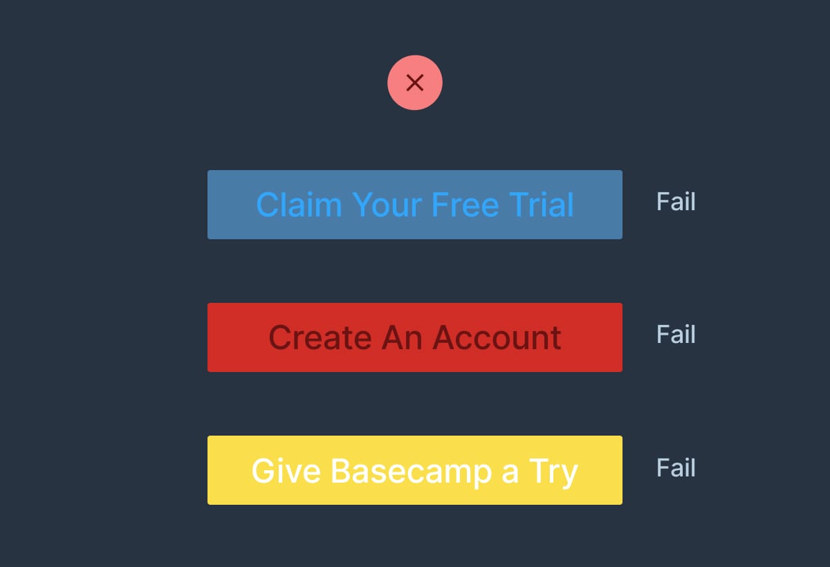
A common design mistake by beginners is keeping the global link color the same throughout Landing Page elements.
This can lead to low contrast CTA buttons:
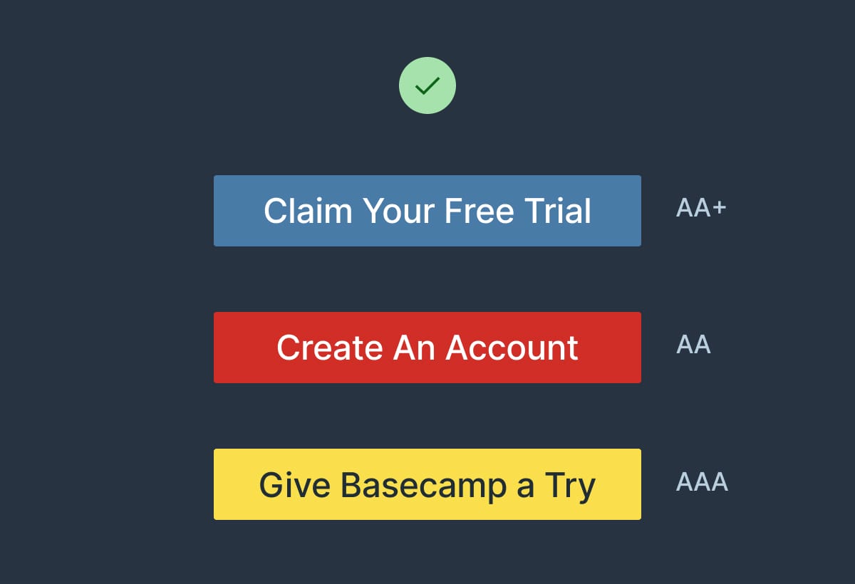
By integrating a text color that’s highly contrasted against the button background, you can create striking CTA buttons:
- Contrast for Mac - Great tool I've been using to to ensure my text color hierarchies are within Accessibility standards.