Improve your Landing Pages with 100 digestible tips. Each tip features a few paragraphs, visual references and related resources.
Foreward
It Depends.
Ha! The best and worst advice one can give.
Context is everything when it comes to Landing Page optimization.
Who is your target demographic?
What is their problem?
How does your offering solve it?
Every Landing Page has a different objective. So before we get going, you need answer those three questions and set them in stone.
Got your answers? Great.
Now what would your target demographic need to see and read in a Landing Page to be persuaded to go all the way?
Unsure? No problem. That's why I created this book.
One hundred tips can be overwhelming. So to get the most out of this book, I recommend reading a handful at a time, digesting the info, and then implementing the lessons that resonate the most with you.
The goal of the book is not to turn a Landing Page into a money-maker overnight. It's for you to strengthen your current and future Landing Pages through understanding.
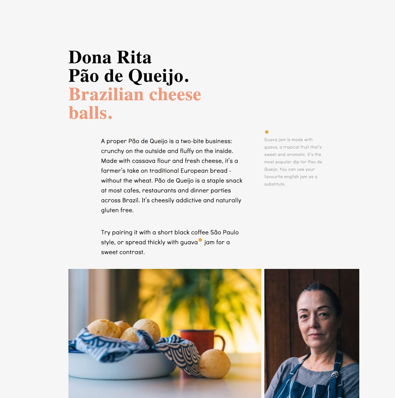
Hot Tip #01 is to utilize your customer testimonials by highlighting features and answering doubts.
So often I see Landing Pages packed with testimonials providing very little value to the visitor. Let’s compare two testimonials. The first is by a customer, Gavin Jenkins:
"I’m a huge fan of the brand, so I’m glad I could finally sample their product."– Gavin Jenkins
Note how Gavin’s testimonial is generic, offering superficial information to the potential customer reading it. This second testimonial is also by a customer, Kim Davis — but note the difference:
"So glad I could finally experience their superb quality myself and I was quite impressed by the thoughtful packaging of such a delicate item."– Kim Davis
See how Kim’s testimonial highlighted a product feature while also answering a potential doubt? The feature being the build quality and the potential doubt being if postage would damage the item.
Round up all of your customer testimonials and select only the choice few adding value for your Landing Page visitor.
How to request testimonials - A three-step method to help generate great Landing Page testimonials from your customers.
Testimonial examples - A more specific collection I've put together of well-designed or interesting Testimonial examples in Landing Pages
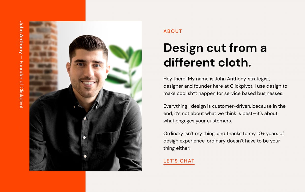
Hot Tip #02 is to showcase testimonials from similar demographics to your potential customers.
If you are selling enterprise-level support software, it’s wise to curate testimonials from customers who work for enterprise-sized businesses.
Put yourself in your Landing Page visitor’s shoes and imagine the concerns of an enterprise customer. They’ll be wary of moving a huge amount of staff over to new support software due to the high stakes involved.
They’ll also want to know other enterprise businesses took this risk and made this transition successfully.
Using Hot Tip #01 as a guide, I’ve hand-picked this excellent testimonial by enterprise customer, Dave Lewis:
"Our team just loves how easy to use the software is and support response time improved by 22% in month one."– Dave Lewis
Glowing feedback, right? Now, let’s take it a step further by highlighting who he works for alongside his name. In this case, Dave is the VP of Customer Relations at Starbucks, which adds significant weight to the testimonial as its backed by an enterprise-sized business:
"Our team just loves how easy to use the software is and support response time improved by 22% in month one."Dave Lewis – Starbucks VP Customer Relations
Avataaars - Online avatar generator for when customer imagery isn't available or poor quality. Try not mix animated with real customer images. So choose a style for consistency.
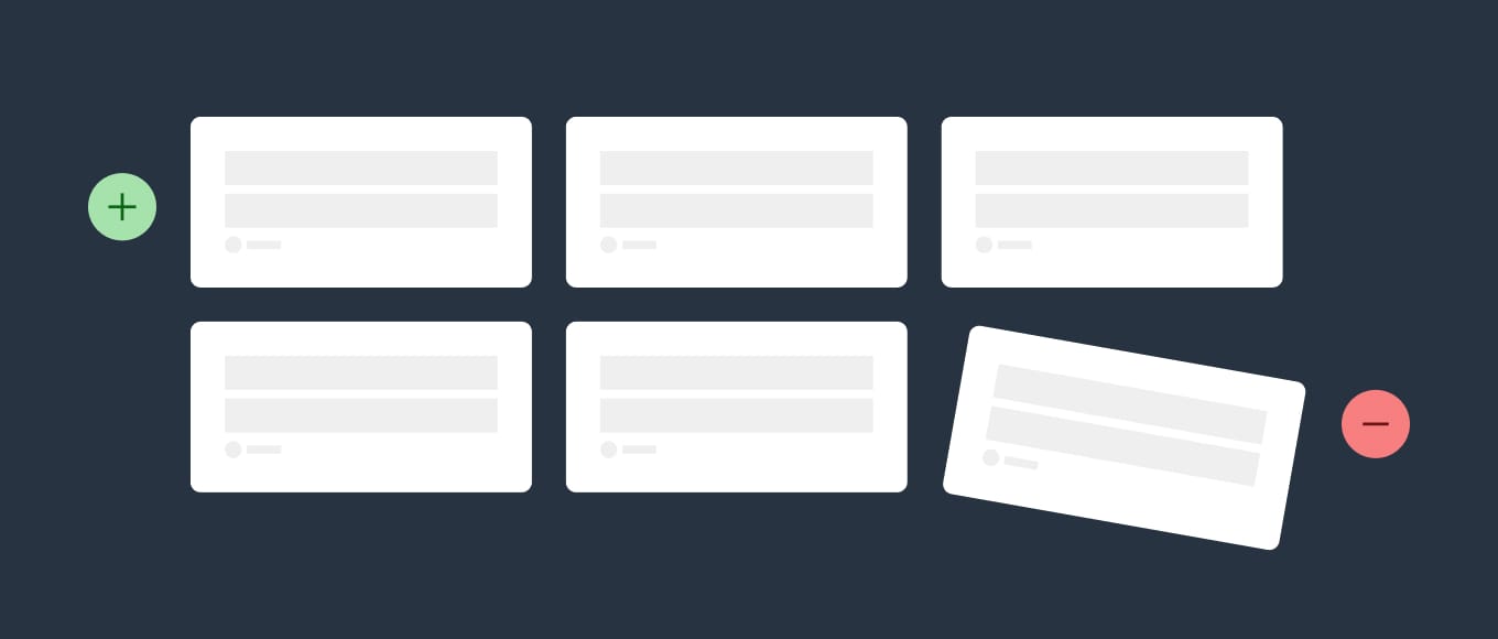
Hot Tip #03 is to use fewer images but also better images.
Good imagery builds trust, and trust is the foundation for conversions. When it comes to your visuals — spend the money!
Invest in a photoshoot of your team, your product, your food. The ROI on a professional photoshoot is pretty much guaranteed.
ImageOptim - My go-to for image size optimization for JPG, GIF, PNG and SVG.
Optimage - An alternative image size optimization tool by Vlad Danilov. Conveniently optimizes MP4 too.
Stocksy - My favorite premium resource for stock images. If you only need a single authentic image for your Landing Page, seriously consider starting here.
Squareshot - Service to send your physical product and they'll send back top quality photos of it for your Landing Page.
Noun Project Photos - Just launched so a good resource of less-used, quality stock imagery. Pricing is around $33/image for commercial use.
Unsplash - High quality, well curated free stock images.
Pixabay - Both good free stock image alternatives if a search term isn't winning on Unsplash. Both include stock video too.
Pexels - Both good free stock image alternatives if a search term isn't winning on Unsplash. Both include stock video too.
IMGIX - Image CDN's are a bit excessive in most Landing Pages but I use IMGIX for my full network of sites. The real benefit is you can upload a big image once, then manipulate (size, compression) the output using only code. I cannot recommend it enough and I do use it for Landing Pages within my bigger sites.
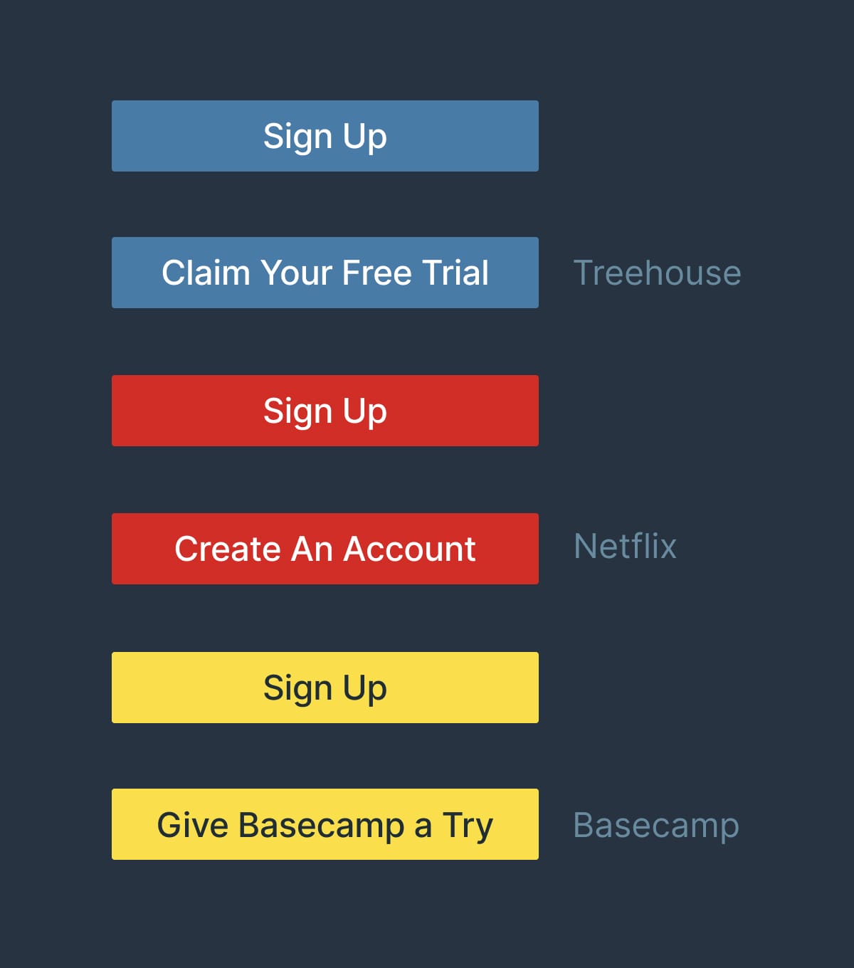
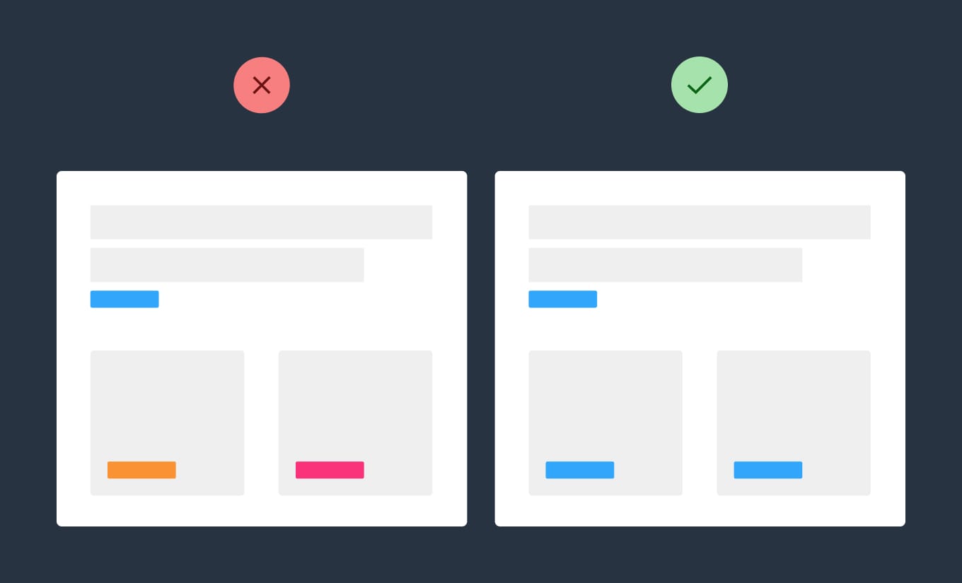
Hot Tip #06 is to empathize with the visitor’s problem using your intro copy.
Then explain exactly what your product or service does in the subtext, removing all verbose words or phrases.
🚫
The world’s most innovative invoice tracking software
XYZ Invoicing uses the cutting edge InvoAlgo algorithm to programmatically track unpaid invoices to send clients reminders using conversion-optimized email templates tested on 1000s of happy customers.
✅
Wasting time chasing late client payments?
XYZ Invoicing sends automated reminders to clients with outstanding invoices.
—
Remember, your Landing Page is there to impress with choice previews, highlights and testimonials.
So start by making the visitor feel your offering was destined for them, in the simplest way possible.
Marketing Examples Titles - A fun Landing Page title breakdown by Annie Maguire from Marketing Examples.
Headlime - A headline generator to help brainstorm dozens of possibilities.
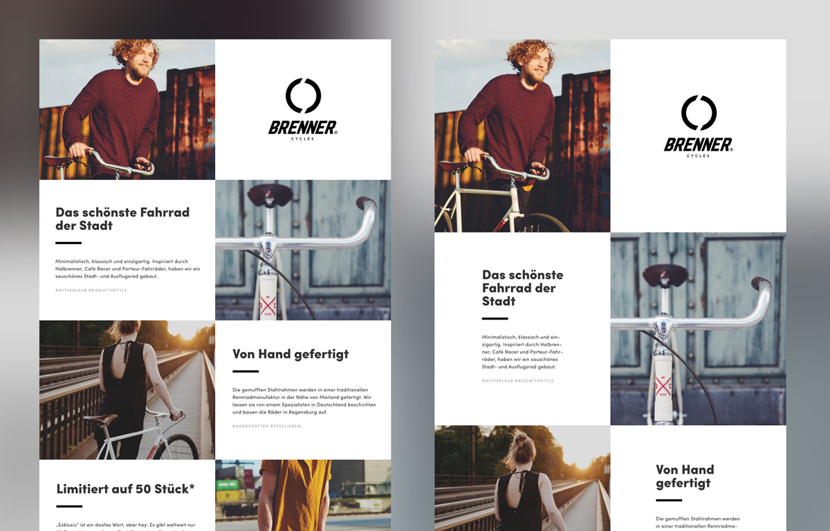
Hot Tip #07 is to avoid center-aligned or justified paragraph text.
When applied to long paragraphs, these two alignments can be difficult to read. This can result in fatigue while browsing Landing Pages with a lot of content.
Let Neil deGrasse Tyson take us through it:
—
🚫 Center-aligned
We think scientific literacy flows out of how many science facts can you recite rather than how was your brain wired for thinking. And it’s the brain wiring that I’m more interested in rather than the facts that come out of the curriculum or the lesson plan that’s been proposed.
✅ Left-aligned
We think scientific literacy flows out of how many science facts can you recite rather than how was your brain wired for thinking. And it’s the brain wiring that I’m more interested in rather than the facts that come out of the curriculum or the lesson plan that’s been proposed.
—
🚫 Justified
You have people who believe they are scientifically literate but, in fact, are not. And I don’t mind if you’re not scientifically literate, but just admit that to yourself, so that you’ll know, and perhaps you can take a first step to try to eradicate that. You have people who believe they are scientifically literate but, in fact, are not. And I don’t mind if you’re not scientifically literate, but just admit that to yourself, so that you’ll know, and perhaps you can take a first step to try to eradicate that.
✅ Left-aligned
You have people who believe they are scientifically literate but, in fact, are not. And I don’t mind if you’re not scientifically literate, but just admit that to yourself, so that you’ll know, and perhaps you can take a first step to try to eradicate that. You have people who believe they are scientifically literate but, in fact, are not. And I don’t mind if you’re not scientifically literate, but just admit that to yourself, so that you’ll know, and perhaps you can take a first step to try to eradicate that.
—
A good rule-of-thumb is that any paragraph with more than two lines should be left- or right-aligned.
Rags-widows-orphans - Kinda inappropriate naming but a good read on certain paragraph shapes and styles to avoid.