You are browsing Hot Tips featuring:

Forms

Landing Page lessons related to the lead forms.

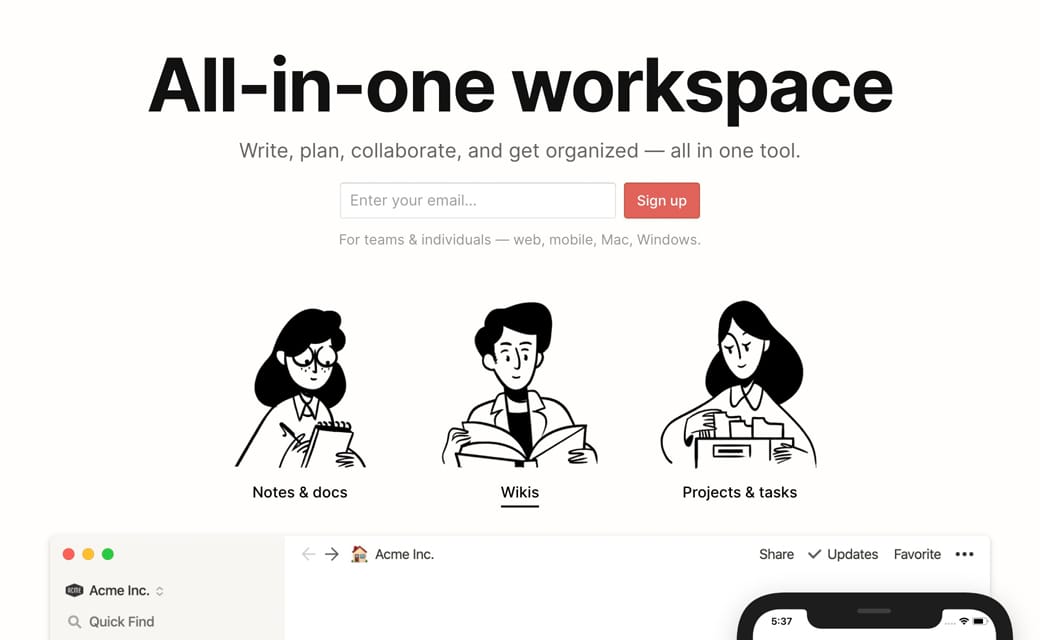
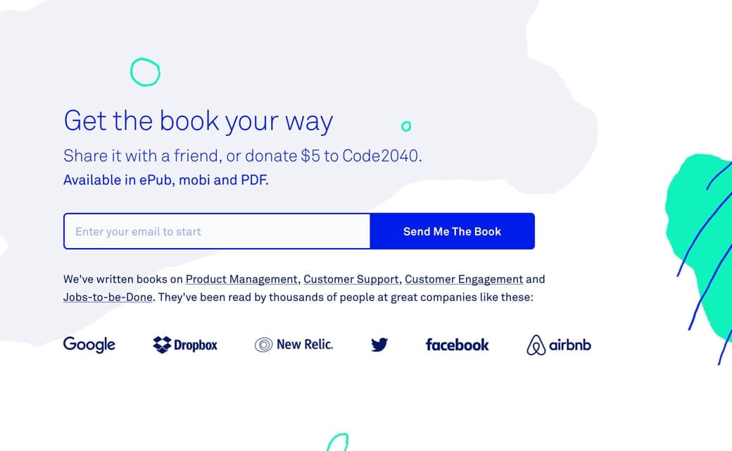
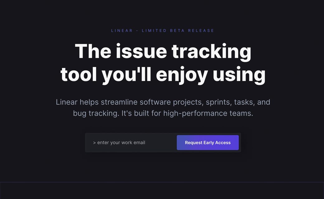
Embed your lead forms

Hot Tip #16 is to embed your forms to try capture leads immediately.

๐Ÿšซ [Click here to Sign Up]

โœ… (Enter your email) + [Sign Up]


Lead capture example
Notion

Lead capture example
Intercom on Onboarding

Lead capture example
Linear

Remember, with every page load your conversion rate drops, so try capture leads as soon as possible.

Minimize the options

Hot Tip #58 is to minimize the options.

Do you really need:

๐Ÿ“Š 5 different pricing plans?
๐Ÿ“ 7 required fields in your enquiry form?
๐ŸŽจ 16 different product color choices?

"The time it takes to make a decision increases with the number and complexity of choices." - Hicks Law

Hicks Law - Beautifully illustrated representation on Laws of UX

Make it accessible

Hot Tip #69 is to make it accessible.

Providing people with health conditions or impairments, the ability to read and navigate your Landing Page easily is the right thing to do.

Here are five small tasks that can go a long way:

  1. Create a clear :focus state like this - keep hitting tab on your keyboard and see what happens in your Landing Page.

  2. Ensure your text color contrast isn't weak - this text against this background - has a decent AAA accessibility score of 8.99.

  3. Increase your browser font size and see if your Landing Page layout breaks or anything become illegible.

  4. Correctly assign and order semantic headings (H1, H2, H3) - disabling your stylesheet or using a screen reader will quickly surface issues with your hierarchy.

  5. Describe all your non-decorative images using the alt tag - if an image is only there for graphic purpose you can let the screen reader skip it.

One hour tackling the above, could saves hundreds of frustrating hours for others.

The exercise will also strengthen your Landing Page by surfacing fundamental development issues.

Accessible Color Generator - Useful to find the nearest accessible-passing color based on your color inputs (that are failing).

Contrast for Mac - Great tool I've been using to to ensure my text color hierarchies are within Accessibility standards.

Focus Styles - Solid article by Eric Bailey covering :focus and :active CSS selectors.

Lighthouse - Instructions how to run an accessibility audit for your Landing Page in Google Chrome.

Screen Readers - A curated round-up by UsabilityGeek.

UserWay - A website accessibility solution for ADA & WCAG Compliance. Their widget sits in the corner of the browser where users can customize their browsing experience.

Focus on form UX

Hot Tip #87 is to focus on form UX.

The importance of good form usability is overlooked in Landing Pages. Fancy layouts with too many required fields will drop conversions.

โœ… Arrange fields in one column
โœ… Keep required fields to a minimum
โœ… Position labels near the top-left of fields
โœ… Tab in the correct order

Investing in a user-friendly form experience is worth every cent for your Landing Page.

Crazy Egg Form UI UX - Crazy Egg published a brilliant Form UI and UX visual guideline.