You are browsing Hot Tips featuring:

Buttons

Landing Page lessons related to the Call-To-Action buttons.

Spice up Call-To-Action buttons

Hot Tip #04 is to spice up your Call-To-Action (CTA) buttons.

Remember: you’re excited to share your product or service!

🚫 Click Here
🚫 Sign Up

Too bland.

Use actionable phrases.

✅ Request a call from our agents
✅ Discover the wonders of science
✅ Unlock creativity for only $19

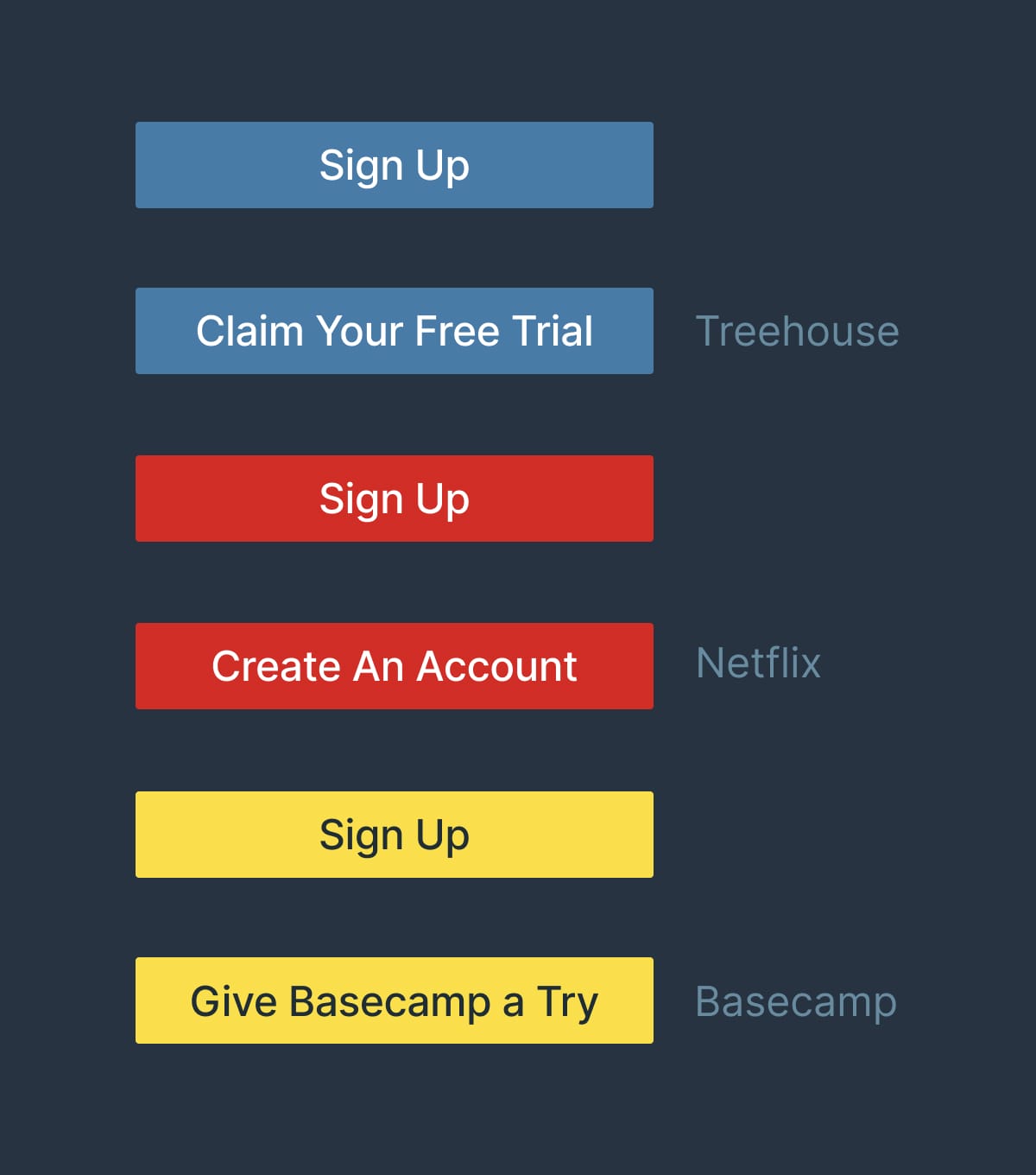
Let’s take a look at what the big dogs are using:


CTA button references

Space using ratios

Hot Tip #28 is to space using ratios.

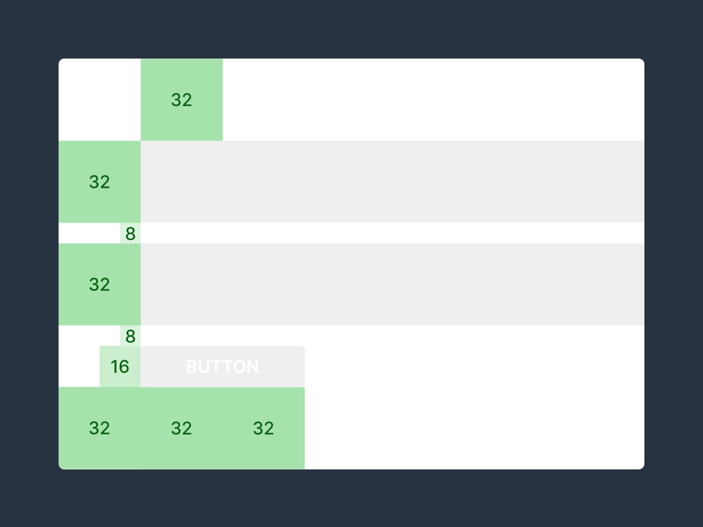
For example, set a base size of 8px, then define your padding using multiples of 8:

Tiny gaps = 8px
Small gaps = 16px
Medium gaps = 32px
Big gaps = 64px


Ratio infographic
Using ratios aligns your content better and tightens up Landing Page design.

8pt Grid System - Very good visual breakdown by Elliot Dahl of the benefits an 8pt system give a design. Includes 8px ratio infographics.

Code your own social share buttons

Hot Tip #41 is to code your own social share buttons.

Embedding a crowd of social share buttons adds unnecessary requests to your Landing Page load.

I'd vote for removing them completely. If you must have them, consider hard-coding the buttons with fun pre-composed text.

Mamma mia! This free set of restaurant icons by @iconfinder is deeelicious 🍕

Share Link Creator - My go-to-tool for populating social share links in my Landing Pages. I used this tool for the links below this. Kick off the Tweet link to see it in action.

Increase the contrast of your button text

Hot Tip #56 is to increase the contrast of your CTA button text.

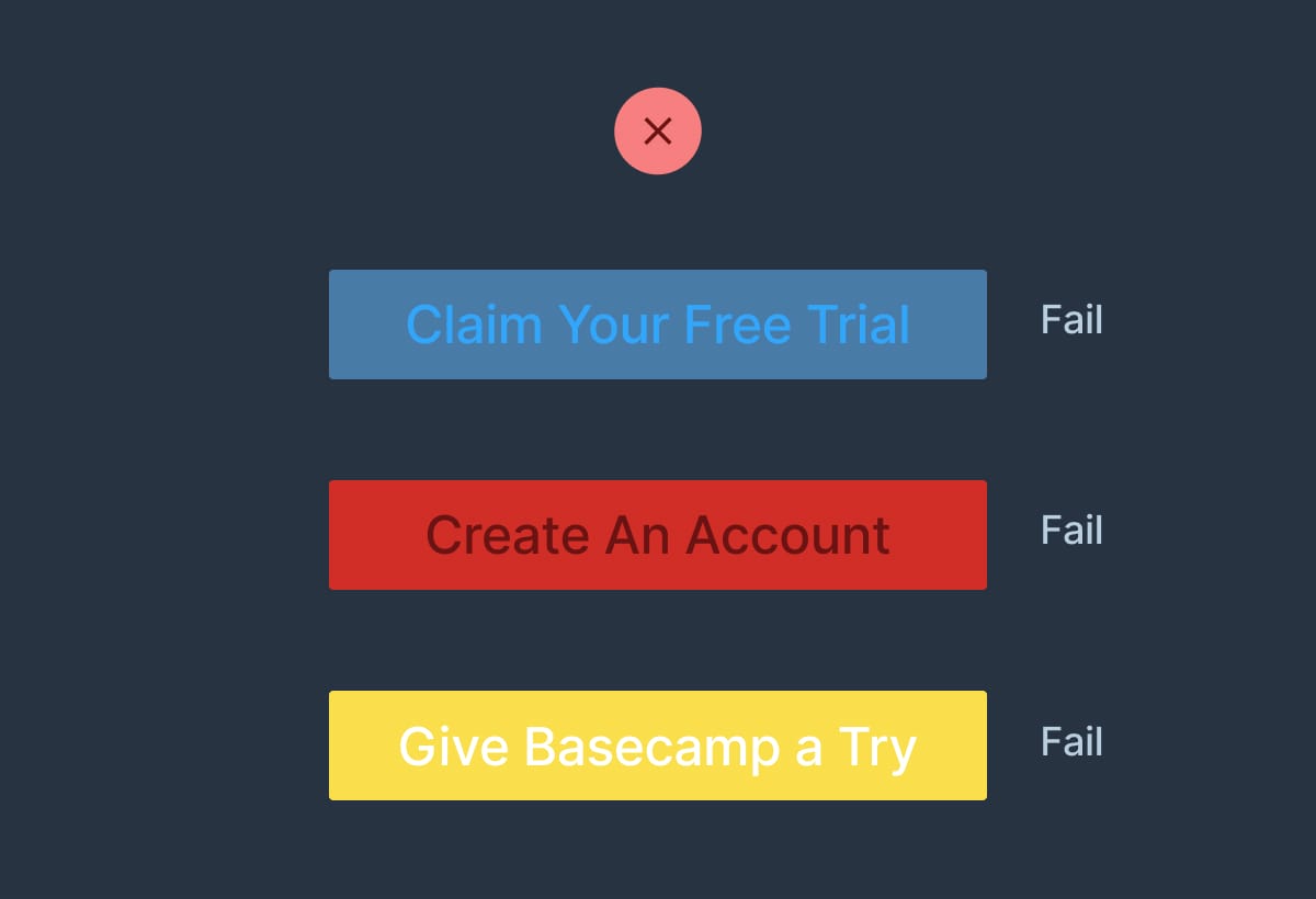
A common design mistake by beginners is keeping the global link color the same throughout Landing Page elements.

This can lead to low contrast CTA buttons:


Button contrast reference
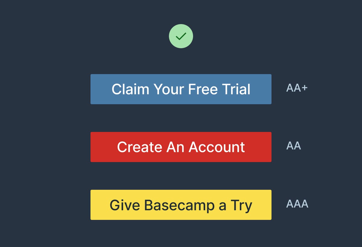
By integrating a text color that’s highly contrasted against the button background, you can create striking CTA buttons:

Button contrast reference

Contrast for Mac - Great tool I've been using to to ensure my text color hierarchies are within Accessibility standards.

Open non-essential links in a new tab

Hot Tip #66 is to open non-essential links in a new tab.

Set links to documentation, support, privacy, and demos to open a new browser tab, keeping the primary Landing Page within a tab's reach.

New Window Links - A strong Counterargument by Jesse including several use-cases and additional UX reads. Always healthy to question UX decisions. I still vote for opening demos, support portals and blogs in new tabs - all 3 in my experience offer poor navigations to return to the primary page.

Make it accessible

Hot Tip #69 is to make it accessible.

Providing people with health conditions or impairments, the ability to read and navigate your Landing Page easily is the right thing to do.

Here are five small tasks that can go a long way:

  1. Create a clear :focus state like this - keep hitting tab on your keyboard and see what happens in your Landing Page.

  2. Ensure your text color contrast isn't weak - this text against this background - has a decent AAA accessibility score of 8.99.

  3. Increase your browser font size and see if your Landing Page layout breaks or anything become illegible.

  4. Correctly assign and order semantic headings (H1, H2, H3) - disabling your stylesheet or using a screen reader will quickly surface issues with your hierarchy.

  5. Describe all your non-decorative images using the alt tag - if an image is only there for graphic purpose you can let the screen reader skip it.

One hour tackling the above, could saves hundreds of frustrating hours for others.

The exercise will also strengthen your Landing Page by surfacing fundamental development issues.

Accessible Color Generator - Useful to find the nearest accessible-passing color based on your color inputs (that are failing).

Contrast for Mac - Great tool I've been using to to ensure my text color hierarchies are within Accessibility standards.

Focus Styles - Solid article by Eric Bailey covering :focus and :active CSS selectors.

Lighthouse - Instructions how to run an accessibility audit for your Landing Page in Google Chrome.

Screen Readers - A curated round-up by UsabilityGeek.

UserWay - A website accessibility solution for ADA & WCAG Compliance. Their widget sits in the corner of the browser where users can customize their browsing experience.

Define a visual hierarchy

Hot Tip #78 is to define a clear visual hierarchy.

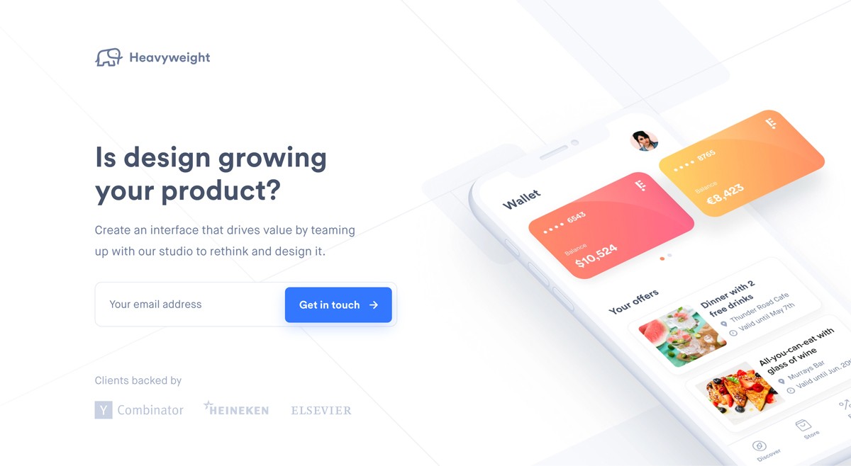
Step back from your Landing Page, squint your eyes, and take note of the content that appears most prominently. Is this prominent content more important?

A visual hierarchy orders content by significance and also suggests the order to follow. If all content was of equal size and weight, we wouldn’t know where to start. Naturally, we want our introduction headline text to be the most prominent as it’s where the visitor’s journey begins:


Visual hierarchy demo
Heavyweight

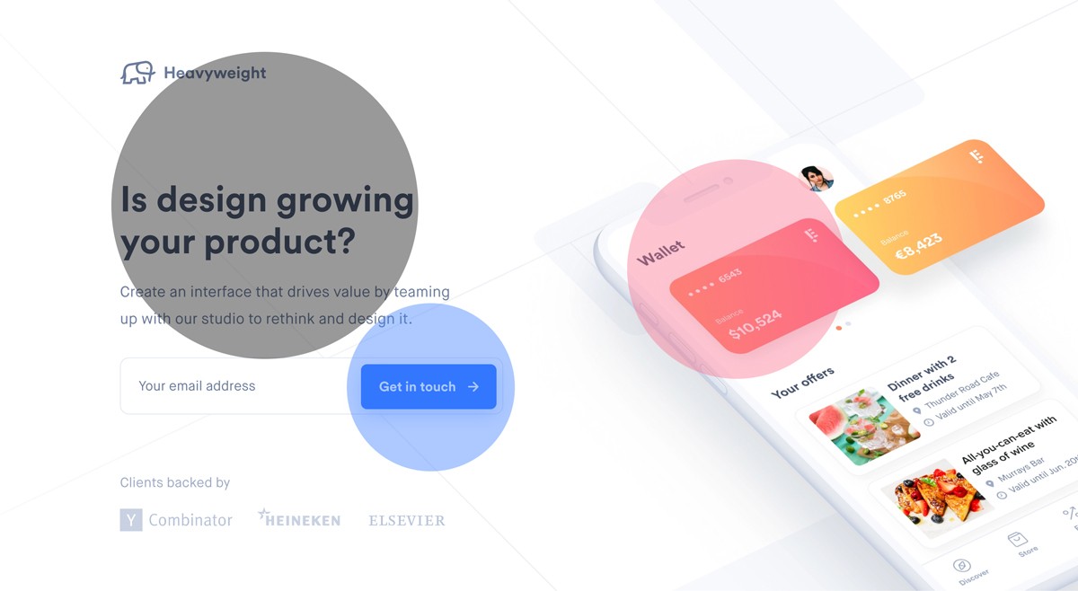
A visitor’s eyes are also trained to follow a Z-pattern:

1 - 2

3 - 4

Note how you probably followed a Z-pattern when looking at the above image:


Visual hierarchy demo
A good rule-of-thumb is to increase the prominence of your more important content while decreasing the less important.

Visual Hierarchies Explained - Webflow published on visual hierarchies if you would like to learn more.