You are browsing:

Development Tips

Landing Page lessons related to the development process. When you are further with your build, kick off the Landing Page Development Checklist.

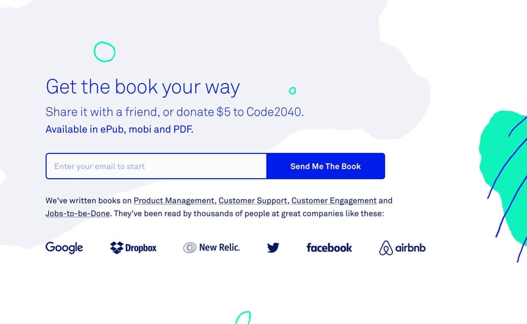
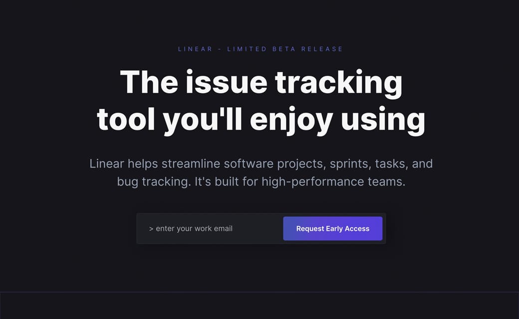
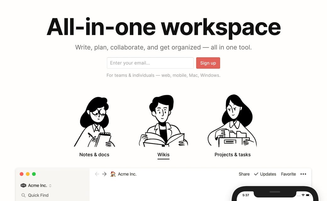
Embed your lead forms

Hot Tip #16 is to embed your forms to try capture leads immediately.

🚫 [Click here to Sign Up]

✅ (Enter your email) + [Sign Up]


Lead capture example
Notion

Lead capture example
Intercom on Onboarding

Lead capture example
Linear

Remember, with every page load your conversion rate drops, so try capture leads as soon as possible.

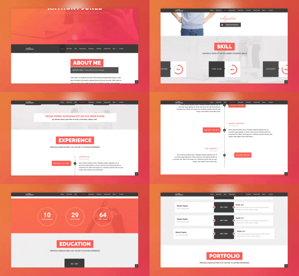
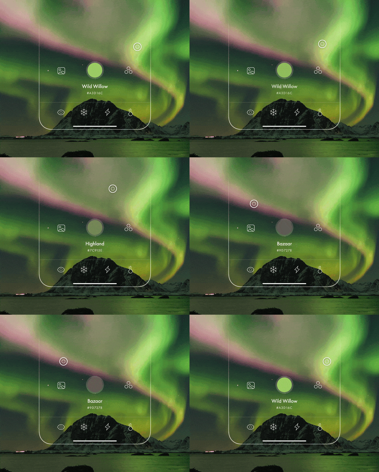
Avoid animation overkill

Hot Tip #21 is to avoid animation overkill.

Gratuitous scroll transitions no longer impress. Subtle animations are timeless and show intent.


Animation demo
Just because you can, doesn’t mean you should.

Integrate a sticky header navigation

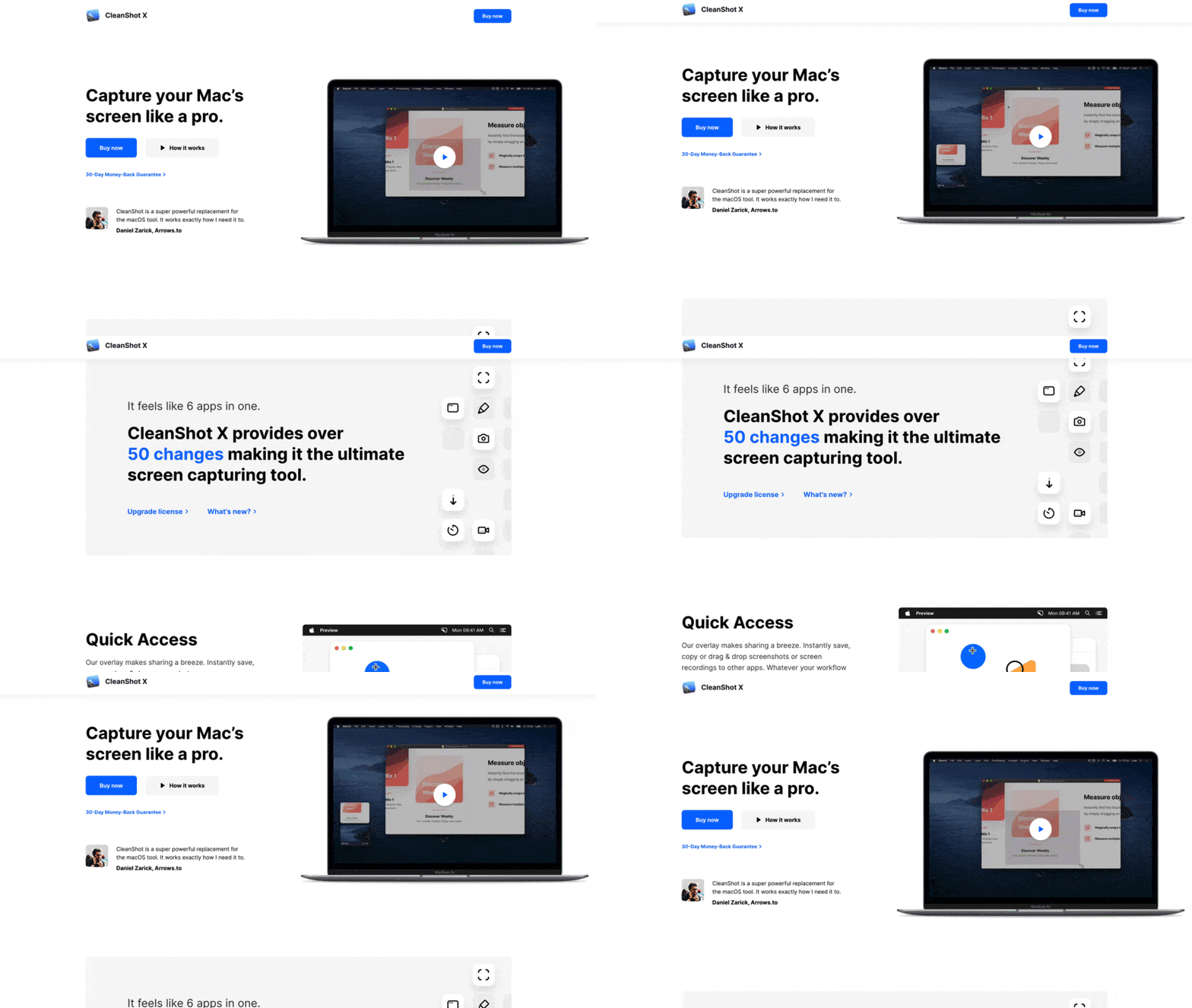
Hot Tip #25 is to integrate a sticky header navigation if your Landing Page is long.


Sticky Header Demo
CleanShot X

A sticky header can make it easier for visitors to navigate page sections and keeps that CTA button visible at all times.

Use fewer fonts

Hot Tip #26 is to use fewer fonts.

Multiple typefaces, each with a number of weights, add unnecessary load time to a Landing Page.

Consider pairing your primary typeface with a native system font to keep it lean.

A fast-loading Landing Page with a more organized typeset is classy and considerate.

System Font Stack - Good breakdown with code snippets by Geoff Graham on CSS-Tricks.

Typewolf - My go-to for typography inspiration. Jeremiah Shoaf has done a fantastic job with the resource.

Typewolf Google Fonts - Quality curation by Typewolf with font previews and direct download links.

Replace GIFs with video

Hot Tip #31 is to replace those demo GIFs with video.

Video offers:

⚡️ Better performance
🎨 More colors
🍃 Less file size
👆 Ability to pause

The argument for using GIFs is that they are easier to produce and save. Neither are reasons to use them in your Landing Page.

ImageOptim - My go-to for image size optimization for JPG, GIF, PNG and SVG.

Screenflow - My absolute favorite screen recording tool I probably use every day. Exports to GIF and lite-sized MP4 (used in this book) for Landing Pages.

Run a regular speed test

Hot Tip #34 is to run a regular speed test.

Speed tests can highlight excessive use of fonts, images or scripts in your Landing Page.

Here are my go-to tools:

⚡️ Google PageSpeed Insights
⚡️ Pingdom Speed Test

The poor results can act as a to-do-list and even a fun optimization game if you allow it.

Code your own social share buttons

Hot Tip #41 is to code your own social share buttons.

Embedding a crowd of social share buttons adds unnecessary requests to your Landing Page load.

I'd vote for removing them completely. If you must have them, consider hard-coding the buttons with fun pre-composed text.

Mamma mia! This free set of restaurant icons by @iconfinder is deeelicious 🍕

Share Link Creator - My go-to-tool for populating social share links in my Landing Pages. I used this tool for the links below this. Kick off the Tweet link to see it in action.

Add Open Graph meta tags

Hot Tip #42 is to add Open Graph meta tags.

These tags add images — plus text alongside them — to Landing Page links shared on social media.

Simply put, meta tags with optimized links are clicked more than those without them. 15 minutes invested here is worth it.

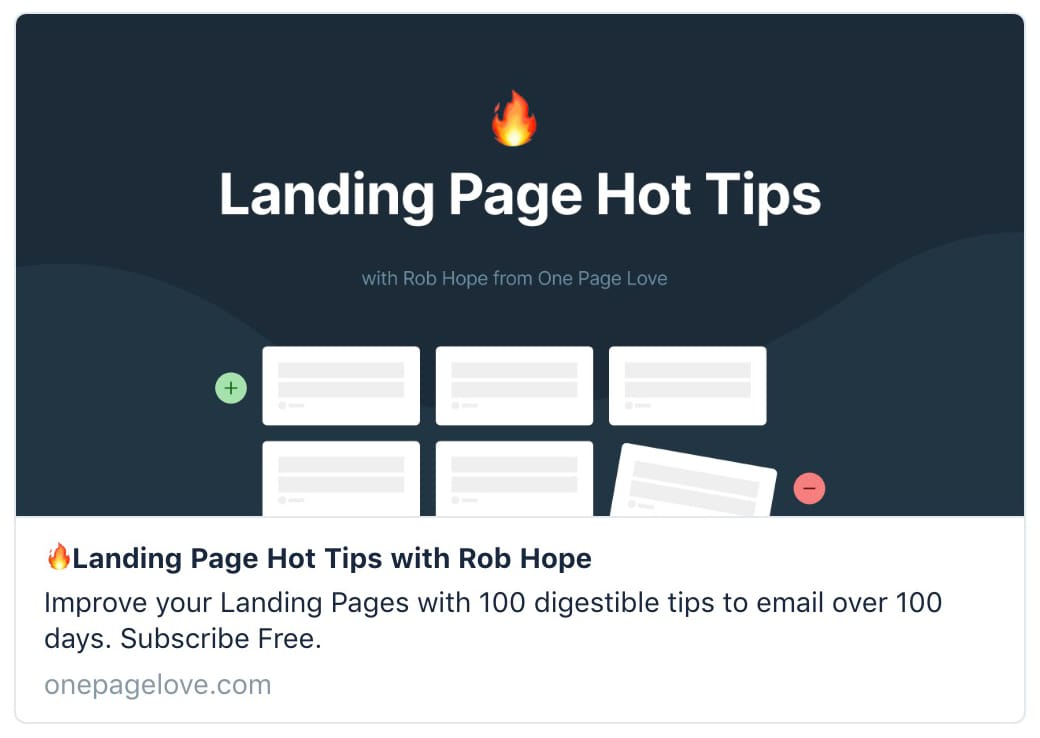
This is what the Hot Tips Landing Page looks like when shared on Twitter. Note the additional ‘Subscribe Free’ I added to the description to answer the potential doubt:


Meta Tag Preview

Metatags - A great tool to generate them and to see how your Landing Pages look on all platforms.

Trim the <head> fat

Hot Tip #61 is to trim the <head> fat.

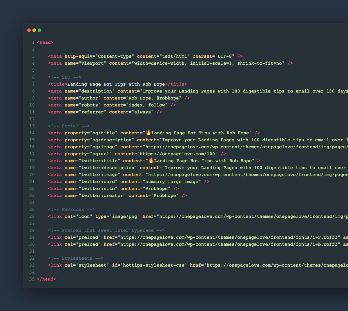
Start by opening up your Landing Page source code view. In Google Chrome: File > View > Developer > View Source. Other browsers will be similar.


Source Code View
Copy all of the code between the opening and closing <head> tag and paste it into a text editor.

Use this checklist, starting from the top:

  • What does this line do?

  • Is it really needed?

  • If not, delete

  • Repeat

This can (and will) uncover scripts, font weights, and code snippets that add nothing but load time to your visitor’s experience.

As tedious as it sounds, your future Landing Pages will benefit from knowing what is behind them.

Include an email within error messages

Hot Tip #62 is to include a support email address within your error messages.

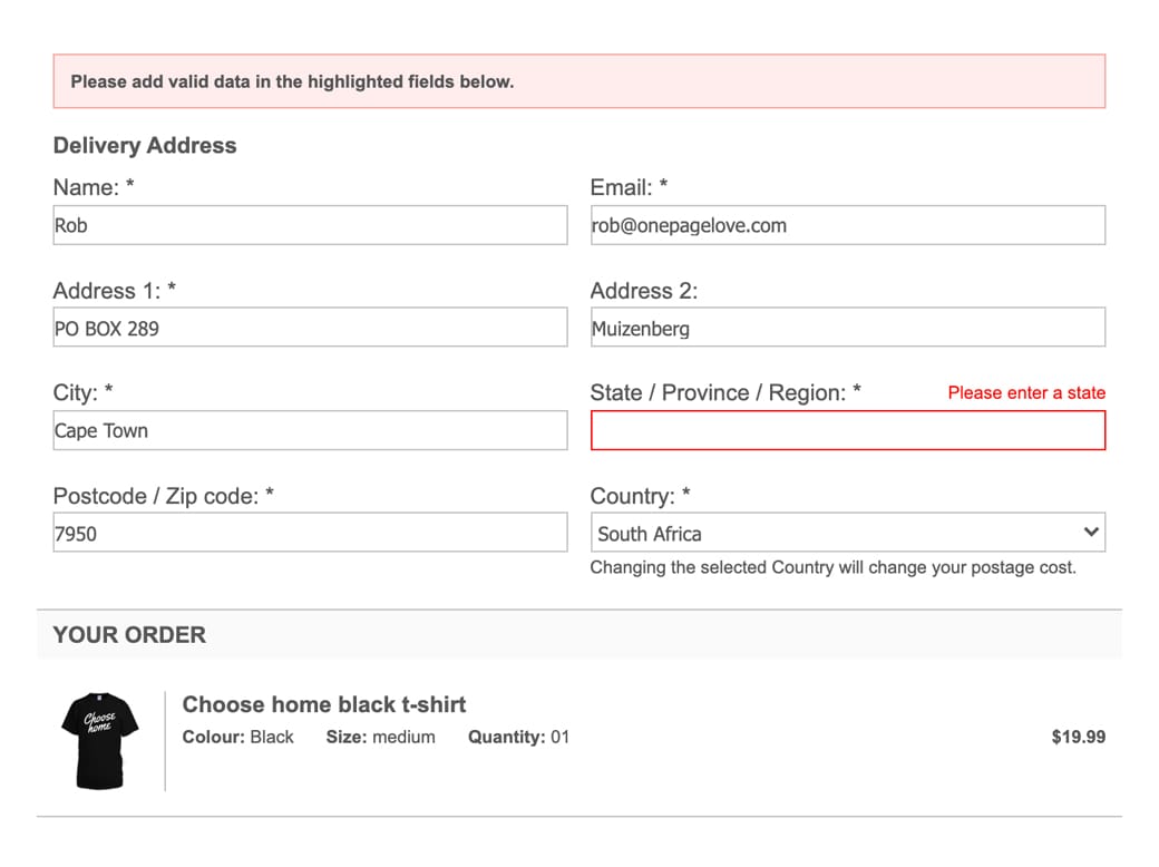
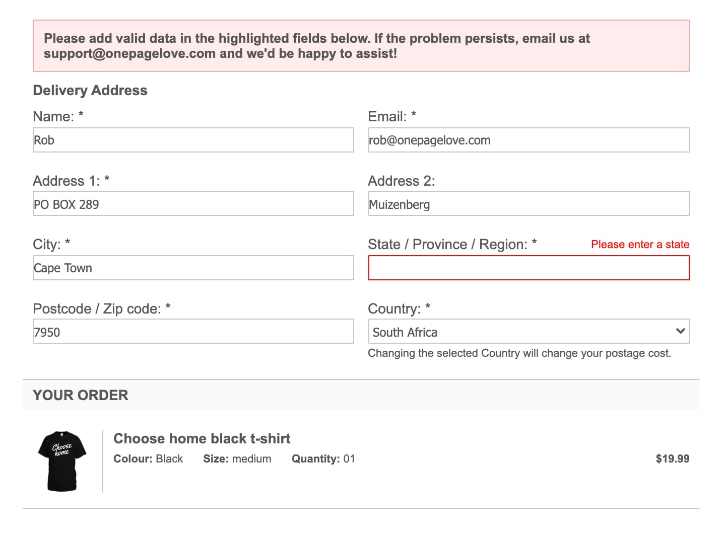
If your Landing Page payment integration offers message customization, include a support email address for when a problem persists:

🚫


Error Reference
✅

Error Reference
This can potentially convert dozens of disgruntled visitors into happy customers.

Delay the chatbot

Hot Tip #64 is to delay your chatbot.

If you feel your Landing Page benefits from one, only kick that bugger off once your visitor has scrolled to the pricing table, FAQs, or footer.

A corner chat notification on arrival wrecks concentration, and we can't afford to distract visitors while they decipher what we do.

Open non-essential links in a new tab

Hot Tip #66 is to open non-essential links in a new tab.

Set links to documentation, support, privacy, and demos to open a new browser tab, keeping the primary Landing Page within a tab's reach.

New Window Links - A strong Counterargument by Jesse including several use-cases and additional UX reads. Always healthy to question UX decisions. I still vote for opening demos, support portals and blogs in new tabs - all 3 in my experience offer poor navigations to return to the primary page.

Make it accessible

Hot Tip #69 is to make it accessible.

Providing people with health conditions or impairments, the ability to read and navigate your Landing Page easily is the right thing to do.

Here are five small tasks that can go a long way:

  1. Create a clear :focus state like this - keep hitting tab on your keyboard and see what happens in your Landing Page.

  2. Ensure your text color contrast isn't weak - this text against this background - has a decent AAA accessibility score of 8.99.

  3. Increase your browser font size and see if your Landing Page layout breaks or anything become illegible.

  4. Correctly assign and order semantic headings (H1, H2, H3) - disabling your stylesheet or using a screen reader will quickly surface issues with your hierarchy.

  5. Describe all your non-decorative images using the alt tag - if an image is only there for graphic purpose you can let the screen reader skip it.

One hour tackling the above, could saves hundreds of frustrating hours for others.

The exercise will also strengthen your Landing Page by surfacing fundamental development issues.

Accessible Color Generator - Useful to find the nearest accessible-passing color based on your color inputs (that are failing).

Contrast for Mac - Great tool I've been using to to ensure my text color hierarchies are within Accessibility standards.

Focus Styles - Solid article by Eric Bailey covering :focus and :active CSS selectors.

Lighthouse - Instructions how to run an accessibility audit for your Landing Page in Google Chrome.

Screen Readers - A curated round-up by UsabilityGeek.

UserWay - A website accessibility solution for ADA & WCAG Compliance. Their widget sits in the corner of the browser where users can customize their browsing experience.

Demo in-page

Hot Tip #70 is to integrate an in-page product demo.

Traditionally Landing Pages demonstrate their products through screenshots, embedded videos, or link out to an online demo.

Have you considered integrating an in-page demo of your product?


In-page demo
Landing Pages putting in the extra effort by demonstrating their actual product in-page, result in a spectacular first impressions.

Clever in-page demos - An article featuring 12 Landing Pages with brilliant in-page demos.

Twitter In-Page - Same as above except Twitter thread with videos.

Don't shortcut hosting

Hot Tip #71 is don't take shortcuts on website hosting.

Cheap, shared hosting will end up costing a lot more (through downtime, hacks, sluggish speeds, slow support, and frustrated customers) in comparison to the savings you'd get from using a reputable host.

However, hosting advice is subjective to where you are in your journey. This tip would apply to Landing Pages with a product or service people are buying.

---

Bonus: here are some hosting FAQs and answers I give One Page Love readers who ask. These are actually taken from my email macros I use them so much:)

FAQ: I have a product idea I want to validate but have little budget or coding experience?

Build a free Landing Page online using Carrd. It's free if you keep the name.carrd.co subdomain, then $9/year if you want to use a custom domain.

FAQ: I have a product idea, want to use WordPress but have little budget?

Bluehost is an option if you really want to use WordPress + a free theme. It's not the best hosting but if you are giving away a free product and need to use WordPress, it's your best option. This link discounts to $3/month if you pay annually.

FAQ: I want good hosting for my Landing Page and want to use WordPress?

Flywheel hosts all my WordPress websites and Landing Pages. The uptime is solid, CDN fast, daily backups are great with a 1-click restore, staging for testing convenient and the support is superb. I'm a massive fan. For my network of sites I'm paying $100/month.

FAQ: I want good hosting for my Landing Page and don't want to use WordPress?

If you know your way around a server, Digital Ocean is your best bet at $5/month. I use it for 1 of my Landing Pages.

Reuse winning templates

Hot Tip #95 is to reuse your winning Landing Page templates.

It's tempting to start a Landing Page from scratch for a new launch, but why not consider reusing an older template that worked well.

The 80/20 principle works well here.

Try spending 20% of your time on your Landing Page arrangement and 80% on your content.

Carrd - Your go-to option if you want to build a basic Landing Page online for free. Then only $9/year if you want to use a custom domain. Founder AJ is a real legend in the template-building space.

Designmodo - A wonderful Landing Page builder solution (for you to host yourself) utilising the Bootstrap framework. The design is definitely up there with the best and features over 300 components to interchange and customize.

Landing Page Templates - A collection of 300+ Landing Page templates I've reviewed over the past few years. About 80 of them are free to test a few ideas at low cost.

Squarespace - Your best hosted solution if you would like to build a Landing Page online with an alongside blog for content marketing. It is also worth noting if design is your weak point, Squarespace design is perhaps the best out there and will give you a better first impression than the other online website builders.

unbounce - Online Landing Page builder who encourage duplicating your best performing templates to save time. A quick shoutout to them who have been super supportive of this book online.

Don't get too fancy

Hot Tip #96 is don’t get too fancy.

Parallax scrolling, scroll transitions, custom cursors, color switchers…


Parallax Scrolling Demo
Parallax Scrolling examples

While they all have their time and place, avoid dwelling on them if you are new to Landing Pages or not making sales.

Instead, spend your time on an in-page demo or a remarkable product. This will be way more beneficial in the long run.

When your sales start rolling in, then you can indulge in a little bit of flair.