
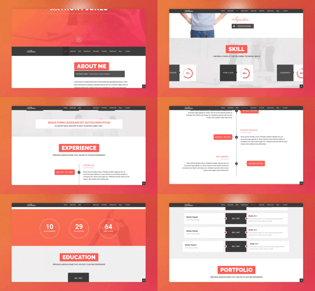
Avoid animation overkill
Hot Tip #21 is to avoid animation overkill.
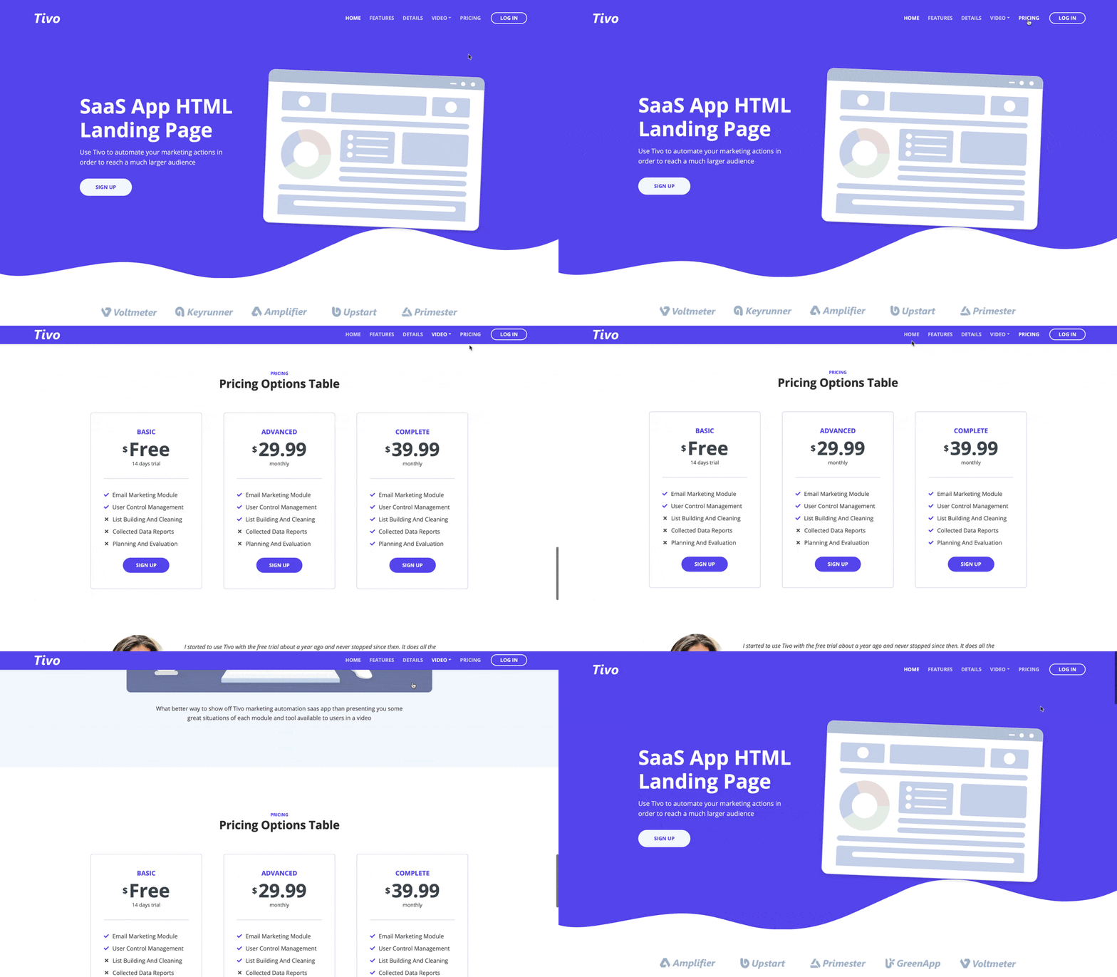
Gratuitous scroll transitions no longer impress. Subtle animations are timeless and show intent.
You are browsing:
Landing Page lessons related to the page usability and overall experience for the visitor.
Hot Tip #21 is to avoid animation overkill.
Gratuitous scroll transitions no longer impress. Subtle animations are timeless and show intent.
Hot Tip #25 is to integrate a sticky header navigation if your Landing Page is long.
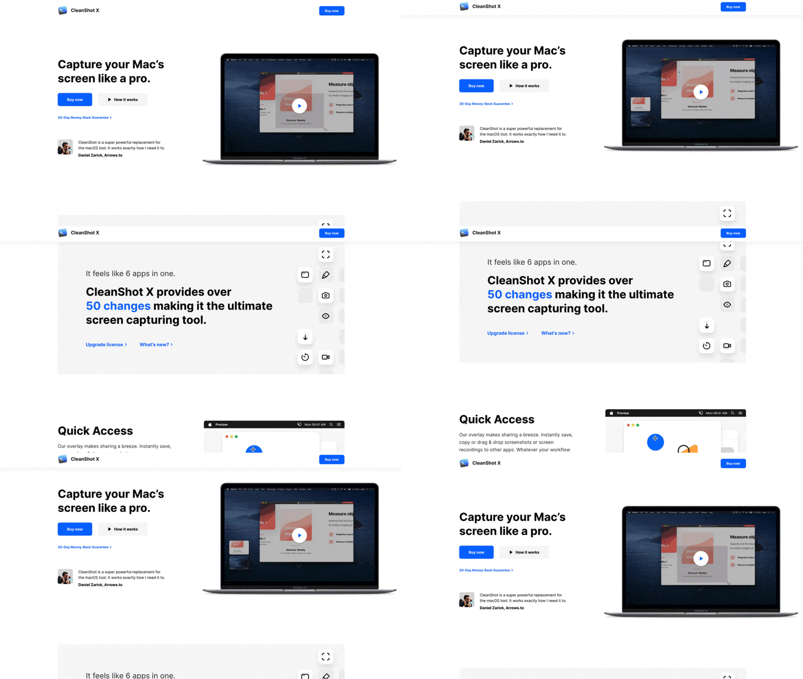
A sticky header can make it easier for visitors to navigate page sections and keeps that CTA button visible at all times.
Hot Tip #39 is to place copy before images on mobile.
Having a legible responsive design is great, but are you ordering your content for a seamless scrolling experience on mobile?
✅ Intro copy before main image
✅ Feature copy before demo image
Landing Page images without context are difficult to decipher:
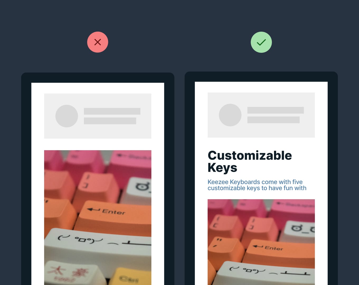
Flexbox order - A neat way to add context with only a few lines of additional code.
Hot Tip #46 is to remove obstacles in the way of demoing your product.
Carrd allows a full website build before asking for an email address.
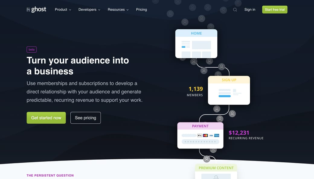
Hot Tip #68 is to add a hint to scroll.
Sometimes, I see long-scrolling Landing Pages with spacious content above the fold, but no indication there is more information further down.
Here are 4 solutions:
Add a subtle down arrow, positioned at the bottom of the introduction.
Add a Learn More CTA button that kicks off the page scroll.
Avoid a 100% window height introduction section, bringing the second section up.
Allow the hero elements to flow into the second section, suggesting storytelling.
The original Ghost Memberships Landing Page does point #4 really well:
Scroll Hint Inspiration - A collection of 150+ Landing Pages I've curated integrating scroll hints.
Hot Tip #69 is to make it accessible.
Providing people with health conditions or impairments, the ability to read and navigate your Landing Page easily is the right thing to do.
Here are five small tasks that can go a long way:
Create a clear :focus state like this - keep hitting tab on your keyboard and see what happens in your Landing Page.
Ensure your text color contrast isn't weak - this text against this background - has a decent AAA accessibility score of 8.99.
Increase your browser font size and see if your Landing Page layout breaks or anything become illegible.
Correctly assign and order semantic headings (H1, H2, H3) - disabling your stylesheet or using a screen reader will quickly surface issues with your hierarchy.
Describe all your non-decorative images using the alt tag - if an image is only there for graphic purpose you can let the screen reader skip it.
One hour tackling the above, could saves hundreds of frustrating hours for others.
The exercise will also strengthen your Landing Page by surfacing fundamental development issues.
Accessible Color Generator - Useful to find the nearest accessible-passing color based on your color inputs (that are failing).
Contrast for Mac - Great tool I've been using to to ensure my text color hierarchies are within Accessibility standards.
Focus Styles - Solid article by Eric Bailey covering :focus and :active CSS selectors.
Lighthouse - Instructions how to run an accessibility audit for your Landing Page in Google Chrome.
Screen Readers - A curated round-up by UsabilityGeek.
UserWay - A website accessibility solution for ADA & WCAG Compliance. Their widget sits in the corner of the browser where users can customize their browsing experience.
Hot Tip #74 is to steer clear of a header carousel aka header slider.
A Landing Page journey should always start with intro copy that the visitor identifies with.
Some will read it fast, some will read it slowly, and some will even read it a few times to fully grasp the offering. This copy is not meant to dance off the side of the page mid-sentence:

Carousels - Brad Frost goes into why carousals are a poor choice.
Hot Tip #77 is to implement smooth scroll in your long-scrolling Landing Page.
Clicking on a navigation pricing link and jumping to a Landing Page pricing section can feel like a fast page load to your visitor.
Implementing smooth scroll will gracefully transport them to the relevant section while reminding them about additional content. It can even prevent them from hitting the back button.

CSS Scroll Compatibility - How it ranks across all browser versions.
Smooth Scroll Inspiration - A collection of 2000+ Landing Pages I've curated featuring smooth scroll.
Hot Tip #78 is to define a clear visual hierarchy.
Step back from your Landing Page, squint your eyes, and take note of the content that appears most prominently. Is this prominent content more important?
A visual hierarchy orders content by significance and also suggests the order to follow. If all content was of equal size and weight, we wouldn’t know where to start. Naturally, we want our introduction headline text to be the most prominent as it’s where the visitor’s journey begins:
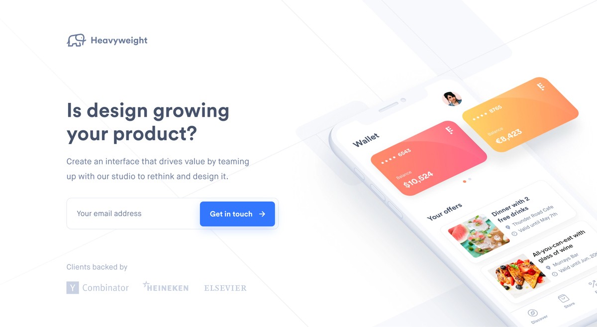
A visitor’s eyes are also trained to follow a Z-pattern:
1 - 2
3 - 4
Note how you probably followed a Z-pattern when looking at the above image:
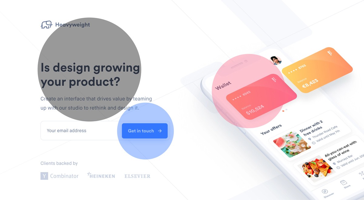
Visual Hierarchies Explained - Webflow published on visual hierarchies if you would like to learn more.
Hot Tip #87 is to focus on form UX.
The importance of good form usability is overlooked in Landing Pages. Fancy layouts with too many required fields will drop conversions.
✅ Arrange fields in one column
✅ Keep required fields to a minimum
✅ Position labels near the top-left of fields
✅ Tab in the correct order
Investing in a user-friendly form experience is worth every cent for your Landing Page.
Crazy Egg Form UI UX - Crazy Egg published a brilliant Form UI and UX visual guideline.