Providing people with health conditions or impairments, the ability to read and navigate your Landing Page easily is the right thing to do.
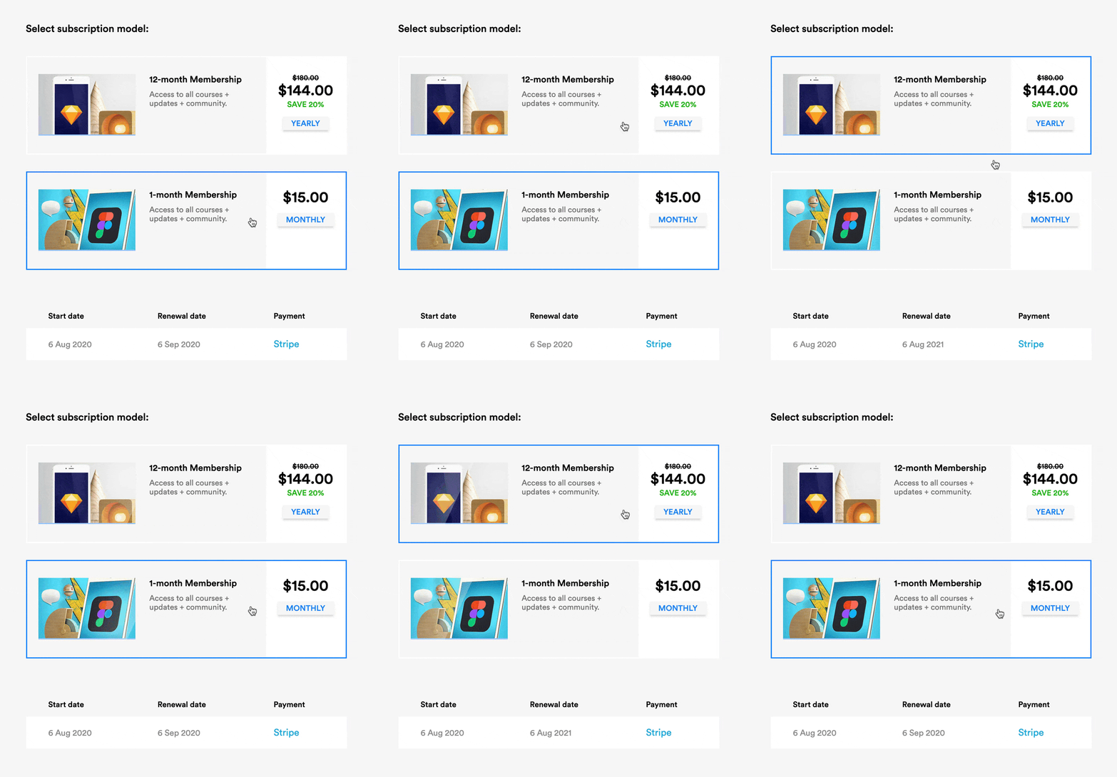
Create a clear :focus state like this - keep hitting tab on your keyboard and see what happens in your Landing Page.
Ensure your text color contrast isn't weak - this text against this background - has a decent AAA accessibility score of 8.99.
Increase your browser font size and see if your Landing Page layout breaks or anything become illegible.
Correctly assign and order semantic headings (H1, H2, H3) - disabling your stylesheet or using a screen reader will quickly surface issues with your hierarchy.
Describe all your non-decorative images using the alt tag - if an image is only there for graphic purpose you can let the screen reader skip it.
One hour tackling the above, could saves hundreds of frustrating hours for others.
The exercise will also strengthen your Landing Page by surfacing fundamental development issues.