You are browsing:

Decluttering Tips

Landing Page lessons related to simplifying and the decluttering the page.

Utilize customer testimonials

Hot Tip #01 is to utilize your customer testimonials by highlighting features and answering doubts.

So often I see Landing Pages packed with testimonials providing very little value to the visitor. Let's compare two testimonials. The first is by a customer, Gavin Jenkins:

"I’m a huge fan of the brand, so I’m glad I could finally sample their product."
Gavin Jenkins

Note how Gavin’s testimonial is generic, offering superficial information to the potential customer reading it. This second testimonial is also by a customer, Kim Davis — but note the difference:

"So glad I could finally experience their superb quality myself and I was quite impressed by the thoughtful packaging of such a delicate item."
Kim Davis

See how Kim’s testimonial highlighted a product feature while also answering a potential doubt? The feature being the build quality and the potential doubt being if postage would damage the item.

Round up all of your customer testimonials and select only the choice few adding value for your Landing Page visitor.

How to request testimonials - A three-step method to help generate great Landing Page testimonials from your customers.

Testimonial examples - A more specific collection I've put together of well-designed or interesting Testimonial examples in Landing Pages
Showcase testimonials from a similar demographic

Hot Tip #02 is to showcase testimonials from similar demographics to your potential customers.

If you are selling enterprise-level support software, it's wise to curate testimonials from customers who work for enterprise-sized businesses.

Put yourself in your Landing Page visitor's shoes and imagine the concerns of an enterprise customer. They'll be wary of moving a huge amount of staff over to new support software due to the high stakes involved.

They'll also want to know other enterprise businesses took this risk and made this transition successfully.

Using Hot Tip #01 as a guide, I’ve hand-picked this excellent testimonial by enterprise customer, Dave Lewis:

"Our team just loves how easy to use the software is and support response time improved by 22% in month one."
Dave Lewis

Glowing feedback, right? Now, let's take it a step further by highlighting who he works for alongside his name. In this case, Dave is the VP of Customer Relations at Starbucks, which adds significant weight to the testimonial as its backed by an enterprise-sized business:

"Our team just loves how easy to use the software is and support response time improved by 22% in month one."
Dave Lewis - Starbucks VP Customer Relations

Avataaars - Online avatar generator for when customer imagery isn't available or poor quality. Try not mix animated with real customer images. So choose a style for consistency.

Replace, don't add

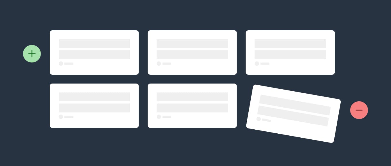
Hot Tip #08 is to replace old content when new content arrives.

Your Landing Page with 8 testimonials does not need a 9th. Kick out the weakest of the bunch.


Replace, don't add infographic
The 6 best examples of your wedding photography.

Your top 4 customer reviews.

The goal is to persuade your Landing Page visitor with as little as possible.

Set a single objective

Hot Tip #09 is to set a single objective.

An effective Landing Page should only have one objective, not many.

🚫 Sell our eBook + promote our job board

✅ Sell our eBook


Set a single objective infographic
The beauty of a Landing Page is the single canvas to persuade the visitor to do one thing.

Remove your main nav

Hot Tip #11 is to remove your main website navigation.

If your Landing Page sits within a bigger website, hiding your navigation will prevent a potential customer from wandering.

Your Landing Page has only one objective — sending visitors to another page is not it.

Avoid animation overkill

Hot Tip #21 is to avoid animation overkill.

Gratuitous scroll transitions no longer impress. Subtle animations are timeless and show intent.


Animation demo
Just because you can, doesn’t mean you should.

Use fewer fonts

Hot Tip #26 is to use fewer fonts.

Multiple typefaces, each with a number of weights, add unnecessary load time to a Landing Page.

Consider pairing your primary typeface with a native system font to keep it lean.

A fast-loading Landing Page with a more organized typeset is classy and considerate.

System Font Stack - Good breakdown with code snippets by Geoff Graham on CSS-Tricks.

Typewolf - My go-to for typography inspiration. Jeremiah Shoaf has done a fantastic job with the resource.

Typewolf Google Fonts - Quality curation by Typewolf with font previews and direct download links.

Curate your FAQs

Hot Tip #30 is to curate your FAQs.

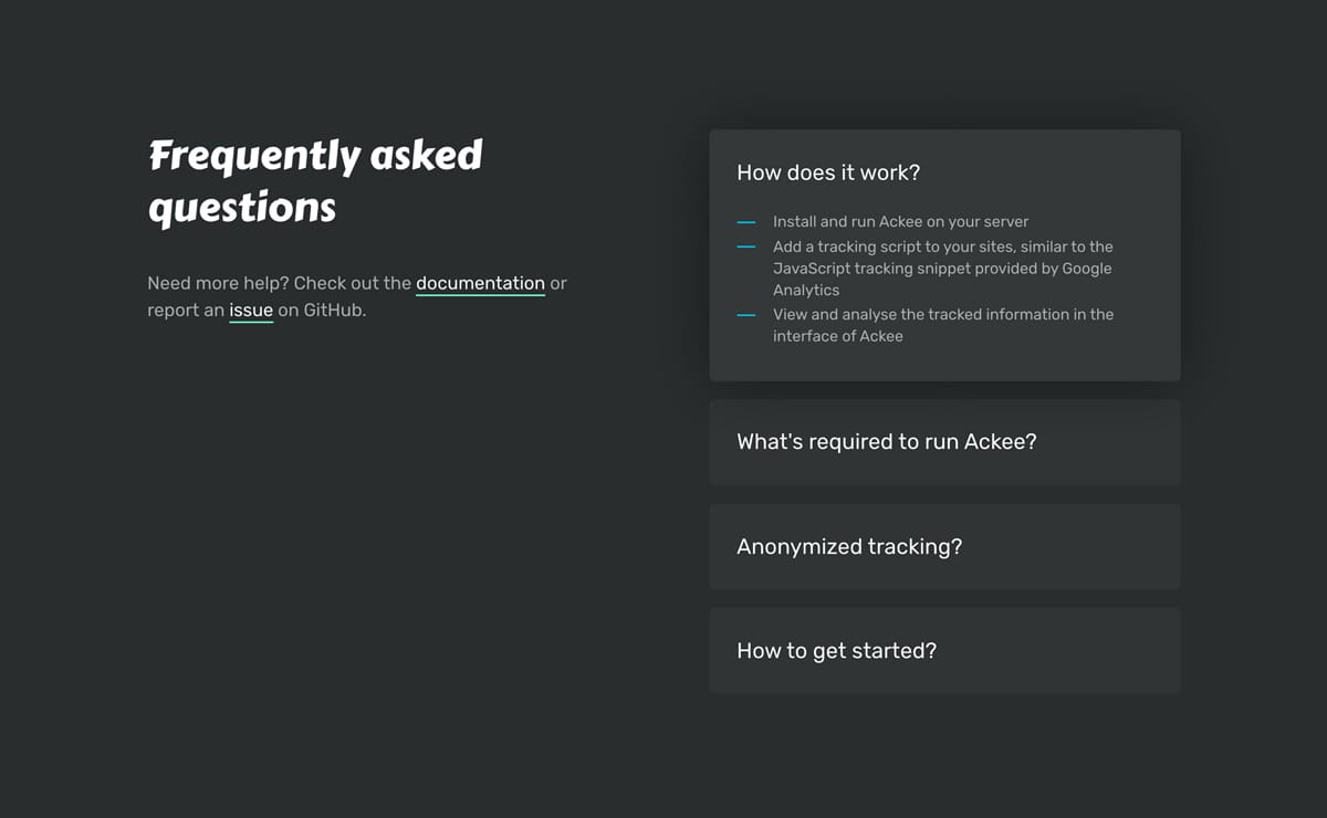
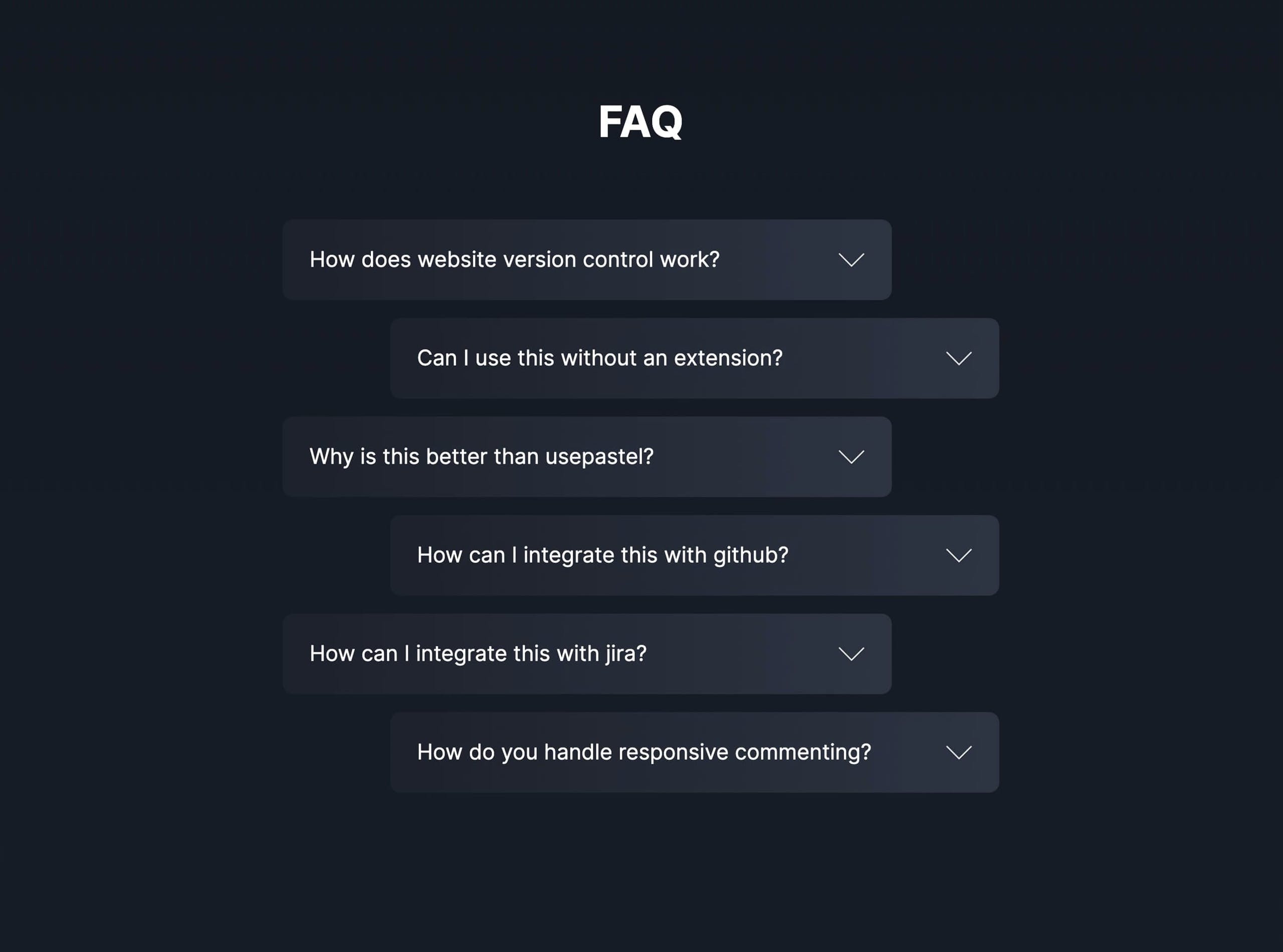
A list of unsorted FAQs is not helpful to your Landing Page visitor, who is presumably confused at this point in their journey.

✅ Frequently asked only
✅ Ordered by popularity


FAQ reference
Ackee

FAQ reference
Greenlight

Remember, your visitor is after pre-sale FAQs, so start by porting anything post-sale to your support page.

FAQ Examples - A more specific collection I've put together of well-designed or interesting FAQ sections in Landing Pages

FAQ Inspiration - A collection of 70+ Landing Pages I've curated featuring helpful FAQs near the bottom.

Deconstruct your About paragraph

Hot Tip #33 is to deconstruct your About paragraph.

I've seen so many Landing Pages trying to sound fancy like this:

🚫 Citrus Studio creates multi-faceted online business software using modern, cutting-edge technologies to help businesses stay on track and achieve their dreams.

1. Start by removing all unnecessary words and paring it down to your core offering:

✅ Citrus Studio builds goal-tracking software.

2. Then add a single impactful adjective to spice it up:

✅ Citrus Studio builds effective goal-tracking software.

---

Your Landing Page visitor cannot be persuaded to take action if they don't understand what your service does.

"Perfection is not when there is no more to add, but no more to take away." ~ Antoine de Saint-Exupéry

Code your own social share buttons

Hot Tip #41 is to code your own social share buttons.

Embedding a crowd of social share buttons adds unnecessary requests to your Landing Page load.

I'd vote for removing them completely. If you must have them, consider hard-coding the buttons with fun pre-composed text.

Mamma mia! This free set of restaurant icons by @iconfinder is deeelicious 🍕

Share Link Creator - My go-to-tool for populating social share links in my Landing Pages. I used this tool for the links below this. Kick off the Tweet link to see it in action.

Minimize the options

Hot Tip #58 is to minimize the options.

Do you really need:

📊 5 different pricing plans?
📝 7 required fields in your enquiry form?
🎨 16 different product color choices?

"The time it takes to make a decision increases with the number and complexity of choices." - Hicks Law

Hicks Law - Beautifully illustrated representation on Laws of UX

Delay the chatbot

Hot Tip #64 is to delay your chatbot.

If you feel your Landing Page benefits from one, only kick that bugger off once your visitor has scrolled to the pricing table, FAQs, or footer.

A corner chat notification on arrival wrecks concentration, and we can't afford to distract visitors while they decipher what we do.

Seek hero images with negative space

Hot Tip #67 is to seek for background images featuring negative space.

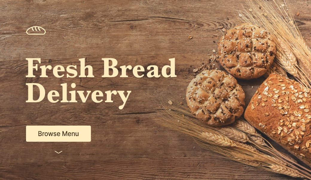
Negative space refers to the area of an image surrounding the main subject or object. This can be intentionally shot and cropped to provide a beautiful canvas for your copy — helping prevent overlapping elements:


Negative space reference
If you know your way around Photoshop, start by expanding your hero image canvas to the left or right. Then fill the newly created blank space using the Content-Aware fill option. It’s honestly magic.

Stocksy - My favorite premium resource for stock images. If you only need a single authentic image for your Landing Page, seriously consider starting here.

Unsplash - High quality, well curated free stock images.

Whitespace Inspiration - A collection of 1000+ Landing Pages I've curated featuring healthy whitespace.

Remove inactive social media accounts

Hot Tip #79 is to remove inactive social media accounts.

Launching your Landing Page with social media icons linking to new profiles with low followers is perfectly fine.

Linking to social accounts last updated 3 years ago gives the impression the product or service is either poorly supported or even abandoned.

This tip is particularly important for subscription pricing Landing Pages, where the potential customer is in a deeper research phase before the big commitment.