You are browsing:

Design Tips

Landing Page lessons related to the overall page design. When you are further with your design, kick off the Landing Page Design Checklist.

Fewer images, better images

Hot Tip #03 is to use fewer images but also better images.

Good imagery builds trust, and trust is the foundation for conversions. When it comes to your visuals — spend the money!
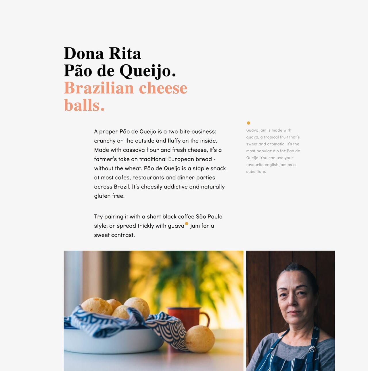

Dona Rita website
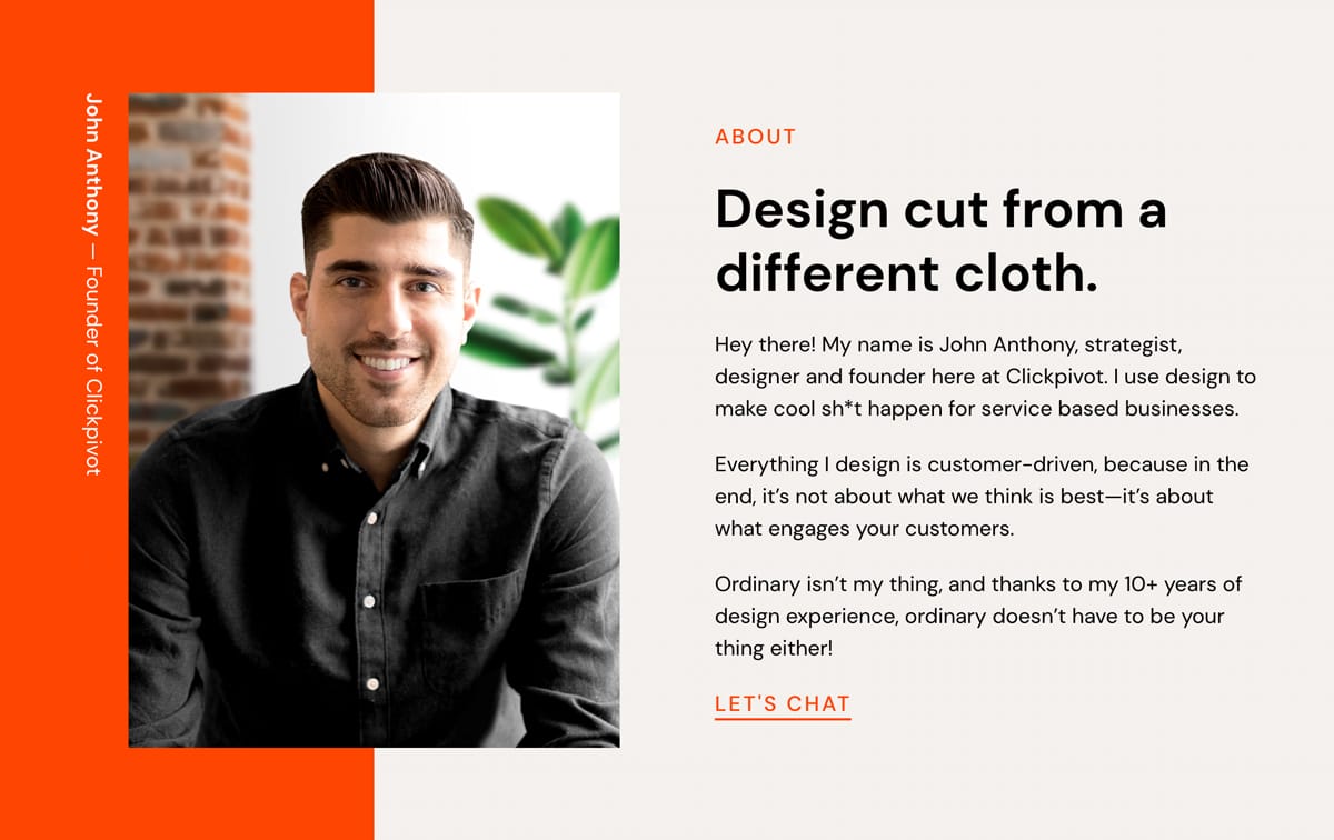
Dona Rita

Logoswift website
Logoswift

Invest in a photoshoot of your team, your product, your food. The ROI on a professional photoshoot is pretty much guaranteed.

ImageOptim - My go-to for image size optimization for JPG, GIF, PNG and SVG.

IMGIX - Image CDN's are a bit excessive in most Landing Pages but I use IMGIX for my full network of sites. The real benefit is you can upload a big image once, then manipulate (size, compression) the output using only code. I cannot recommend it enough and I do use it for Landing Pages within my bigger sites.

Noun Project Photos - Just launched so a good resource of less-used, quality stock imagery. Pricing is around $33/image for commercial use.

Optimage - An alternative image size optimization tool by Vlad Danilov. Conveniently optimizes MP4 too.

Pexels - Both good free stock image alternatives if a search term isn't winning on Unsplash. Both include stock video too.

Pixabay - Both good free stock image alternatives if a search term isn't winning on Unsplash. Both include stock video too.

Squareshot - Service to send your physical product and they'll send back top quality photos of it for your Landing Page.

Stocksy - My favorite premium resource for stock images. If you only need a single authentic image for your Landing Page, seriously consider starting here.

Team Section Inspiration - A collection I put together with 20+ team sections in Landing Pages.

Unsplash - High quality, well curated free stock images.
When in doubt, double the padding

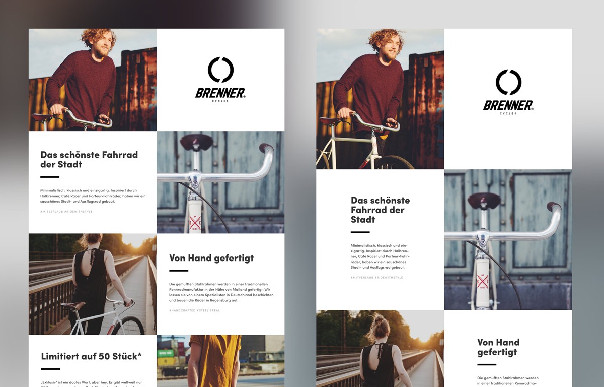
Hot Tip #05 is when in doubt, double the padding.

Whitespace isn’t just breathing room for your content, it’s breathing room for your potential customer.

Digestible content improves focus and clarifies what you’re offering.


Whitespace reference
Brenner Cycles

If your Landing Page feels overwhelming, double the padding and I think you’ll be pleasantly surprised.

Whitespace Inspiration - A collection of 1000+ Landing Pages I've curated featuring healthy whitespace.

Avoid center-aligned or justified paragraphs

Hot Tip #07 is to avoid center-aligned or justified paragraph text.

When applied to long paragraphs, these two alignments can be difficult to read. This can result in fatigue while browsing Landing Pages with a lot of content.

Let Neil deGrasse Tyson take us through it:

---

🚫 Center-aligned

We think scientific literacy flows out of how many science facts can you recite rather than how was your brain wired for thinking. And it's the brain wiring that I'm more interested in rather than the facts that come out of the curriculum or the lesson plan that's been proposed.

✅ Left-aligned

We think scientific literacy flows out of how many science facts can you recite rather than how was your brain wired for thinking. And it's the brain wiring that I'm more interested in rather than the facts that come out of the curriculum or the lesson plan that's been proposed.

---

🚫 Justified

You have people who believe they are scientifically literate but, in fact, are not. And I don't mind if you're not scientifically literate, but just admit that to yourself, so that you'll know, and perhaps you can take a first step to try to eradicate that. You have people who believe they are scientifically literate but, in fact, are not. And I don't mind if you're not scientifically literate, but just admit that to yourself, so that you'll know, and perhaps you can take a first step to try to eradicate that.

✅ Left-aligned

You have people who believe they are scientifically literate but, in fact, are not. And I don't mind if you're not scientifically literate, but just admit that to yourself, so that you'll know, and perhaps you can take a first step to try to eradicate that. You have people who believe they are scientifically literate but, in fact, are not. And I don't mind if you're not scientifically literate, but just admit that to yourself, so that you'll know, and perhaps you can take a first step to try to eradicate that.

---

A good rule-of-thumb is that any paragraph with more than two lines should be left- or right-aligned.

Rags-widows-orphans - Kinda inappropriate naming but a good read on certain paragraph shapes and styles to avoid.

Create a text color hierarchy

Hot Tip #10 is to create a text color hierarchy.

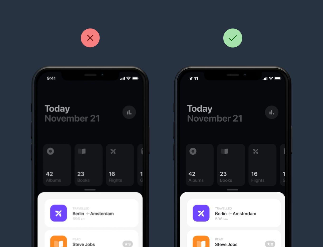
The biggest tell a Landing Page was built by someone with little design experience is black text with maximum contrast on a white background:


Maximum contrast example
Soften the blow with an off-white background and a subtle grey/color text hierarchy:

Subtle contrast example
Some time spent here goes a long way towards creating a more pleasurable reading experience for your visitor.

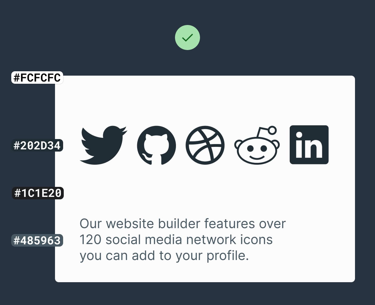
Accessible Color Generator - Useful to find the nearest accessible-passing color based on your color inputs (that are failing).

Contrast for Mac - Great tool I've been using to to ensure my text color hierarchies are within Accessibility standards.

Highlight USP among feature list/grid

Hot Tip #13 is to highlight your Unique Selling Proposition (USP) among your features.

A grid/list of 12 features can be overwhelming for a visitor who is learning about your product/service for the first time.

Begin with your highlighted USPs:


Highlighted Feature Demo
Emphasize the benefits of choosing you over the competition.

Set a max-width typography (CPL)

Hot Tip #19 is to set a max-width for your typography.

100% width paragraphs are very difficult to read on bigger resolutions.

Typography optimization can get very technical but try aim for 55–100 characters per line (CPL). The Landing Page Hot Tips email drip has ~60 CPL. Real easy to digest. This this Ebook is ~75.

Characters Per Line - Excellent article on fine-tuning typography based on characters per line.

GRT Calculator - The Golden Ratio Typography (GRT) calculator helps perfect typography for your Landing Page by entering your current font, font size, and content width.

Consider a color scheme

Hot Tip #22 is to consider a color scheme.

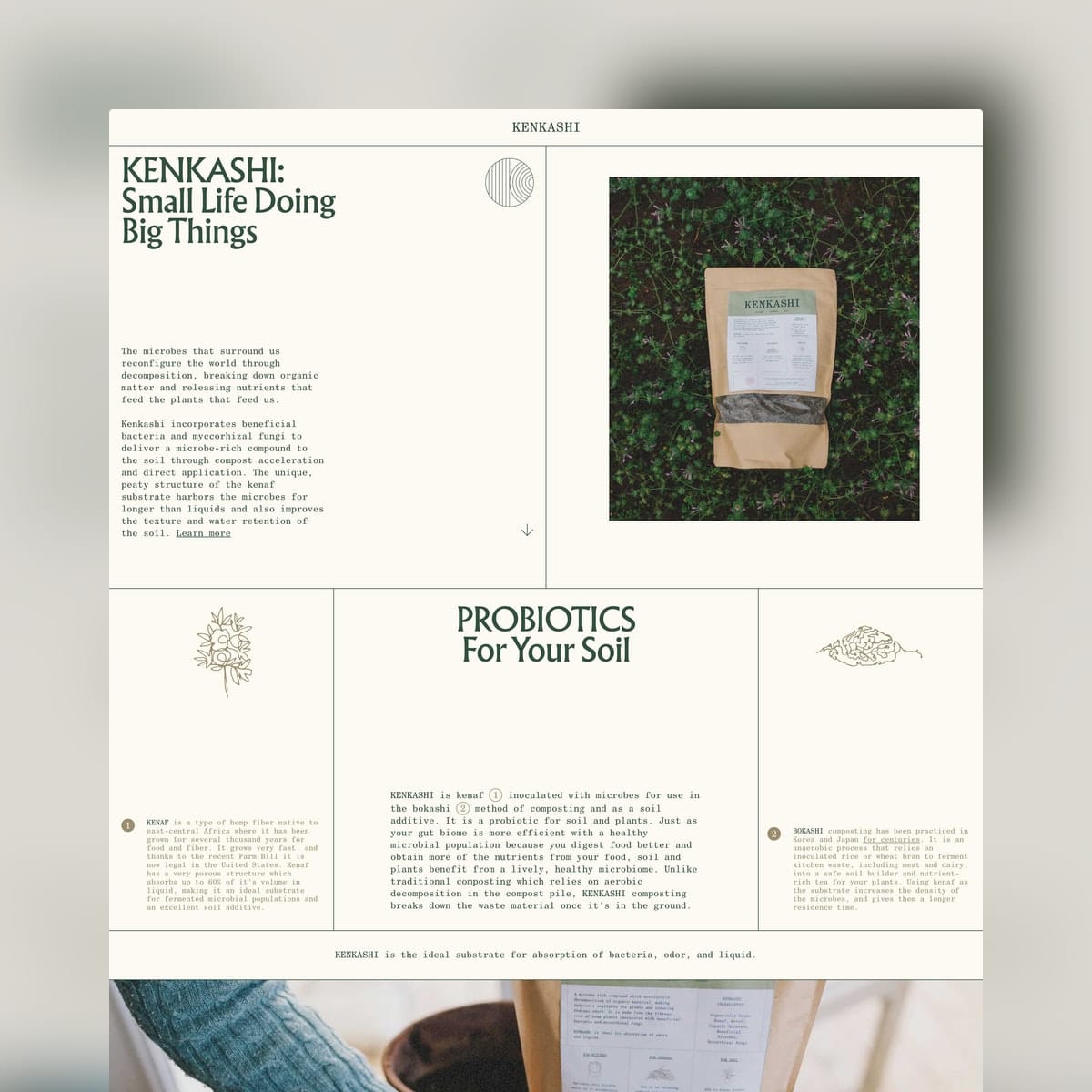
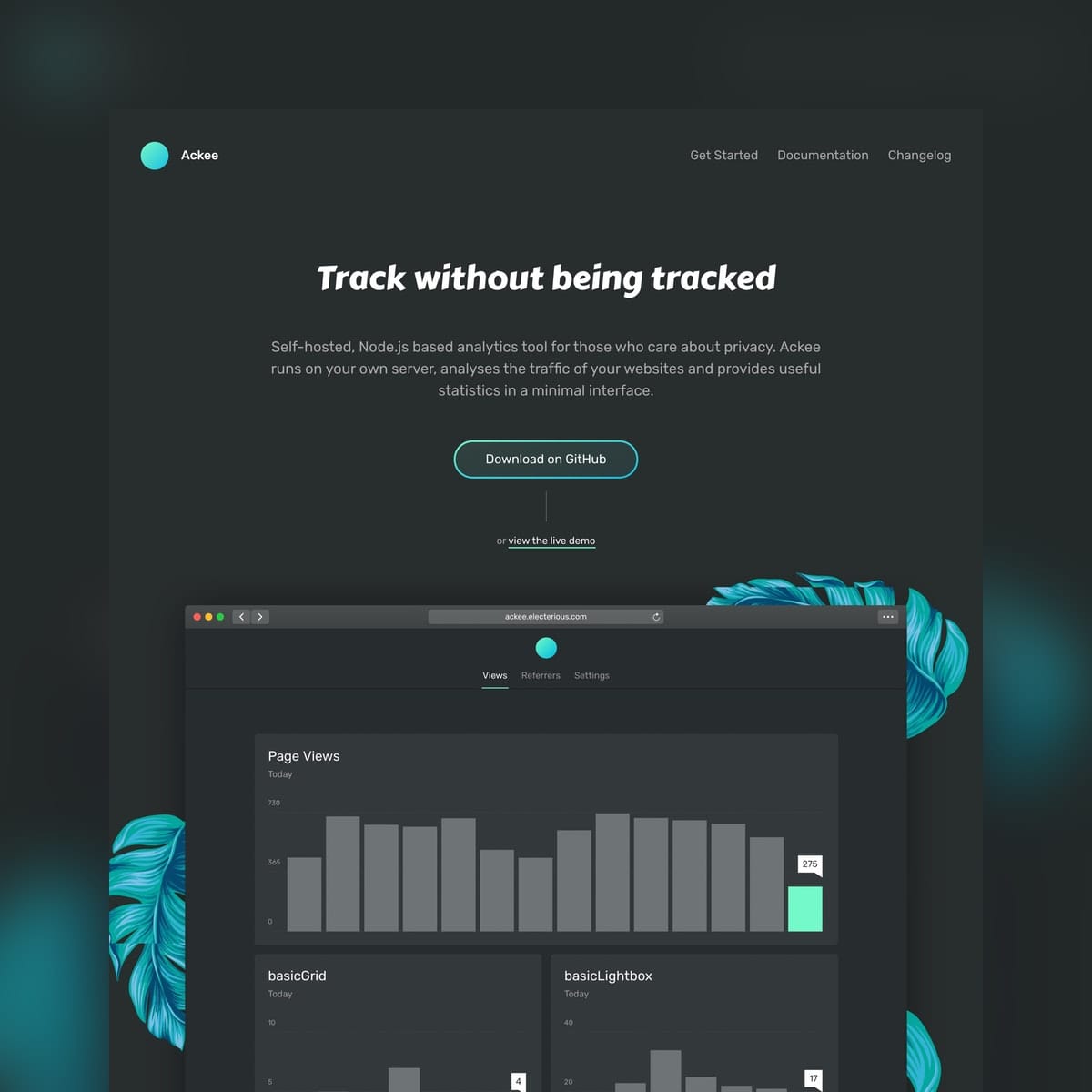
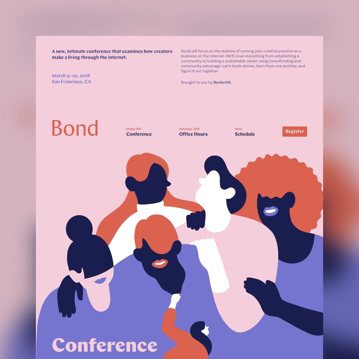
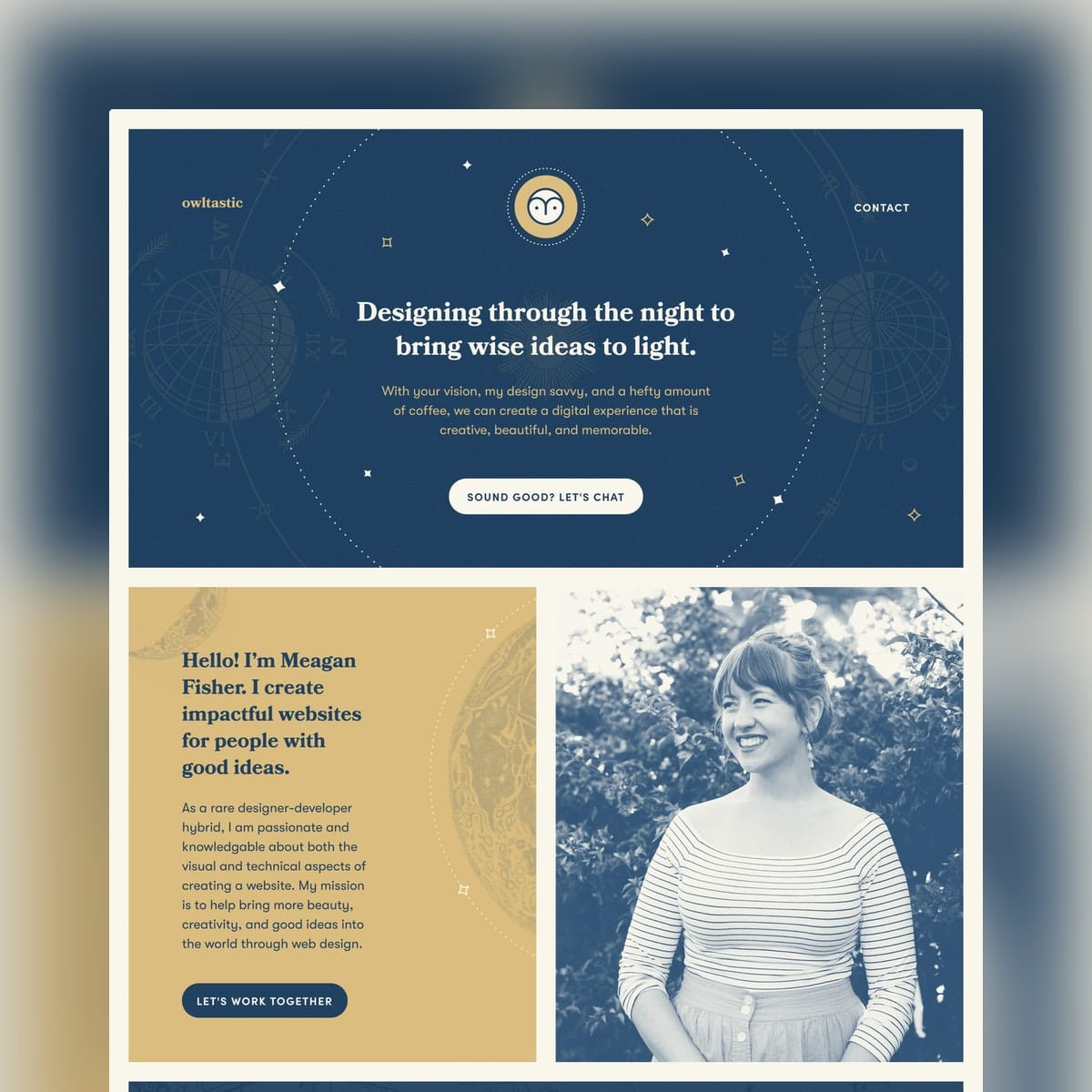
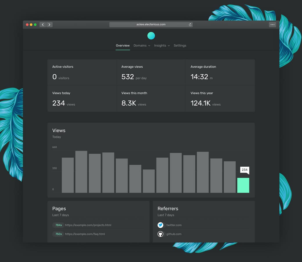
A carefully crafted Landing Page color scheme stands out and takes effort. An effort your visitor will assume carries over to your event, product, or service.


Color Scheme reference
Kenkashi

Color Scheme reference
Ackee

Color Scheme reference
Bond

Color Scheme reference
Owltastic

Color Scheme Inspiration - A collection of 700+ Landing Pages I've curated featuring colorful schemes.

Space using ratios

Hot Tip #28 is to space using ratios.

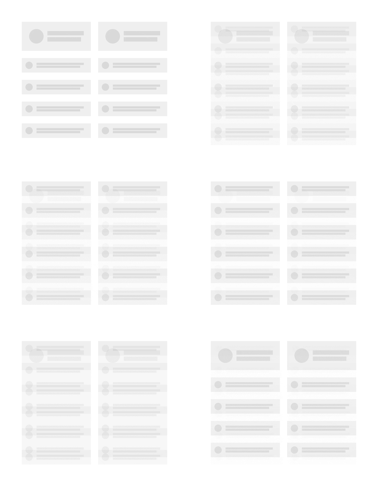
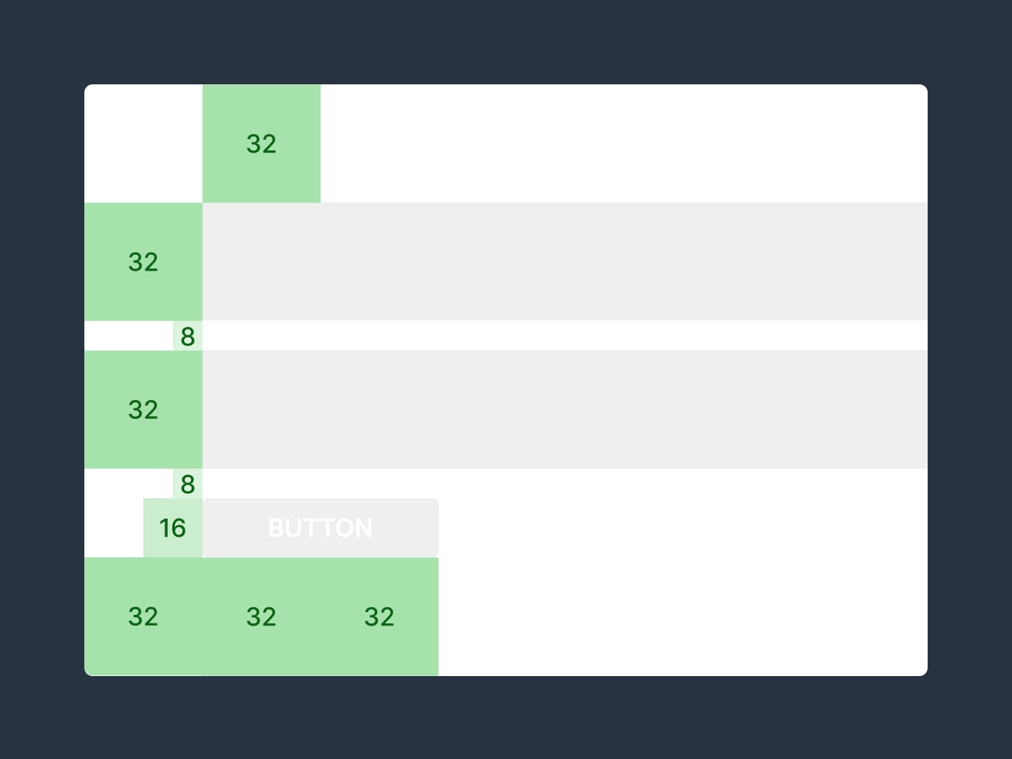
For example, set a base size of 8px, then define your padding using multiples of 8:

Tiny gaps = 8px
Small gaps = 16px
Medium gaps = 32px
Big gaps = 64px


Ratio infographic
Using ratios aligns your content better and tightens up Landing Page design.

8pt Grid System - Very good visual breakdown by Elliot Dahl of the benefits an 8pt system give a design. Includes 8px ratio infographics.

Add personality

Hot Tip #29 is to add personality.

👩‍🎤 A portrait of the person who developed the service.
📑 The desk where these posters were illustrated.
✍️ Even adding a subtle animation of your signature.


Signature demo
People want to support people, and these little touches give visitors a glimpse of the human behind the Landing Page.

Fiverr Signatures - Get an animation of your signature commissioned for $5.

Sign Your Work - Little 2014 nugget blog post by Seth Godin.

Align with a grid

Hot Tip #36 is to align with a grid.

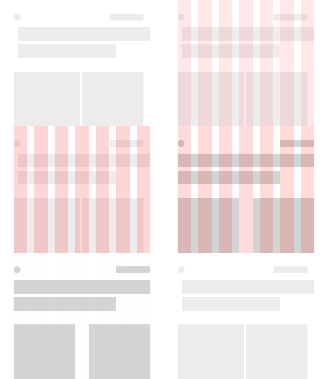
Layout grids keep your Landing Page tidy by positioning within constraints.


Grid demo

1200px - The original grid systems we all used to reference.

8pt Grid System - Very good visual breakdown by Elliot Dahl of the benefits an 8pt system give a design. Includes 8px ratio infographics.

960px - The original grid systems we all used to reference.

CSS Grid Layout Guide - The most powerful layout system available in CSS. A comprehensive breakdown by CSS-Tricks.

History of grids - The brief evolution on Wikipedia.

Material columns-gutters-and-margins - Google's Material Design initiative does a great job of explaining the differences between columns, gutters, and margins.

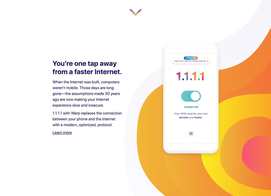
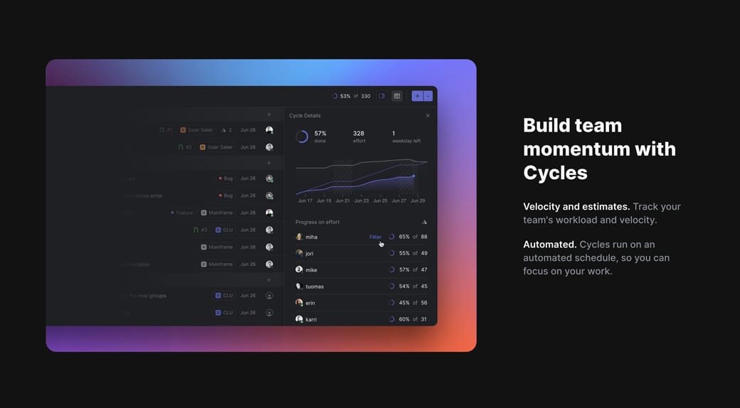
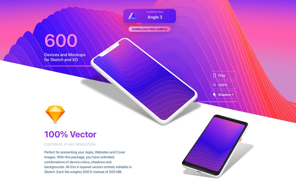
Add a splash of color

Hot Tip #37 is to add a splash of color.

A burst on a Landing Page can command attention and add excitement.


Color splash reference
1.1.1.1

Color splash reference
Linear

Color splash reference
Angle

And when excited, we tend to try new things.

BGJar - Free online tool to create colorful SVG blobs.

Color Scheme Inspiration - A collection of 700+ Landing Pages I've curated featuring colorful schemes.

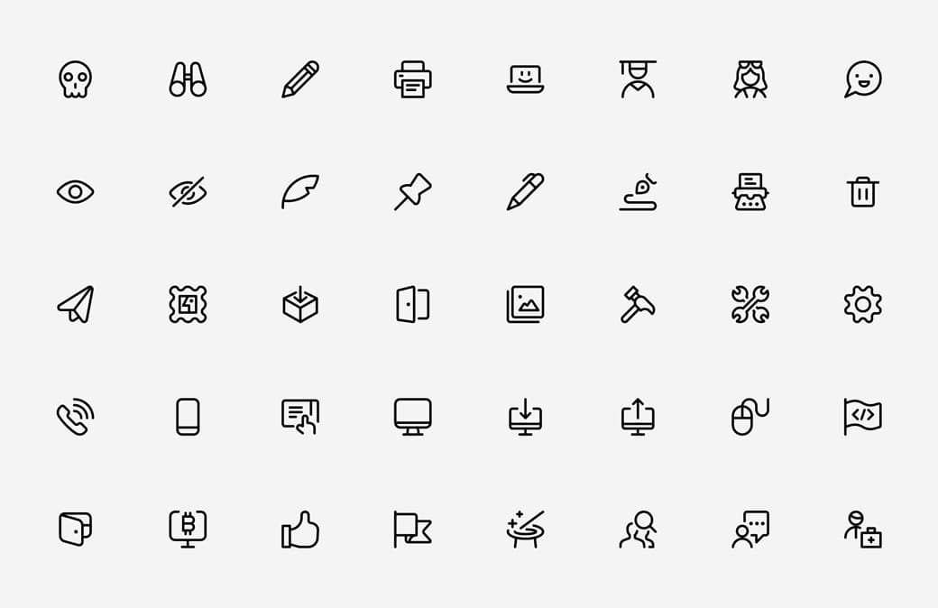
Invest in an icon library

Hot Tip #38 is to invest in an icon library.

Having a go-to icon pack can speed up Landing Page development and keep the aesthetic consistent.


Streamline Icons

Font Awesome - Another quality library. I backed them on Kickstarter in 2017 and still using the odd icon. The site UI is very impressive and continuously being worked on.

Iconinder - Solid resource for finding and icon style you like first, then purchasing. Lots of free ones in sets in here too.

Streamline Icons - My personal favorite (pictured above). Owner Vincent and his team have spent a zillion hours putting together this comprehensive 30,000+ resource with 3 weights.

Tighten your big type

Hot Tip #44 is to tighten your big typography.

Font Kerning and Tracking is a tricky subject as not all typefaces need it. That said, it’s a good idea to experiment with your bigger fonts.

Kerning is adjusting the space between 2 letters in a word. Tracking is adjusting the space between all the letters in the word.

Here is a Font Tracking example:


Tracking demo
Reducing the spacing between characters in your big intro copy can really tighten your Landing Page design.

Kerning Tips - An older but solid piece by Rebecca Creger with 10 kerning tips for improving your typography.

Leading Kerning Tracking - Decent article on Creative Market showcasing the differences between Leading, Kerning and Tracking.

Don't neglect Retina optimization

Hot Tip #45 is don’t neglect Retina optimization.

Simply put, Retina Displays have higher density pixels, needing a bigger version of the imagery to appear crisp.


Retina comparison
Haptic

Retina comparison
Clear infographics and crisp app screenshots leave a wonderful first impression, especially if your target market is designers.

BGJar - Free online tool to create colorful SVG blobs.

ImageOptim - My go-to for image size optimization for JPG, GIF, PNG and SVG.

Responsive Images - Developer Eric Portis details exactly how to deliver @2x images on Retina screens.

Keep brand capitalization consistent

Hot Tip #48 is to keep brand capitalization consistent.

Landing Pages with different case variations of the brand name look unprofessional and can be confusing.

✅ Starbucks
🚫 Star Bucks
🚫 starbucks
🚫 StarBucks
🚫 STARBUCKS

Avoid ALL CAPS if you can. And once you've chosen a case style, stick with it to ensure it's consistent throughout your Landing Page.

Keep vertical spacing even

Hot Tip #49 is to keep vertical spacing even.

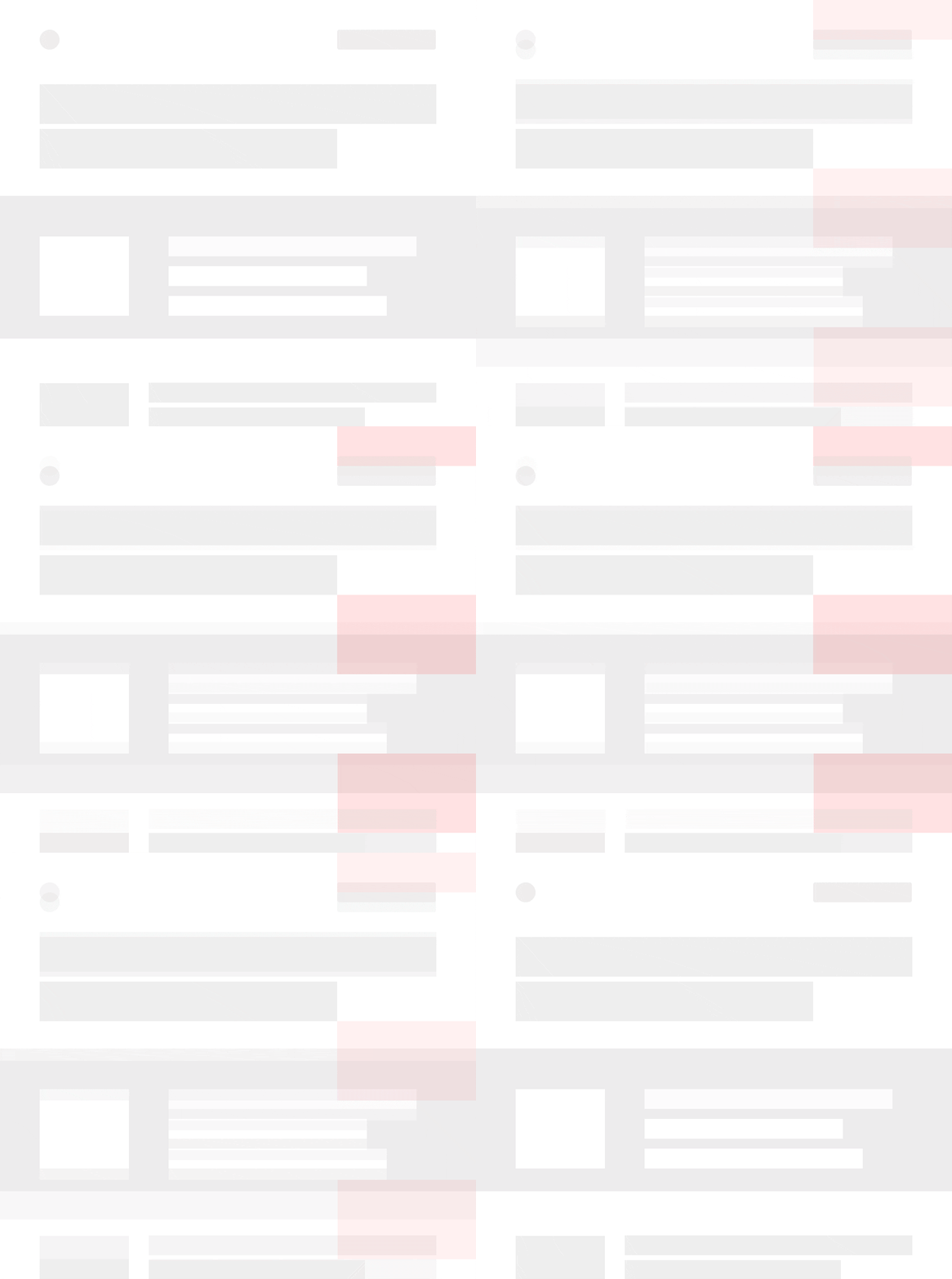
The vertical padding between your Landing Page section dividers is often overlooked:


Vertical Spacing Demo
A simple yet consistent spacing rule, applied throughout the long-scrolling page, can really tighten up the design.

Consider dark mode

Hot Tip #54 is to consider dark mode.

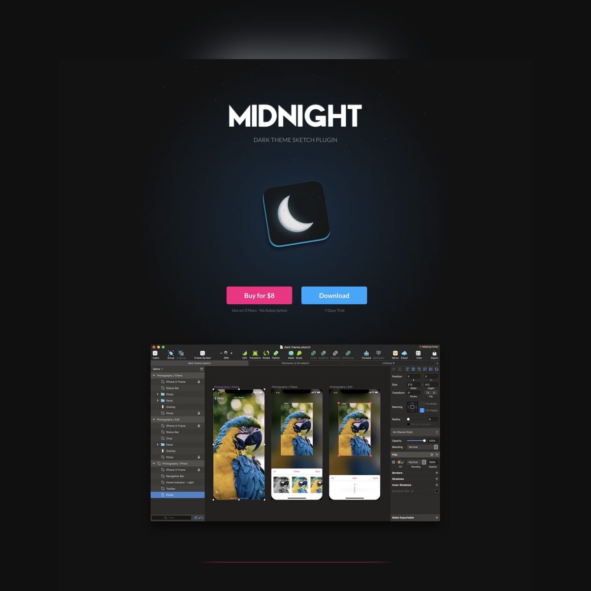
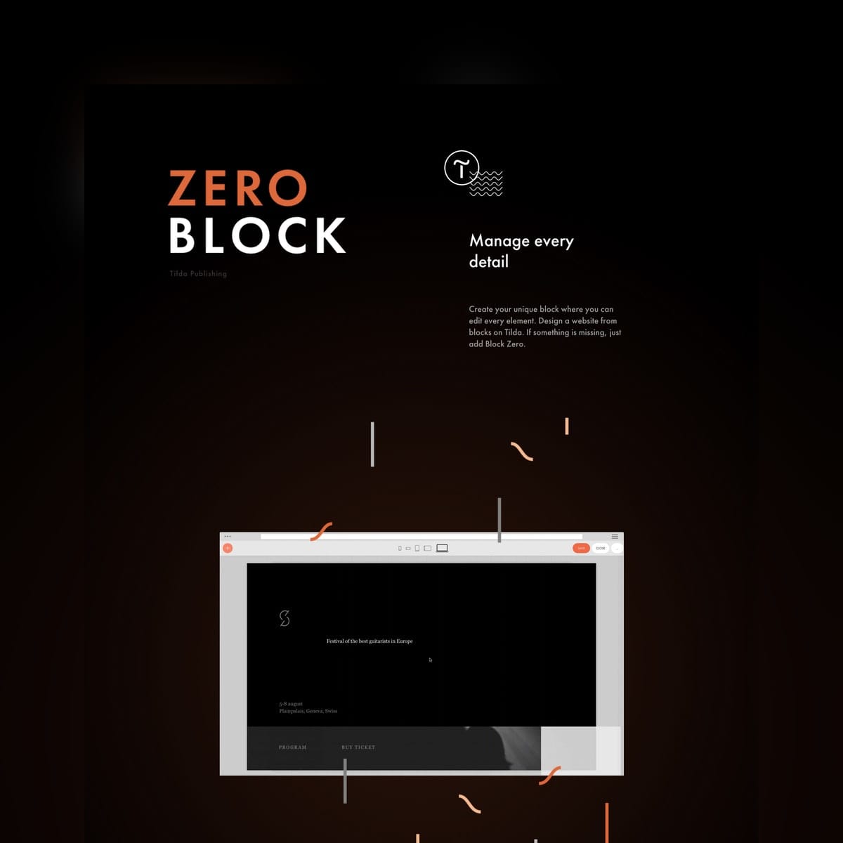
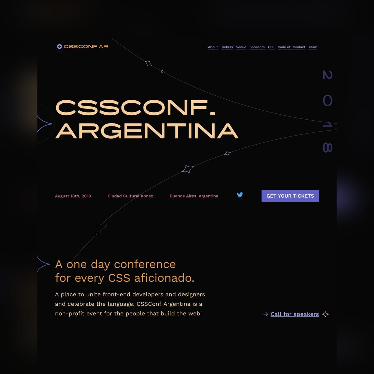
There is something remarkable about a Landing Page with a strong, dark color scheme.


Dark color scheme reference
Midnight

Dark color scheme reference
Tilda Zero Block

Dark color scheme reference
Play

Dark color scheme reference
CSSConf Argentina 2018

If your design feels conventional, why not dabble with a dark color scheme for 30 minutes to see how it feels.

Dark Scheme Inspiration - A collection of 25 Landing Pages I've curated featuring beautifully crafted dark color schemes.

Increase the contrast of your button text

Hot Tip #56 is to increase the contrast of your CTA button text.

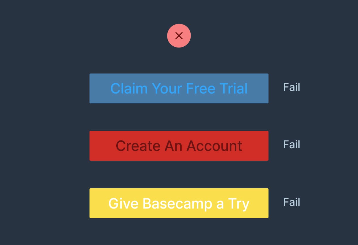
A common design mistake by beginners is keeping the global link color the same throughout Landing Page elements.

This can lead to low contrast CTA buttons:


Button contrast reference
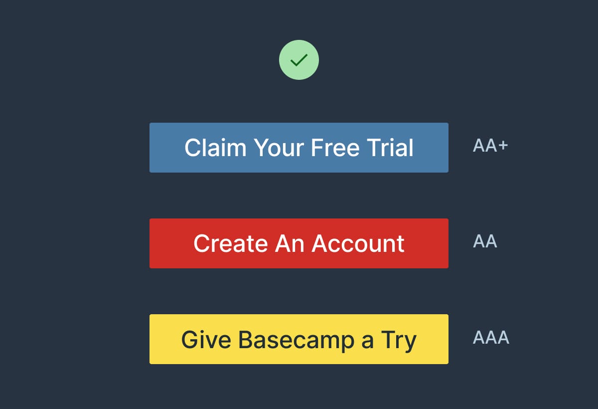
By integrating a text color that’s highly contrasted against the button background, you can create striking CTA buttons:

Button contrast reference

Contrast for Mac - Great tool I've been using to to ensure my text color hierarchies are within Accessibility standards.

Try font smoothing

Hot Tip #59 is to consider font smoothing.

Simply put, adding the CSS font-smooth property to a font will trim it down very slightly.

While this effect won't look great on all of your Landing Page typography, it's particularly effective on 'chunky' fonts.

When applied correctly, it can really help polish your typography.

CSS Font Smooth - Property guide by Mozilla.

Font Smoothing Explained - This 11-year-old piece by Krzysztof Szafranek is still the best explanation of font smoothing I've read.

Liven with illustrations

Hot Tip #60 is to liven with illustrations.

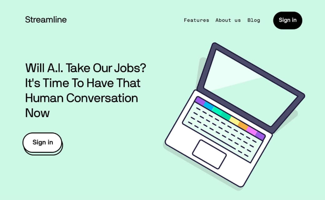
Illustrated characters, devices, and elements can really bring a Landing Page to life:


Illustration reference
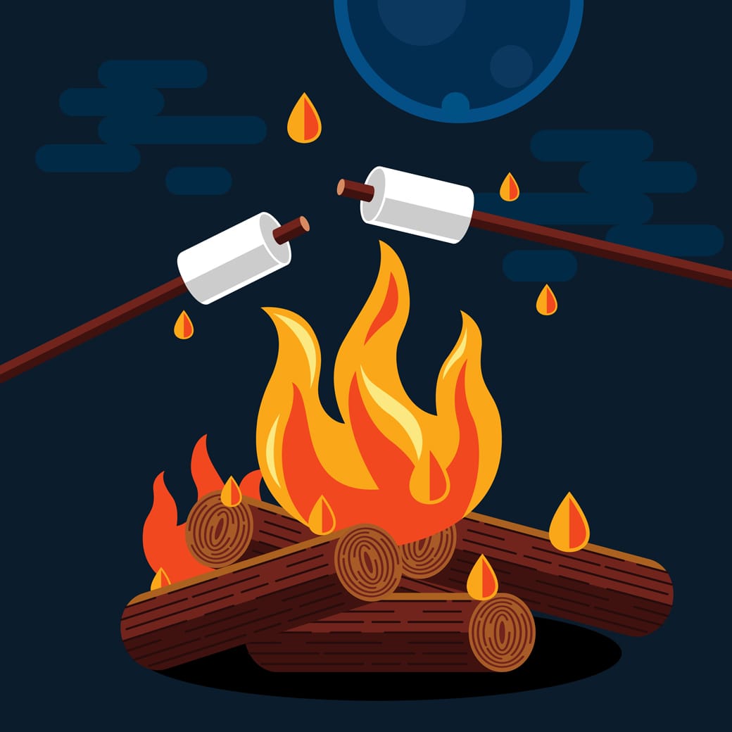
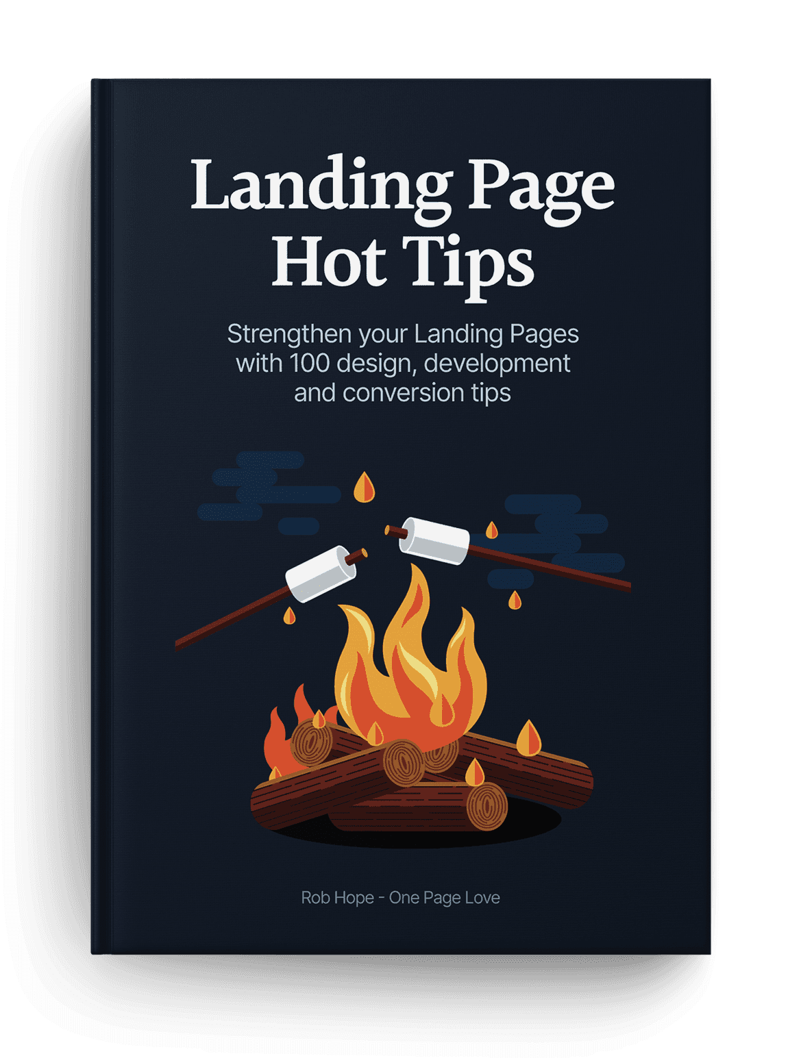
I was going to keep this is a secret but the commercial license for the Hot Tips Ebook fire illustration was $4 on Creative Market. It completely changed the way the product looks and feels within the Landing Page:

Illustration reference
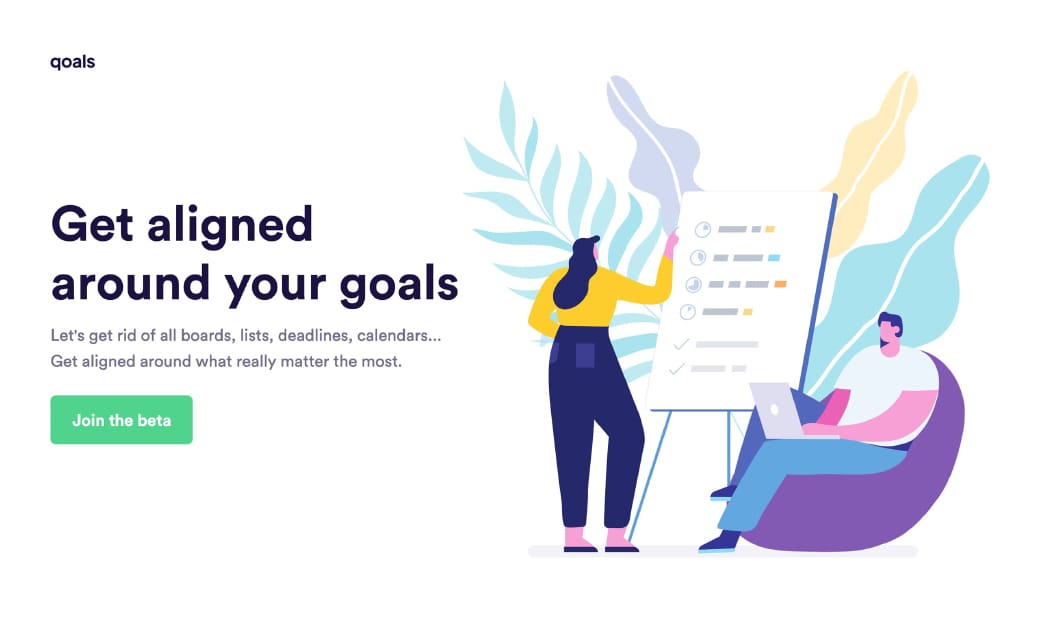
Character illustrations are currently on-trend in SaaS Landing Pages. I’d argue they are becoming generic but definitely still work to brighten a stale page:

Illustration reference
Qoals

If you have the budget, aim to commission custom illustrations from a designer. If not, these resources are a good place to start:

Blush - Online tool to create, mix, and customize illustrations made by artists around the world.

Humaaans - Free library to mix and match illustrations of people. Made for Sketch, Figma, InVision Studio and Adobe XD.

Illustration Inspiration - A collection of 1500+ Landing Pages I've curated featuring a mix of illustrations.

Streamline UX - Vincent and his team have launched an illustration tier to their icon library.

Undraw - Royalty-free illustration resource by Katerina Limpitsouni.

Add a radial burst behind product imagery

Hot Tip #63 is to add a radial burst behind your product imagery.

With only a few additional lines of CSS code, you can add another dimension to your Landing Page design.

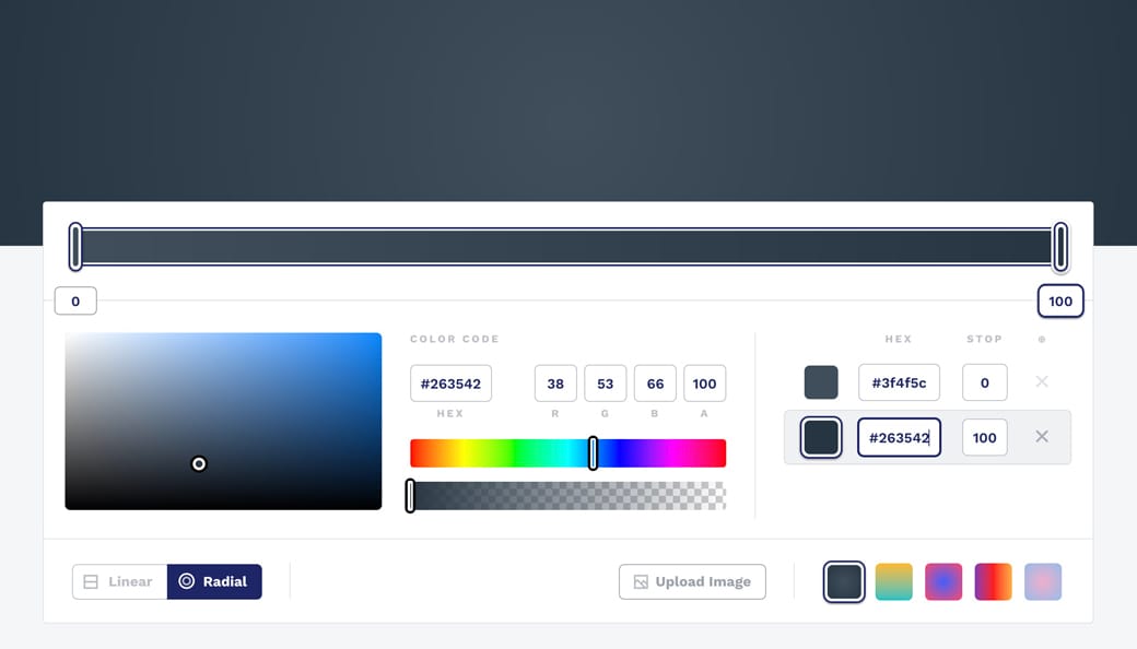
The CSS Gradient tool can help generate the code for you online:


CSS Gradient Tool
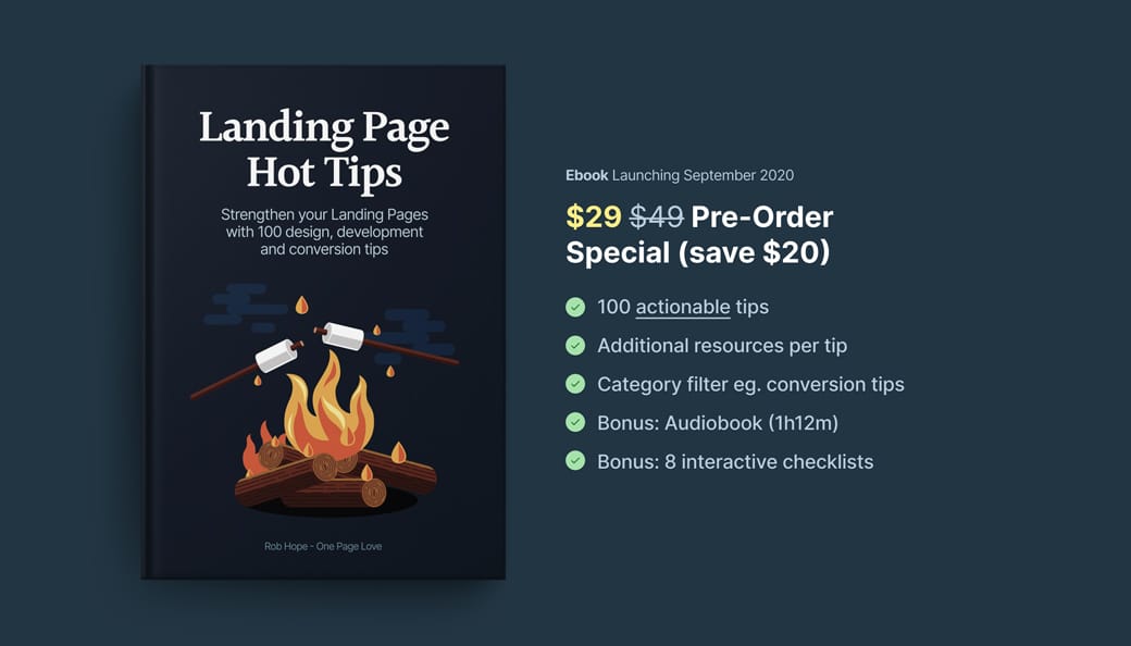
Here is the Hot Tip (Pre-Sale) Landing Page without a radial burst:

No Radial Burst
Here is the Landing Page with a radial burst:

Description
With the addition of a drop-shadow on the image, a background radial burst can really add depth to the design, bringing your product imagery to life.

CSS Gradient - Wonderful tool I use to generate all my gradient code for Landing Pages. Here is a 1-minute video walkthrough.

CSS Gradient Walkthrough - Wonderful tool I use to generate all my gradient code for Landing Pages. Here is a 1-minute video walkthrough.

Gradient Inspiration - A collection of 100+ Landing Pages I've curated featuring colorful gradients.

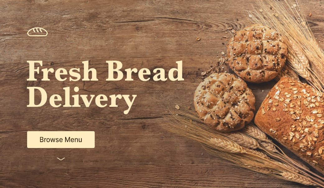
Seek hero images with negative space

Hot Tip #67 is to seek for background images featuring negative space.

Negative space refers to the area of an image surrounding the main subject or object. This can be intentionally shot and cropped to provide a beautiful canvas for your copy — helping prevent overlapping elements:


Negative space reference
If you know your way around Photoshop, start by expanding your hero image canvas to the left or right. Then fill the newly created blank space using the Content-Aware fill option. It’s honestly magic.

Stocksy - My favorite premium resource for stock images. If you only need a single authentic image for your Landing Page, seriously consider starting here.

Unsplash - High quality, well curated free stock images.
Whitespace Inspiration - A collection of 1000+ Landing Pages I've curated featuring healthy whitespace.

Define a visual hierarchy

Hot Tip #78 is to define a clear visual hierarchy.

Step back from your Landing Page, squint your eyes, and take note of the content that appears most prominently. Is this prominent content more important?

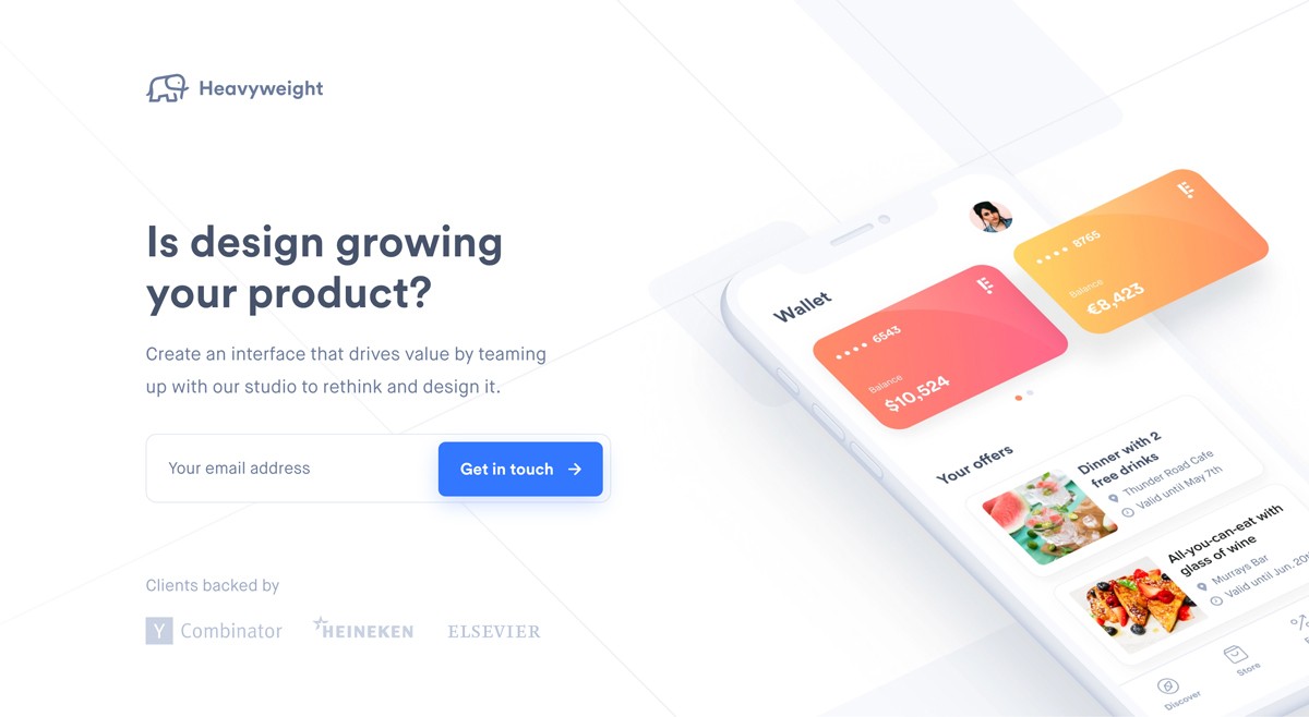
A visual hierarchy orders content by significance and also suggests the order to follow. If all content was of equal size and weight, we wouldn’t know where to start. Naturally, we want our introduction headline text to be the most prominent as it’s where the visitor’s journey begins:


Visual hierarchy demo
Heavyweight

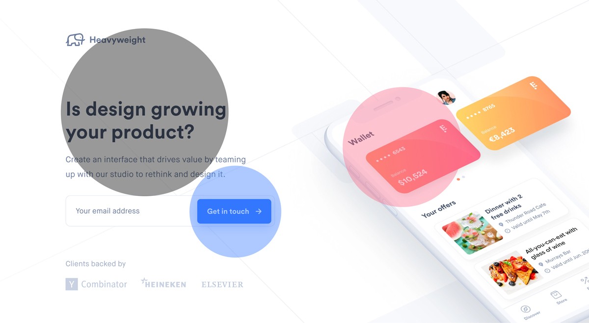
A visitor’s eyes are also trained to follow a Z-pattern:

1 - 2

3 - 4

Note how you probably followed a Z-pattern when looking at the above image:


Visual hierarchy demo
A good rule-of-thumb is to increase the prominence of your more important content while decreasing the less important.

Visual Hierarchies Explained - Webflow published on visual hierarchies if you would like to learn more.

Wrap it in a device

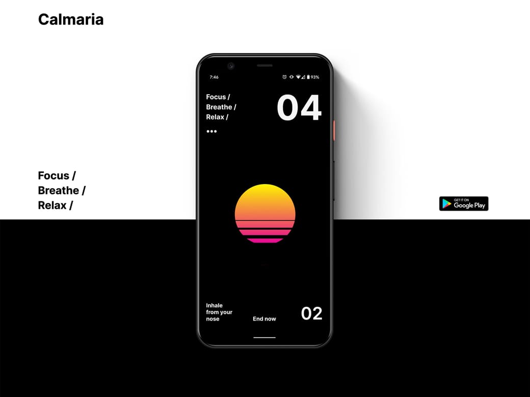
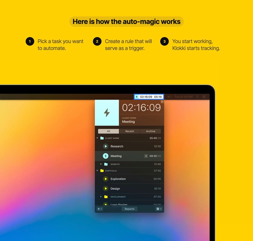
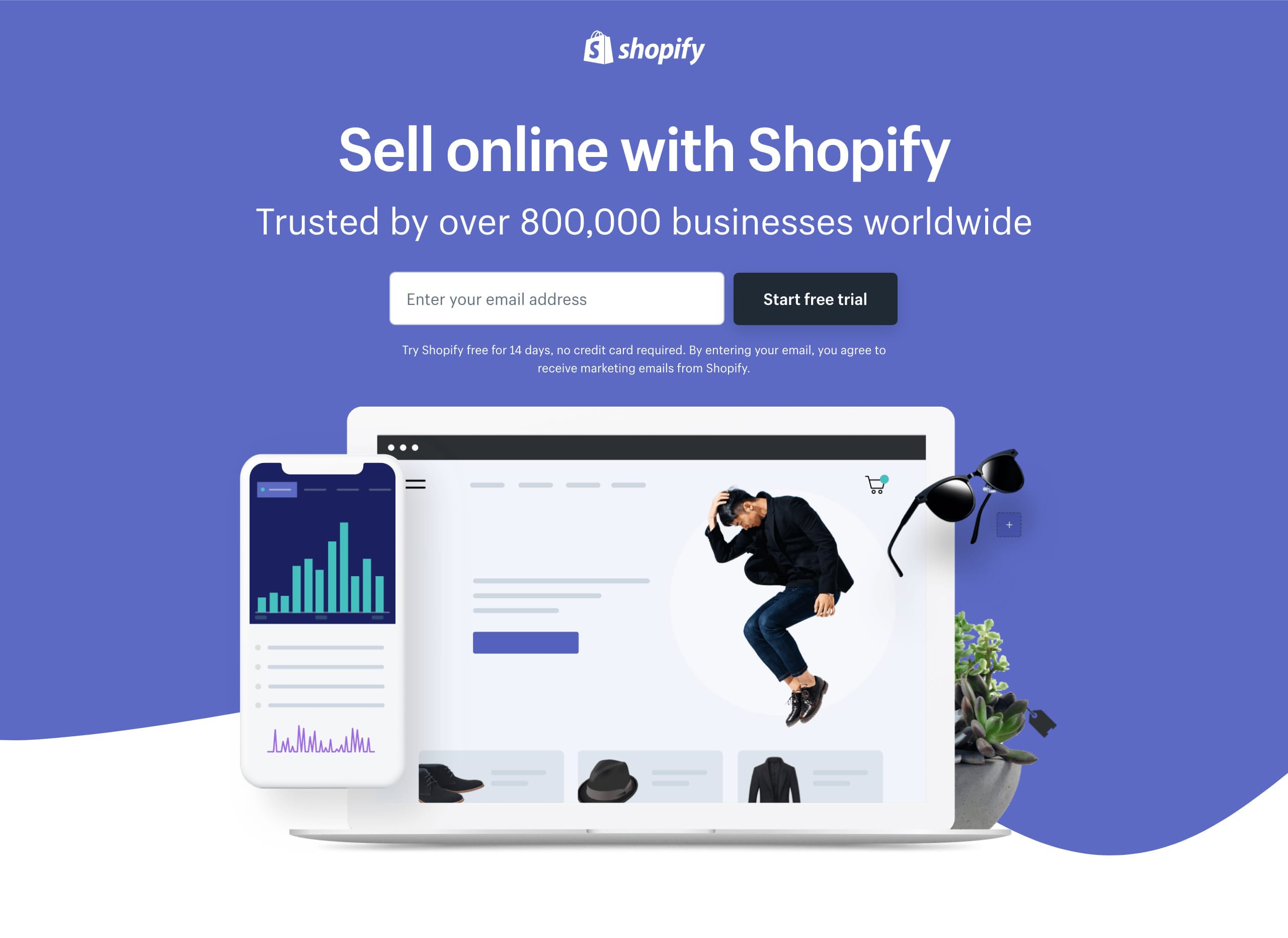
Hot Tip #80 is to wrap your screenshots in a device.

A device mock-up, with a subtle drop shadow, can really bring your digital product to life:


Device mock-up reference
Calmaria

Device mock-up reference
Klokki

If your software caters for multi-device usability, consider showcasing the screenshots within a family of devices. This emphasizes the remote-working possibilities too:
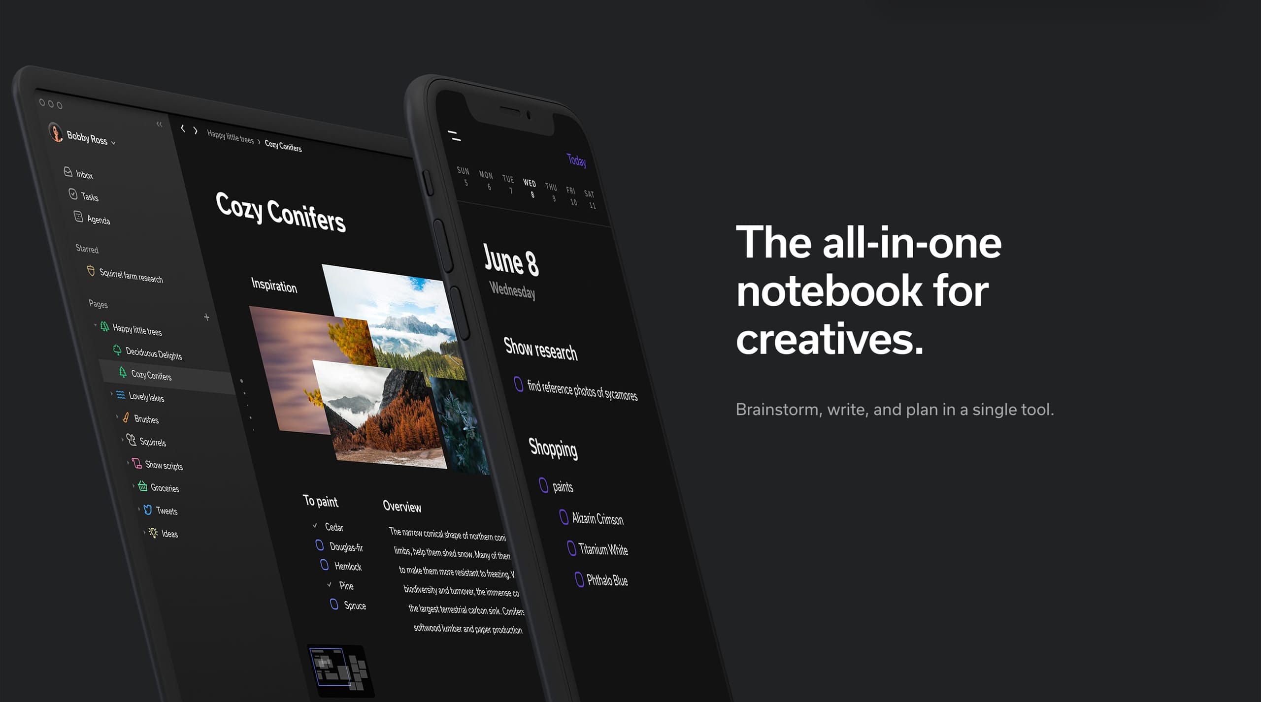

Device mock-up reference
Clover

Family of devices
Shopify Free Trial

Creative Market Mock-Ups - The device mock-ups category is filled with unique options by their community.

Facebook Devices - Monster collection of mock-up devices in both PNG and Sketch. Ridiculous this is free.

Lstore Graphics - Top quality device mock-up resource. Video options too!

shotsnapp - Brilliant device mock-up tool that works in your browser.

Define container width

Hot Tip #81 is to set a maximum width for your content.

Hot Tip #19 referred to setting a max-width for your typography — but what about defining your Landing Page container width?


Container width demo
UIBoost

Audiences differ but over 20% of my Landing Page desktop visitors use a 1920px wide monitor.

W3Schools’ stats also indicate bigger resolution browsing is on the rise.

Containing your Landing Page with a max-width will keep elements from floating on big resolutions, preventing a rugged reading experience.

Alternate section background colors

Hot Tip #90 is to alternate section background colors.
Consider a slightly darker or lighter background color for every alternate Landing Page section. This design tip will also help contain section content better as a visitor scrolls.
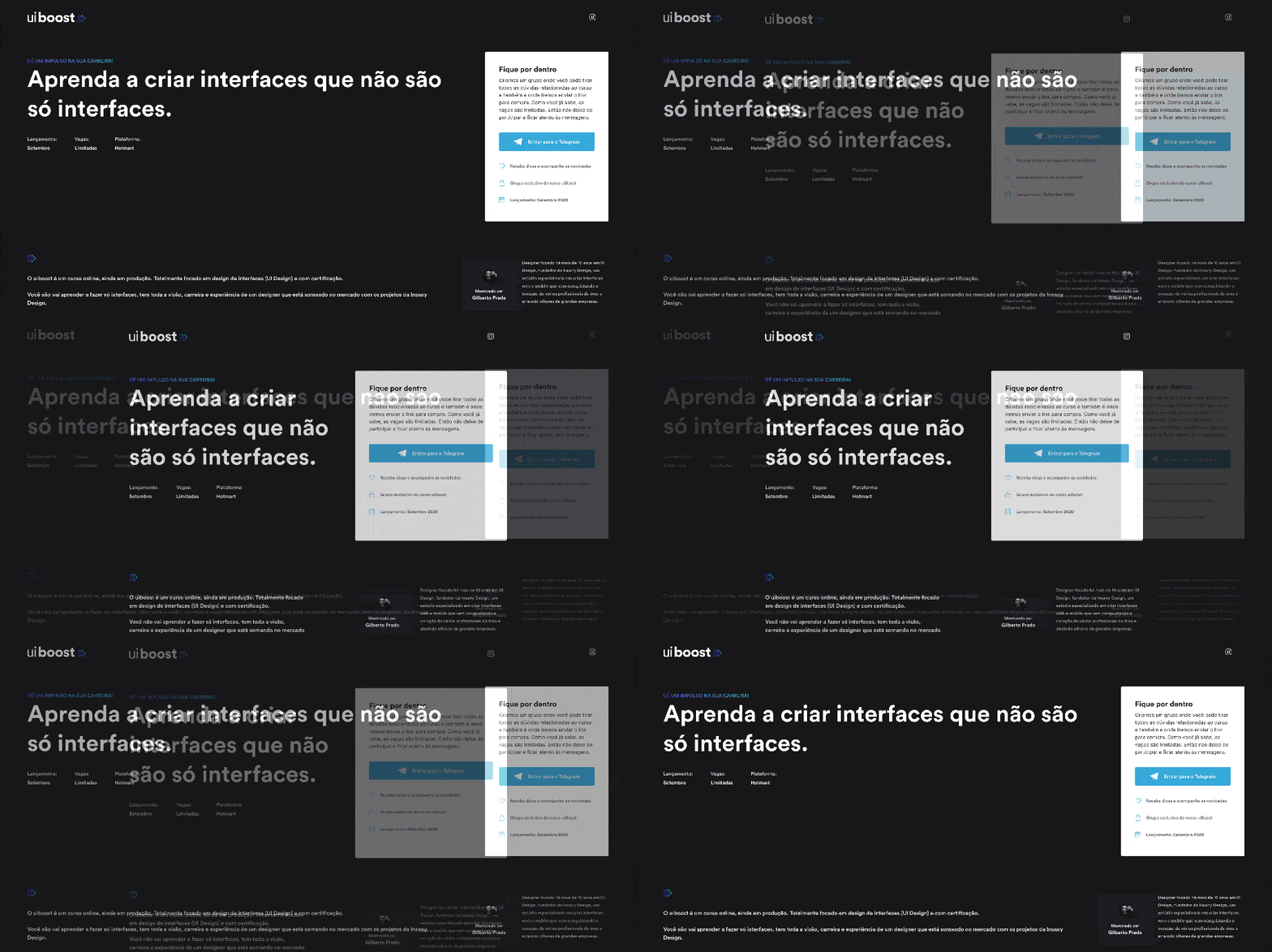

Landing Page background color reference
Adivo

Wavy Line reference
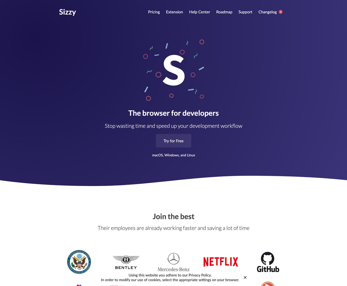
Sizzy

To add spice, why not experiment by separating sections using wavy lines (above) or diagonal lines (below).


Diagonal Line reference
Wirize

Diagonal Line reference
We Ain’t Plastic

BGJar - Free online tool to create colorful SVG blobs.

Diagonal Line References - A collection of 30+ Landing Pages I've curated featuring diagonal line separators.

Wavy Line References - A collection of 10+ Landing Pages I've curated featuring wavy line separators.

Bring it to life

Hot Tip #91 is to bring it to life.

Skeuomorphism is the design concept of making digital items resemble their tangible real-world counterpart.

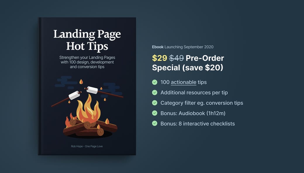
If you are selling a book, consider using a book mock-up template to bring it to life in your Landing Page:


Book Cover reference
I grabbed this book template from Creative Market and it made a huge difference to the Hot Tips Landing Page design.

Selling a print? Why not put it in a frame and overlay a leaf to really bring it to life:


Print reference
Creative Market

Pre-selling property? Give it life with an aerial view of the desk and the beautiful plans strewn across it:


Print reference
Skylark

Another trick to bring your offering to vibrant life is to add a subtle drop shadow behind the image, product mock-up, or browser screenshot:


Drop shadow design reference
Ackee

The above subtleties aren’t noticeable at first but collectively mold into a beautiful Landing Page design, like this:


Drop shadow design reference

Aerial View Inspiration - A collection of 80+ Landing Pages I've curated with aerial view shot.

Creative Market Mock-Ups - The device mock-ups category is filled with unique options by their community.

Depth Inspiration - A collection of 50+ Landing Pages I've curated featuring a perception of depth within the page.

Facebook Devices - Monster collection of mock-up devices in both PNG and Sketch. Ridiculous this is free.

Lstore Graphics - Top quality device mock-up resource. Video options too!

Ray - Useful little web app to generate beautiful images of your code snippets. Supports a bunch of languages and features a neat UI options panel including dark + light modes.

Rotato - macOS app to generate fancy rotating device mock-ups. Free to try, then $40.

shotsnapp - Brilliant device mock-up tool that works in your browser.

Smartmockups - Tool with a more diverse (tees, cups, devices) set of mock-ups. Free for 200 mock-ups then $9/month.

Unboxshot - A service specializing in stop-motion unboxing animations for your products. Instant delight in your Landing Page.