You are browsing:

Conversion Tips

Landing Page lessons related to the strengthening the page for conversions. When you are further with your optimization, kick off the Landing Page Pre-Launch Checklist.

Utilize customer testimonials

Hot Tip #01 is to utilize your customer testimonials by highlighting features and answering doubts.

So often I see Landing Pages packed with testimonials providing very little value to the visitor. Let's compare two testimonials. The first is by a customer, Gavin Jenkins:

"Iโ€™m a huge fan of the brand, so Iโ€™m glad I could finally sample their product."
Gavin Jenkins

Note how Gavinโ€™s testimonial is generic, offering superficial information to the potential customer reading it. This second testimonial is also by a customer, Kim Davis โ€” but note the difference:

"So glad I could finally experience their superb quality myself and I was quite impressed by the thoughtful packaging of such a delicate item."
Kim Davis

See how Kimโ€™s testimonial highlighted a product feature while also answering a potential doubt? The feature being the build quality and the potential doubt being if postage would damage the item.

Round up all of your customer testimonials and select only the choice few adding value for your Landing Page visitor.

How to request testimonials - A three-step method to help generate great Landing Page testimonials from your customers.

Testimonial examples - A more specific collection I've put together of well-designed or interesting Testimonial examples in Landing Pages
Showcase testimonials from a similar demographic

Hot Tip #02 is to showcase testimonials from similar demographics to your potential customers.

If you are selling enterprise-level support software, it's wise to curate testimonials from customers who work for enterprise-sized businesses.

Put yourself in your Landing Page visitor's shoes and imagine the concerns of an enterprise customer. They'll be wary of moving a huge amount of staff over to new support software due to the high stakes involved.

They'll also want to know other enterprise businesses took this risk and made this transition successfully.

Using Hot Tip #01 as a guide, Iโ€™ve hand-picked this excellent testimonial by enterprise customer, Dave Lewis:

"Our team just loves how easy to use the software is and support response time improved by 22% in month one."
Dave Lewis

Glowing feedback, right? Now, let's take it a step further by highlighting who he works for alongside his name. In this case, Dave is the VP of Customer Relations at Starbucks, which adds significant weight to the testimonial as its backed by an enterprise-sized business:

"Our team just loves how easy to use the software is and support response time improved by 22% in month one."
Dave Lewis - Starbucks VP Customer Relations

Avataaars - Online avatar generator for when customer imagery isn't available or poor quality. Try not mix animated with real customer images. So choose a style for consistency.

Set a single objective

Hot Tip #09 is to set a single objective.

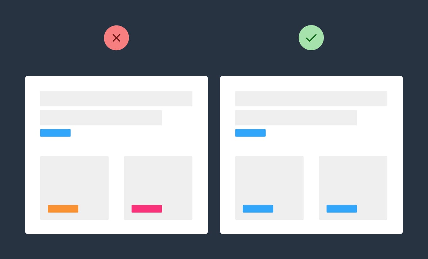
An effective Landing Page should only have one objective, not many.

๐Ÿšซ Sell our eBook + promote our job board

โœ… Sell our eBook


Set a single objective infographic
The beauty of a Landing Page is the single canvas to persuade the visitor to do one thing.

Use footer for pre-sale

Hot Tip #12 is to use your footer area for pre-sale support.

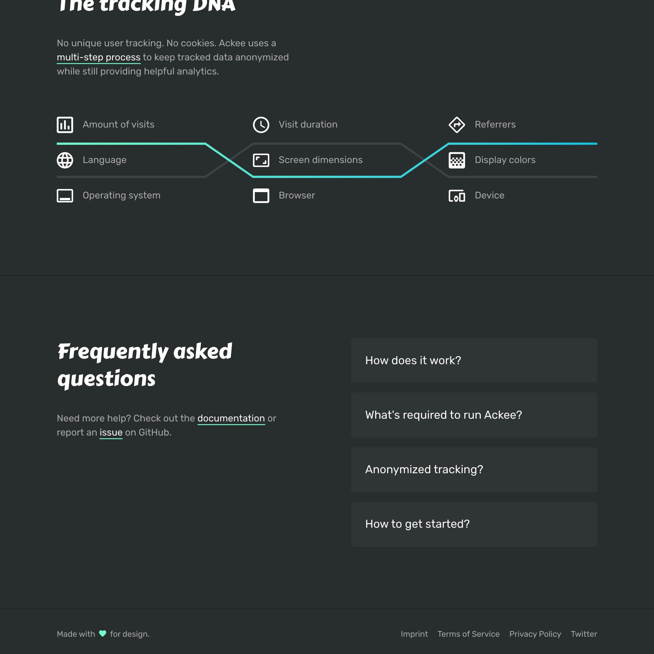
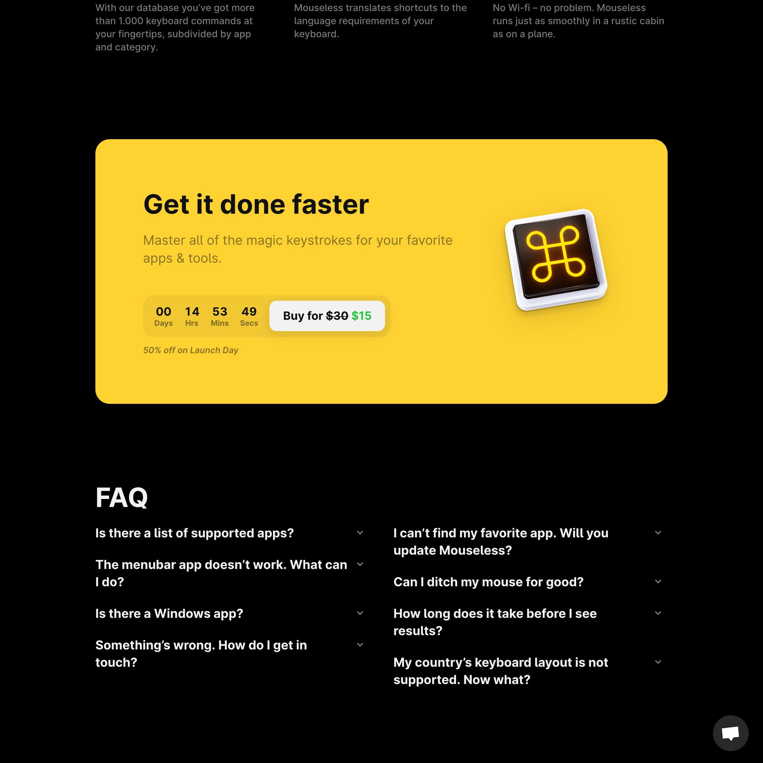
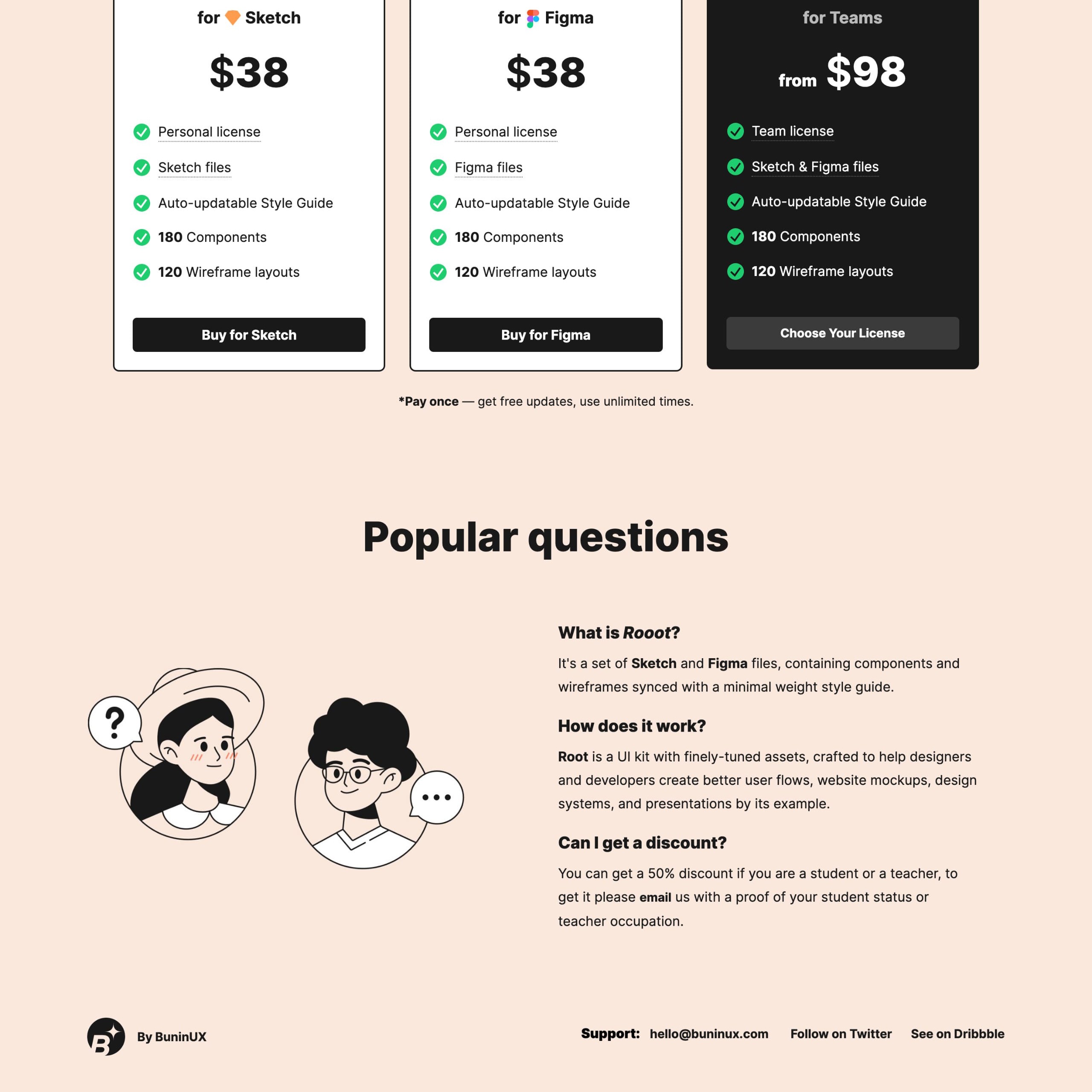
If your visitor has not committed by the end of the scroll, they still have doubts. Insert your FAQs, along with your support details:


FAQ reference
Root UI Kit

FAQ reference
Ackee

FAQ reference
Mouseless

This area could be the difference between a visitor and a customer.

FAQ Examples - A more specific collection I've put together of well-designed or interesting FAQ sections in Landing Pages
FAQ Inspiration - A collection of 70+ Landing Pages I've curated featuring helpful FAQs near the bottom.

Highlight USP among feature list/grid

Hot Tip #13 is to highlight your Unique Selling Proposition (USP) among your features.

A grid/list of 12 features can be overwhelming for a visitor who is learning about your product/service for the first time.

Begin with your highlighted USPs:


Highlighted Feature Demo
Emphasize the benefits of choosing you over the competition.

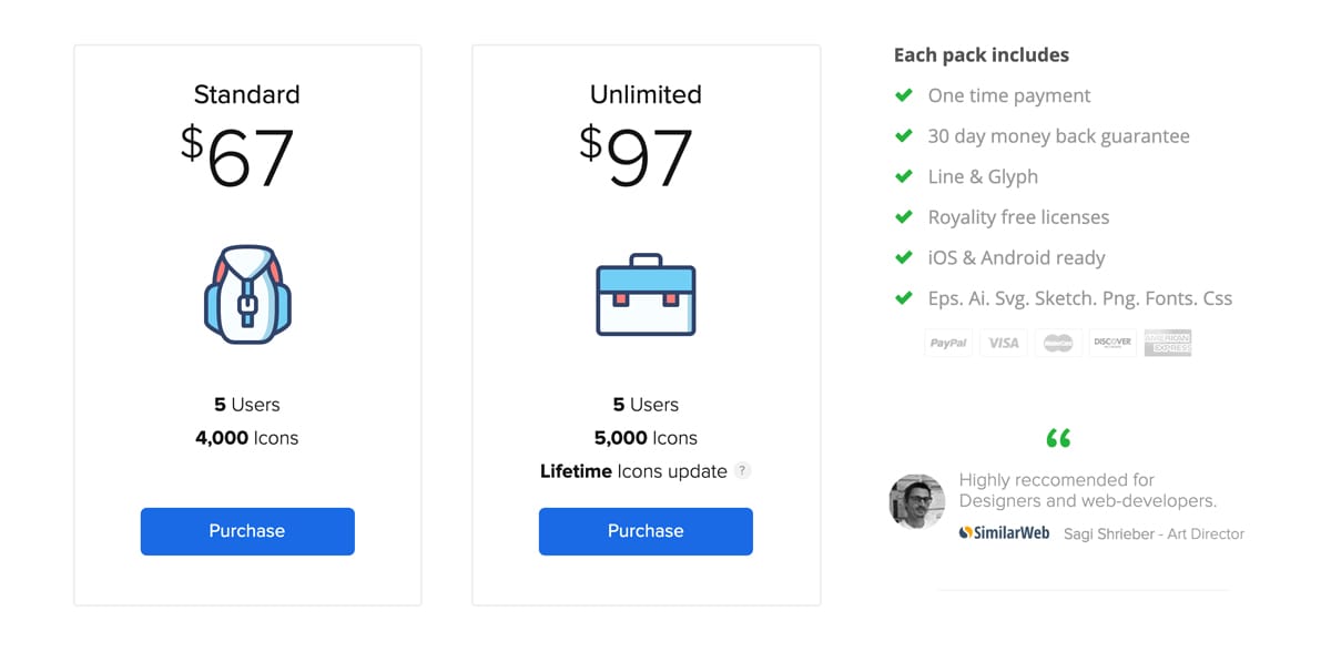
Offer more pricing tiers

Hot Tip #14 is to offer more pricing tiers.


Price Table reference

Price Table reference
Aim to tier up with more features and benefits versus tiering down by stripping your core offering.

Price Table reference
โ€œGive people who would be happy to pay you more money, the opportunity to pay you more money.โ€ ~ Adam Wathan, Refactoring UI (source)

Marketing Examples Refactoring UI - Harry from Marketing Examples brilliantly dissects the Refactoring UI higher price tier.

Pricing Psychology - Help Scout breakdown 10 popular pricing strategies.

Pricing Table Examples - A more specific collection I've put together of well-designed or interesting Pricing Tables in Landing Pages.

Pricing Table Inspiration - A collection of 150+ Landing Pages I've curated featuring a wide range of different pricing tables.

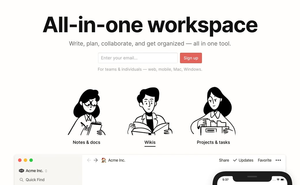
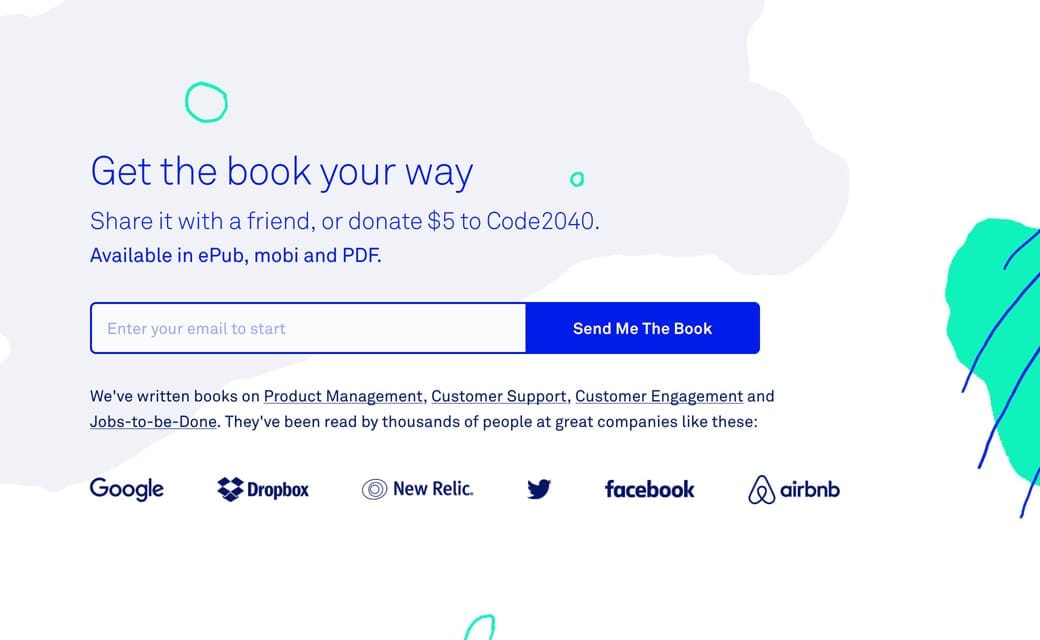
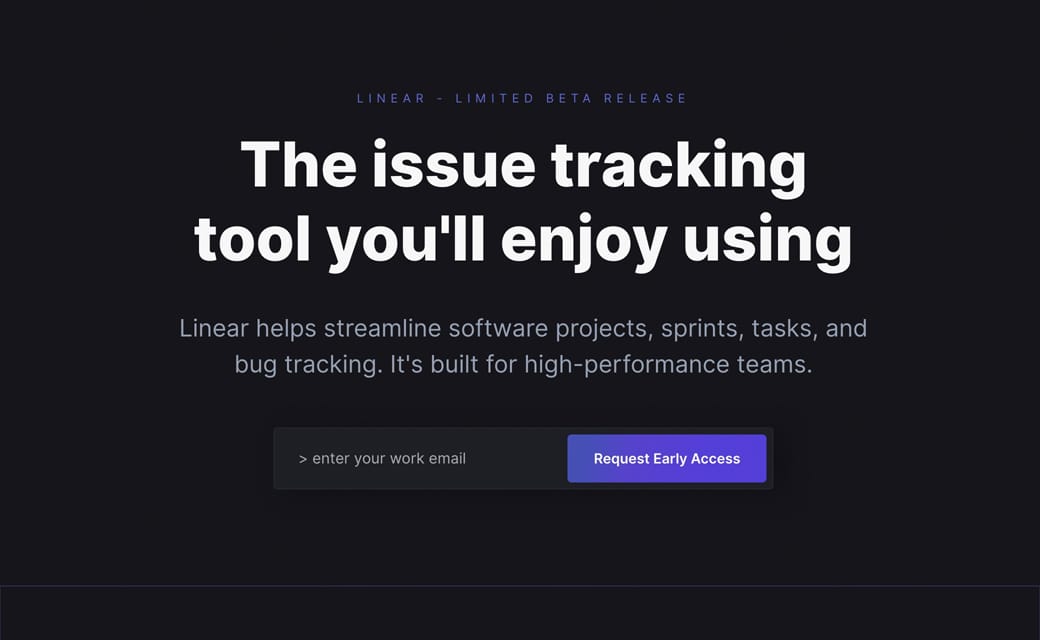
Embed your lead forms

Hot Tip #16 is to embed your forms to try capture leads immediately.

๐Ÿšซ [Click here to Sign Up]

โœ… (Enter your email) + [Sign Up]


Lead capture example
Notion

Lead capture example
Intercom on Onboarding

Lead capture example
Linear

Remember, with every page load your conversion rate drops, so try capture leads as soon as possible.

Sit with someone and see what it takes to convert

There are two ways to experience horror.

The first is to rent a gory R-rated film.

The second is to watch someone interact with your Landing Page. Truly horrifying, but the learnings are worth the trauma.

Hot Tip #18 is to sit with someone from your target market and study what it takes for them to convert.

Highlight a testimonial from an opinion leader

Hot Tip #20 is to highlight a testimonial from an opinion leader who is well known to your target audience.

Take a walk with me...

You are looking for an icon pack for your next project. You discover these great looking "ZenIcons" โ€” but the abundance of icons out there casts doubt on the $49 price tag.

Scrolling past the first icon preview you arrive at this featured testimonial:

"With 9 different weights, Zen Icons are my go-to icons for all my side projects."
Klaudia Schneider - Spotify Product Designer

Now you think to yourself: "No way! That's Klaudia, the designer at Spotify I'm following on Twitter. She's so talented and has great taste. These ZenIcons must be best-in-class for her to endorse them."

This form of social proof is the game-changing Joker card in your Landing Page deck.

Witzenhausen - This tip was taken from my WordCamp Berlin talk on Landing Page optimization.

Create Haste

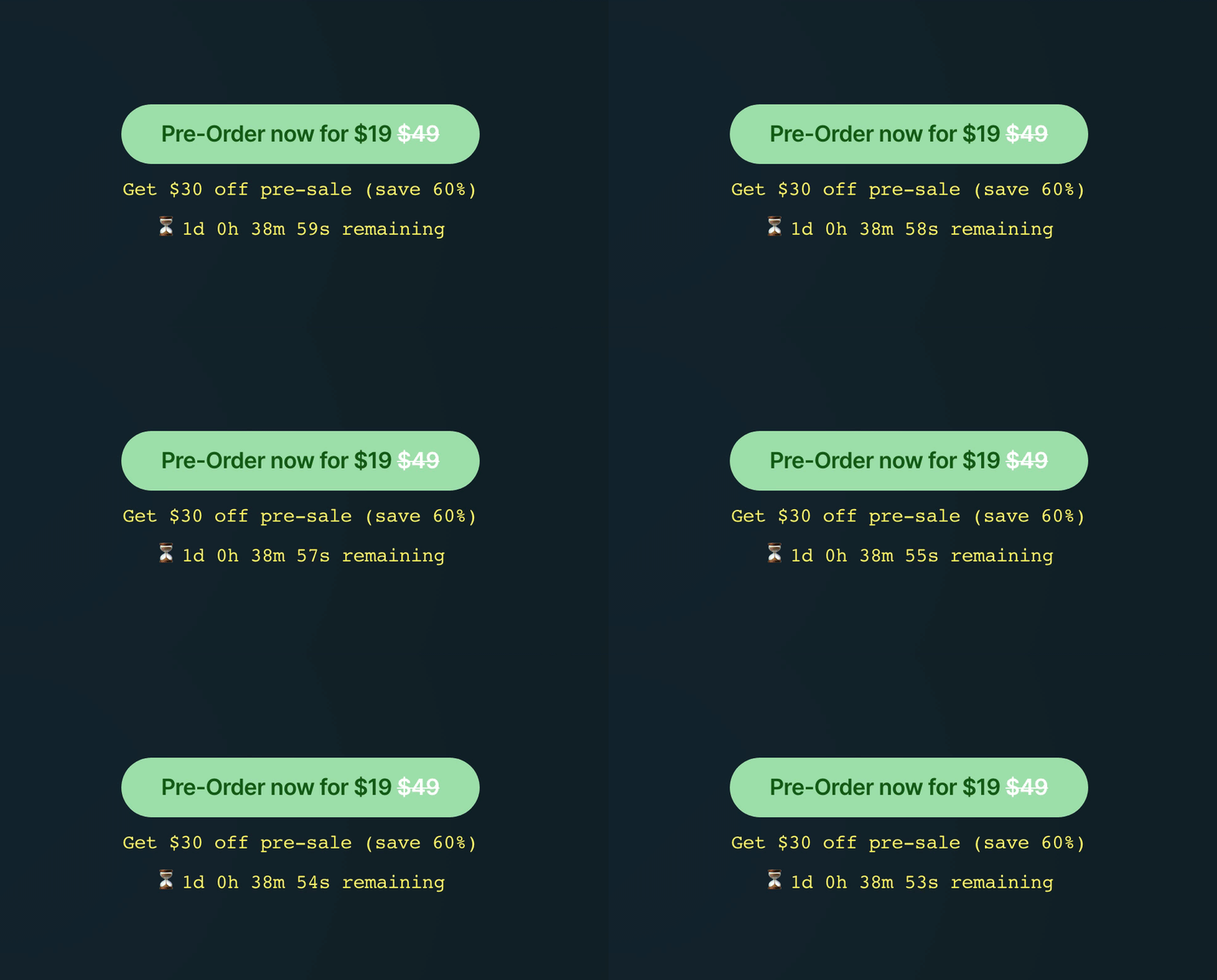
Hot Tip #24 is to create haste.

Consider offering a discount or a gift within a diminishing timeframe to encourage a quicker purchase. Call it FOMO if you will.

The Hot Tips Ebook pre-order went live with a $30 saving for 30hrs only - to create haste:


Countdown timer demo
โณ Note how I positioned the 30hr countdown timer right under the CTA button, along with an additional 60% saving reminder.

Date Countdown - The one I used on the Hot Tips Landing Page

Step into your visitor's shoes

Hot Tip #27 is to step into your visitor's shoes.

๐Ÿ“ฑ Load your Landing Page on mobile
๐Ÿ’ฌ Read the text aloud
๐Ÿ‘† Use the navigation
๐Ÿ’ณ Checkout successfully

Doing the above will expose conversion friction points in your Landing Page.

Once confident, see Hot Tip #18.

Offer an annual discount

Hot Tip #32 is to offer an annual discount.

Offering a saving for a 12-month commitment can really help boost cash flow for your SaaS.

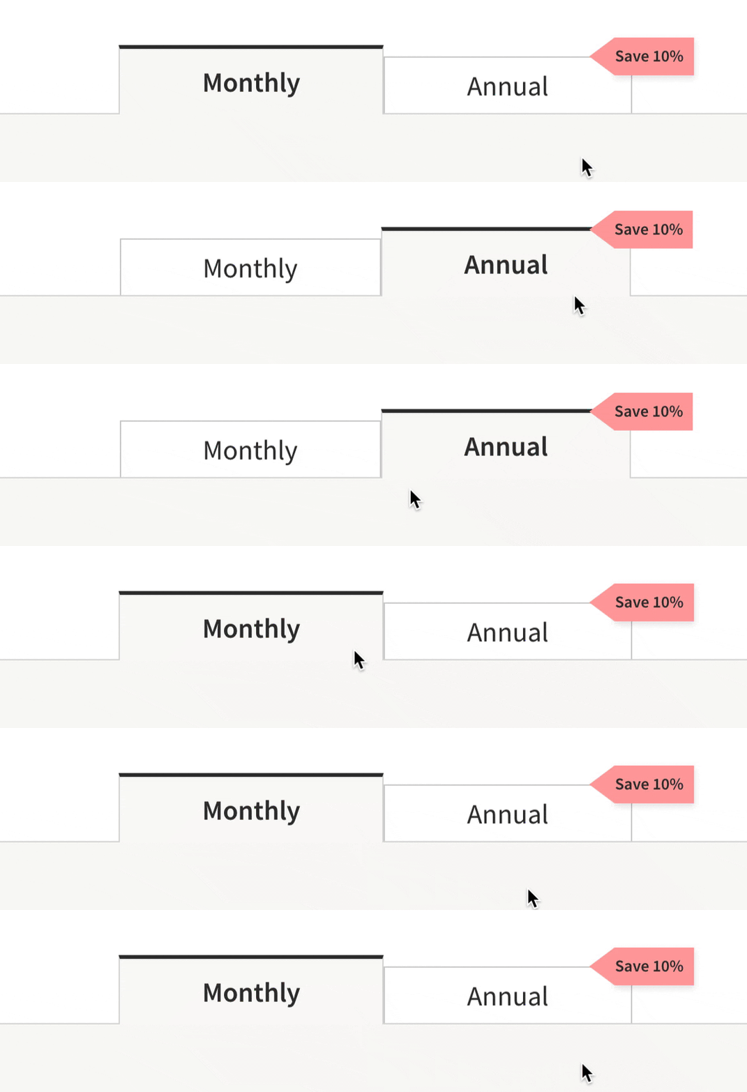
Note how Unbounce has a Monthly/Annual switcher with a crystal clear โ€œSave 10%โ€ badge on the annual tab:


Unbounce Tabs
Also, note how the tiered pricing changes as you switch:

Unbounce Pricing
Avoid doing anything too fancy with your pricing switcher. Rather aim for legibility and a stable experience thatโ€™s been tested on mobile thoroughly.

Put your name on it

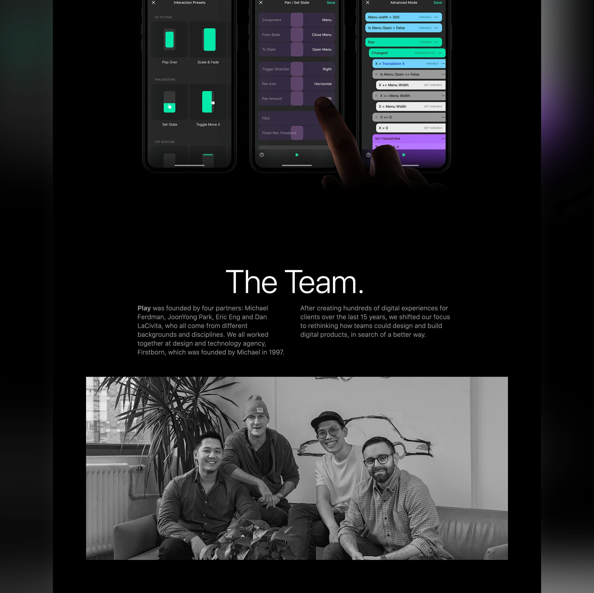
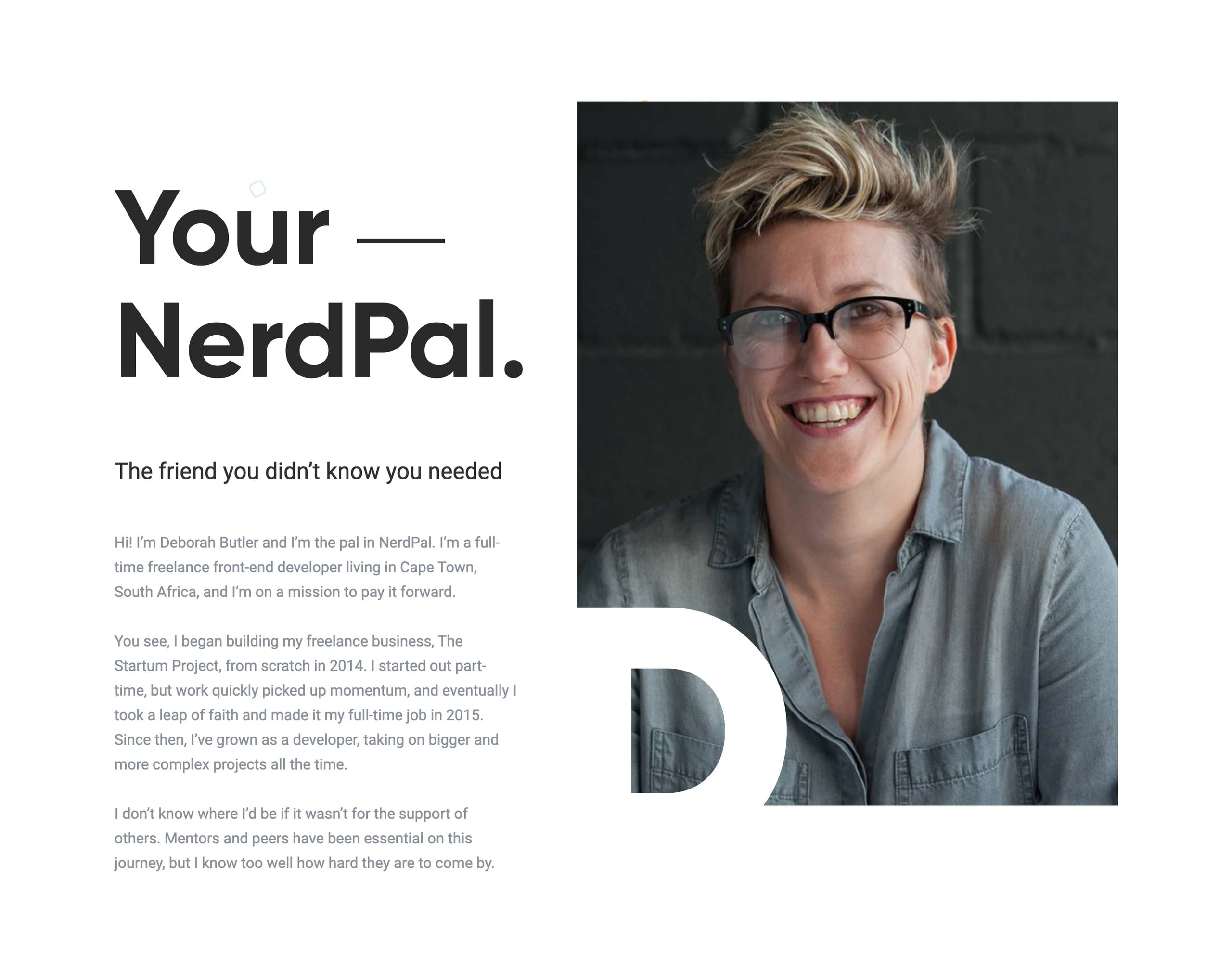
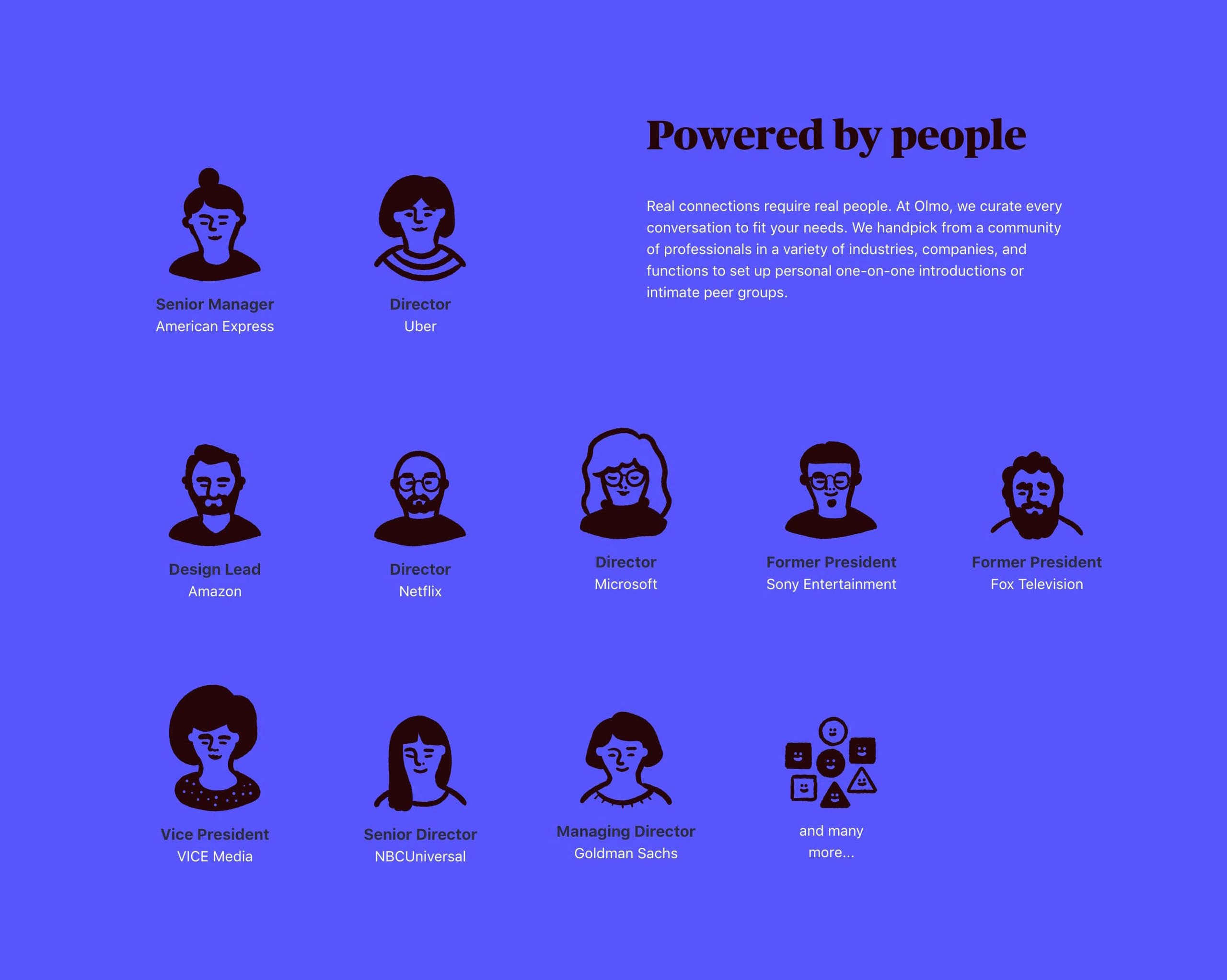
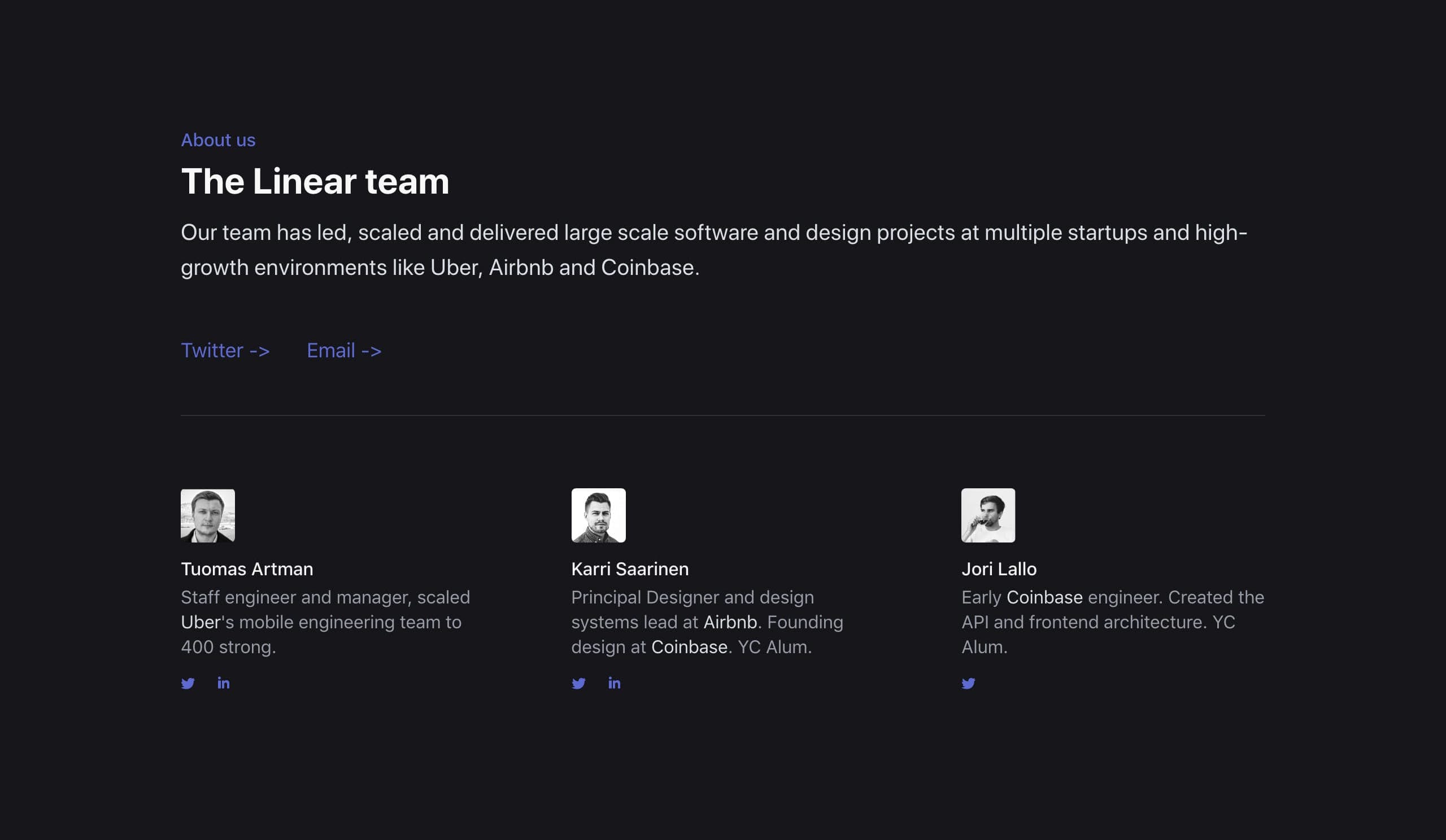
Hot Tip #35 is to put your name on it.

A common concern among Landing Page visitors is how well a product or service is supported.

If I commit, will I get help?
Who actually built this?
Are they continuously improving it?


Team reference
Play

Team reference

Team reference
Olmo

Team reference
Linear

Taking ownership eases fears and shows confidence. Be proud of what youโ€™ve created.

Landing Pages with Team sections - A collection of 400+ Landing Pages I've curated featuring team sections.

Sign Your Work - Little 2014 nugget blog post by Seth Godin.

Team Examples - A more specific collection I've put together of well-designed or interesting Team sections in Landing Pages.

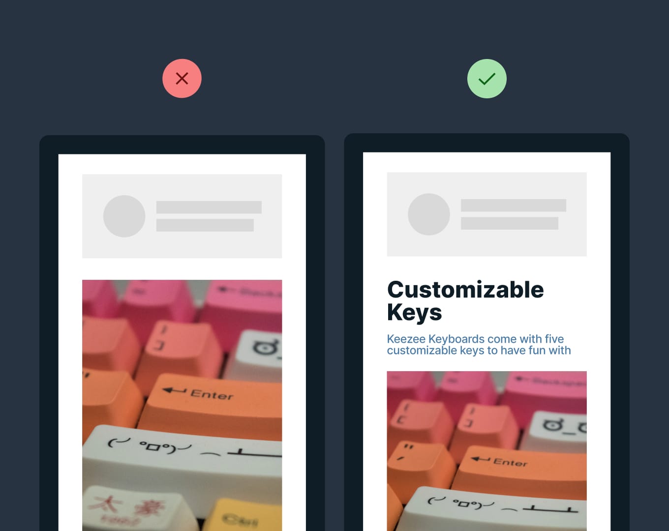
Place copy before images on mobile

Hot Tip #39 is to place copy before images on mobile.

Having a legible responsive design is great, but are you ordering your content for a seamless scrolling experience on mobile?

โœ… Intro copy before main image
โœ… Feature copy before demo image

Landing Page images without context are difficult to decipher:


Copy before images on mobile
P.S. Donโ€™t be afraid to hide images (or text) that add nothing to the mobile experience.

Flexbox order - A neat way to add context with only a few lines of additional code.

Offer a free teaser

Hot Tip #40 is to offer a free teaser.

โณ 14 day free trial of your SaaS
๐Ÿ“– 2 of the 14 eBook chapters
๐Ÿ“ฆ 80 icons from the full library
๐Ÿ“ฑ 1 of 10 mobile wallpapers

Teasers are great ways for visitors to experience more without having to pay upfront.

Remove the obstacles to demo

Hot Tip #46 is to remove obstacles in the way of demoing your product.

Carrd allows a full website build before asking for an email address.


You are confident your SaaS offering will satisfy your potential customer. Why not get visitors to experience it as soon as possible?

Lower the risk to commit

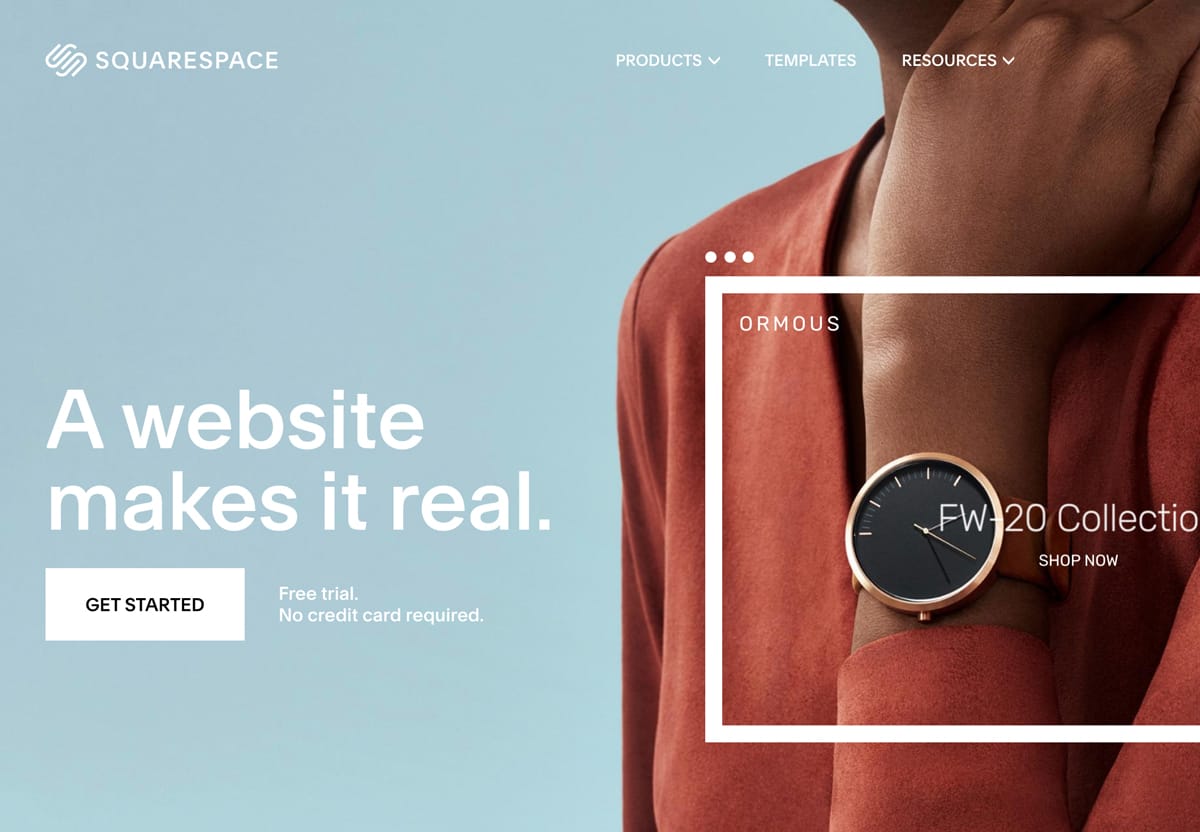
Hot Tip #47 is to lower the risk to commit.

โœ… Free trial
โœ… No credit card needed
โœ… 2 years warranty
โœ… 24/7 support
โœ… 30-day money-back guarantee

Note how Squarespace includes two of the above right next to their CTA button:


Squarespace CTA button alongside copy
Squarespace

Your Landing Page visitor is more likely to commit knowing they will be taken care of post-purchase.

If you discovered your Landing Page for the first time today - would you feel confident signing up?

Suggest a pricing option

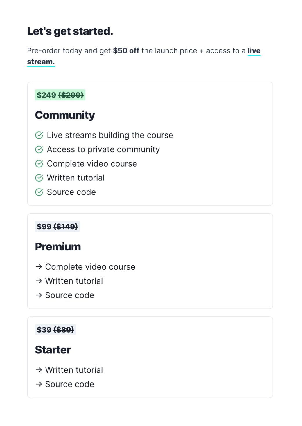
Hot Tip #50 is to suggest a pricing option.

Sure, some Landing Page visitors are price-conscious, but a good portion of them donโ€™t want to spend time investigating. They are convinced by your pitch and simply want to know the option suggested will offer the best value.

Lee Robinson says this hugely impacted his course sales. Note how he simply highlights a tier with green:


Price Table reference
Refactoring UI enlarges a tier:

Price Table reference
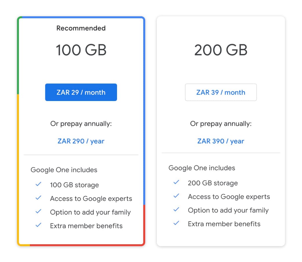
And how cute is this on-brand border by Google:

Price Table reference

Pricing Psychology - Help Scout breakdown 10 popular pricing strategies.

Pricing Table Examples - A more specific collection I've put together of well-designed or interesting Pricing Tables in Landing Pages.

Pricing Table Inspiration - A collection of 150+ Landing Pages I've curated featuring a wide range of different pricing tables.

Increase demand by limiting supply

Hot Tip #51 is to increase demand by limiting supply.

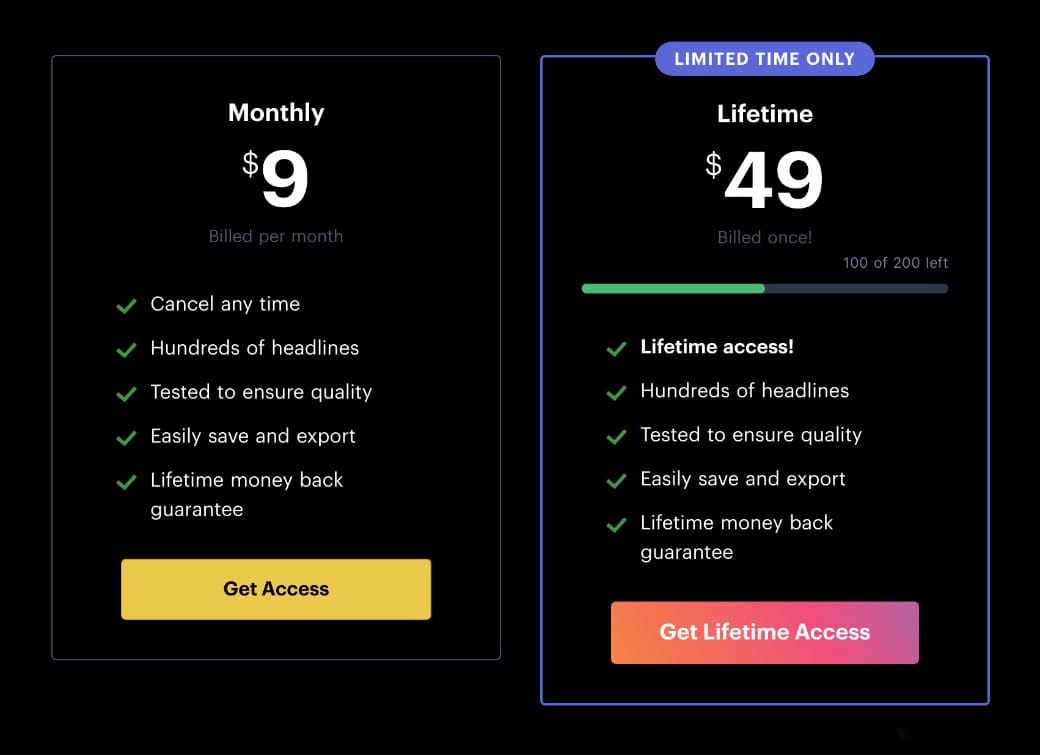
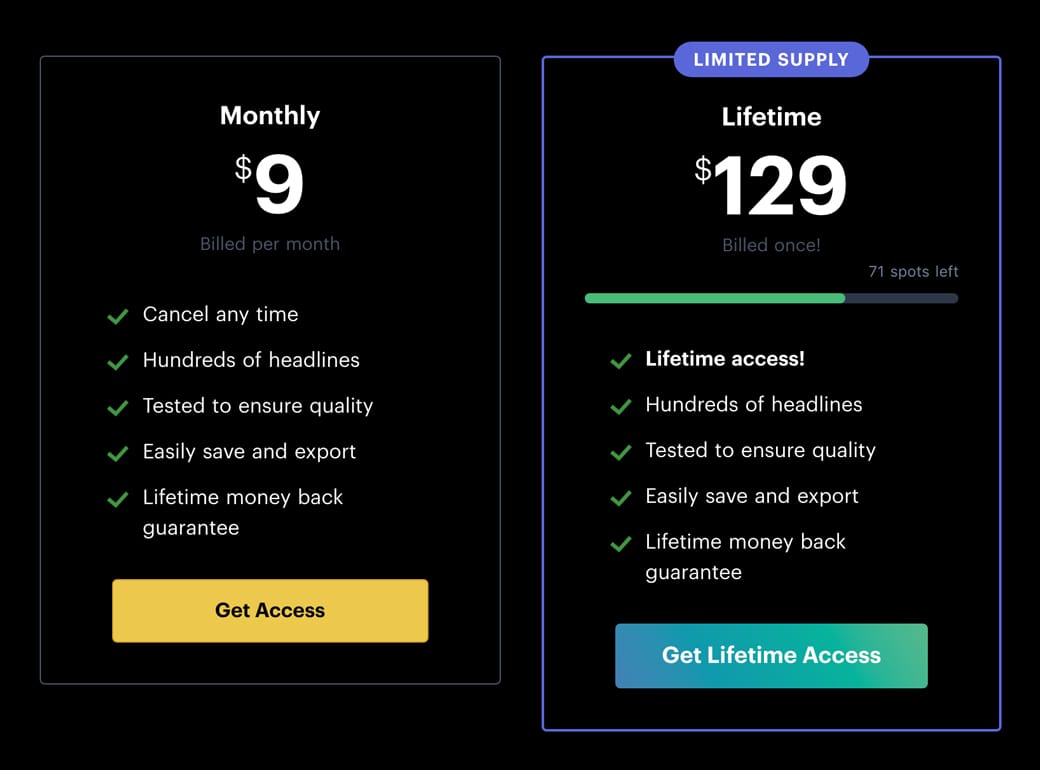
The Headlime site has a limited number of $129 lifetime pricing spots available. Once sold out the price goes up:


Limited Pricing Supply
Founder Danny said it worked wonders for the launch, with both the limited $49 and $89 lifetime pricing specials selling out quickly.

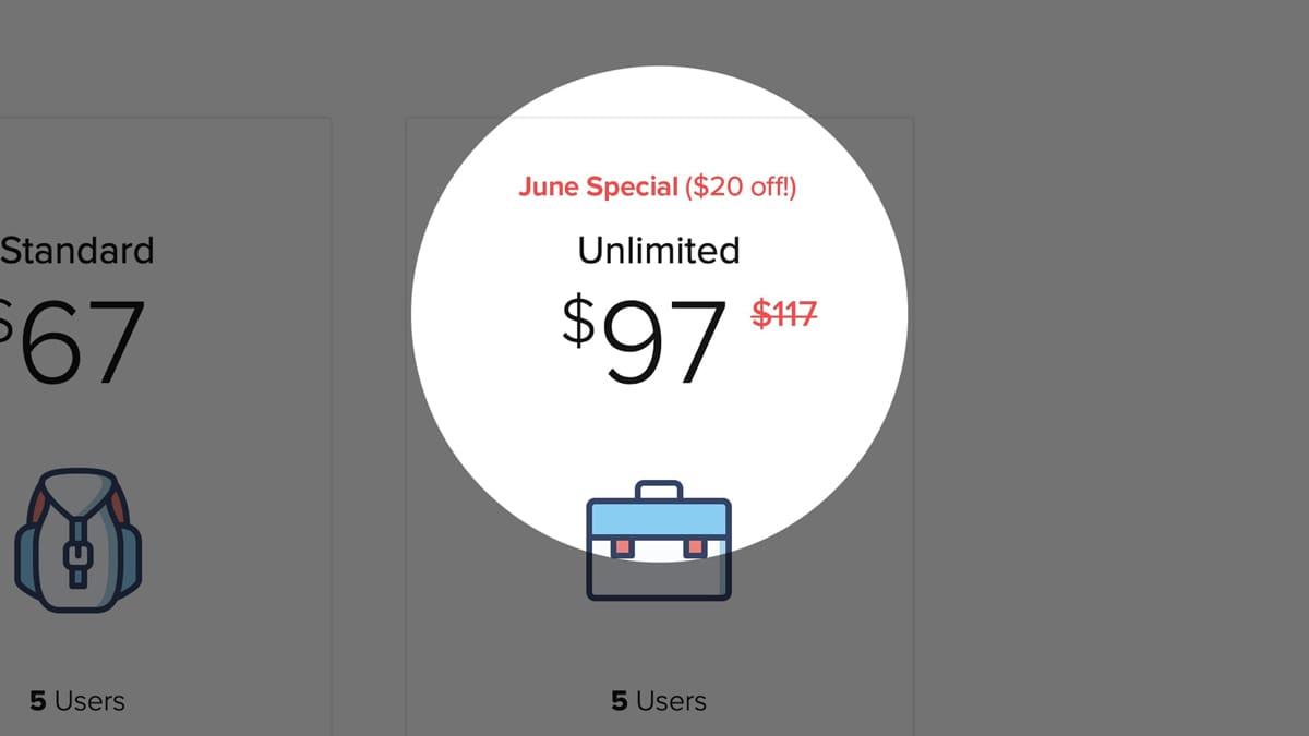
The same goes for limiting time. So consider adding a notice near the CTA button reminding the price is only discounted for the remainder of June.


Limited Time Supply
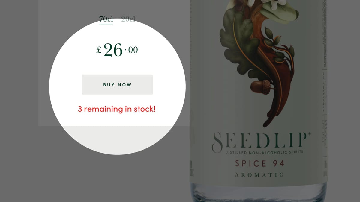
And lastly consider limiting physical quantities. Experiment by displaying a visible count of stock remaining.

Limited Stock Supply

Add social proof

Hot Tip #52 is to add social proof.

Think of social proof as herd mentality. We tend to follow bigger herds vs. smaller herds. We are influenced by higher ratings vs. lower ratings. If everyone else is doing it, it must be the best and safest bet.

Strengthen your social proof by including:

โญ๏ธ Customer Ratings
๐Ÿ’ฌ Testimonials
๐Ÿ† Service Awards
โœ๏ธ Critic Reviews
๐Ÿฅ‡ Industry Rankings
๐Ÿ Client Logos
๐Ÿ“ฐ Press Features

What would you need to integrate into your Landing Page for your visitor to believe you are the obvious best choice?

Shoutout - A service that taps into your existing social proof online and turns it into an embeddable "Wall of Love" to embed in your Landing Pages.

Align your marketing

Hot Tip #55 is to align your marketing and Landing Page narratives.

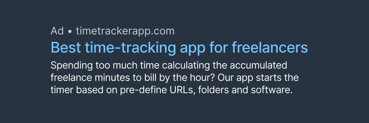
A Google Ad for freelance time-tracking software that takes you to a page offering time-tracking for teams is confusing. Consider this advertisement:


Align your marketing
Which intro headline do you think resonated more with the visitor?

๐Ÿšซ Voted the worldโ€™s most innovative time-tracking software for teams.

โœ… Optimize your freelance hours with automated time-tracking software.

It is vital we donโ€™t lose our visitors upon arrival. Spend some time reviewing your marketing copy and where it takes their expectations.

Minimize the options

Hot Tip #58 is to minimize the options.

Do you really need:

๐Ÿ“Š 5 different pricing plans?
๐Ÿ“ 7 required fields in your enquiry form?
๐ŸŽจ 16 different product color choices?

"The time it takes to make a decision increases with the number and complexity of choices." - Hicks Law

Hicks Law - Beautifully illustrated representation on Laws of UX

Include an email within error messages

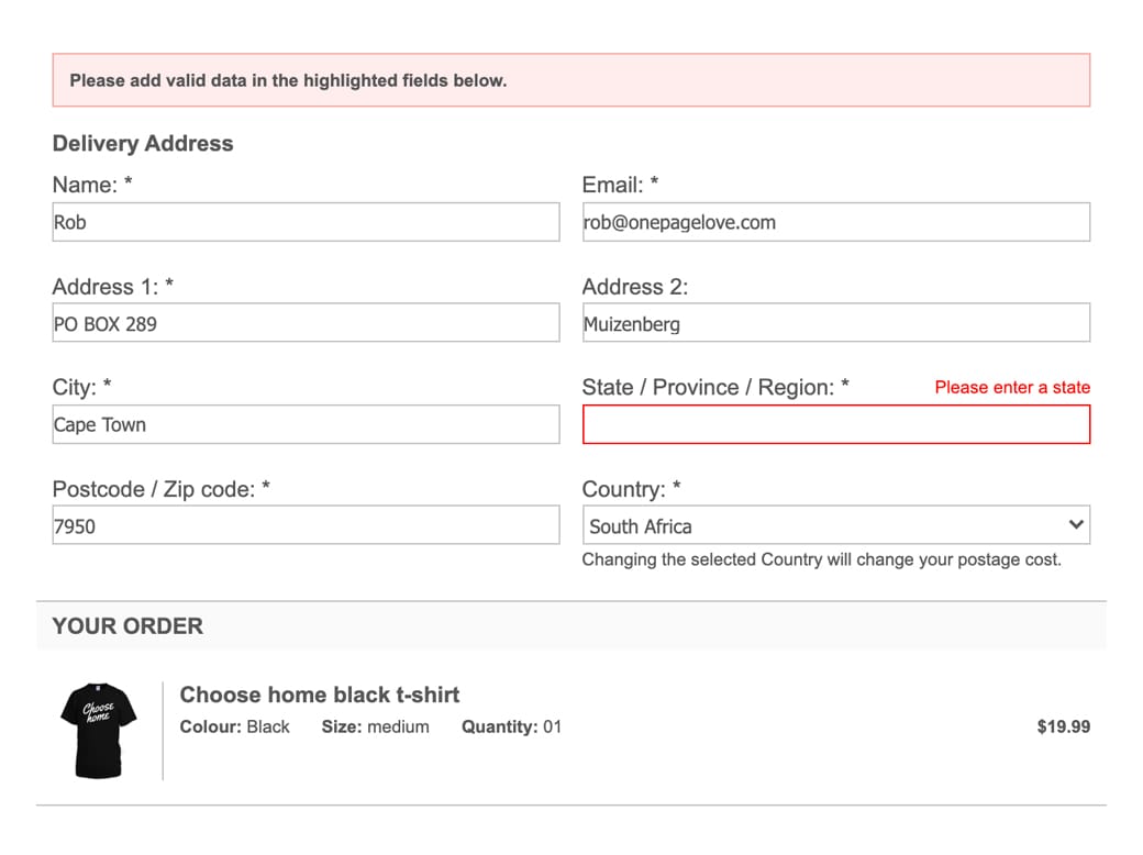
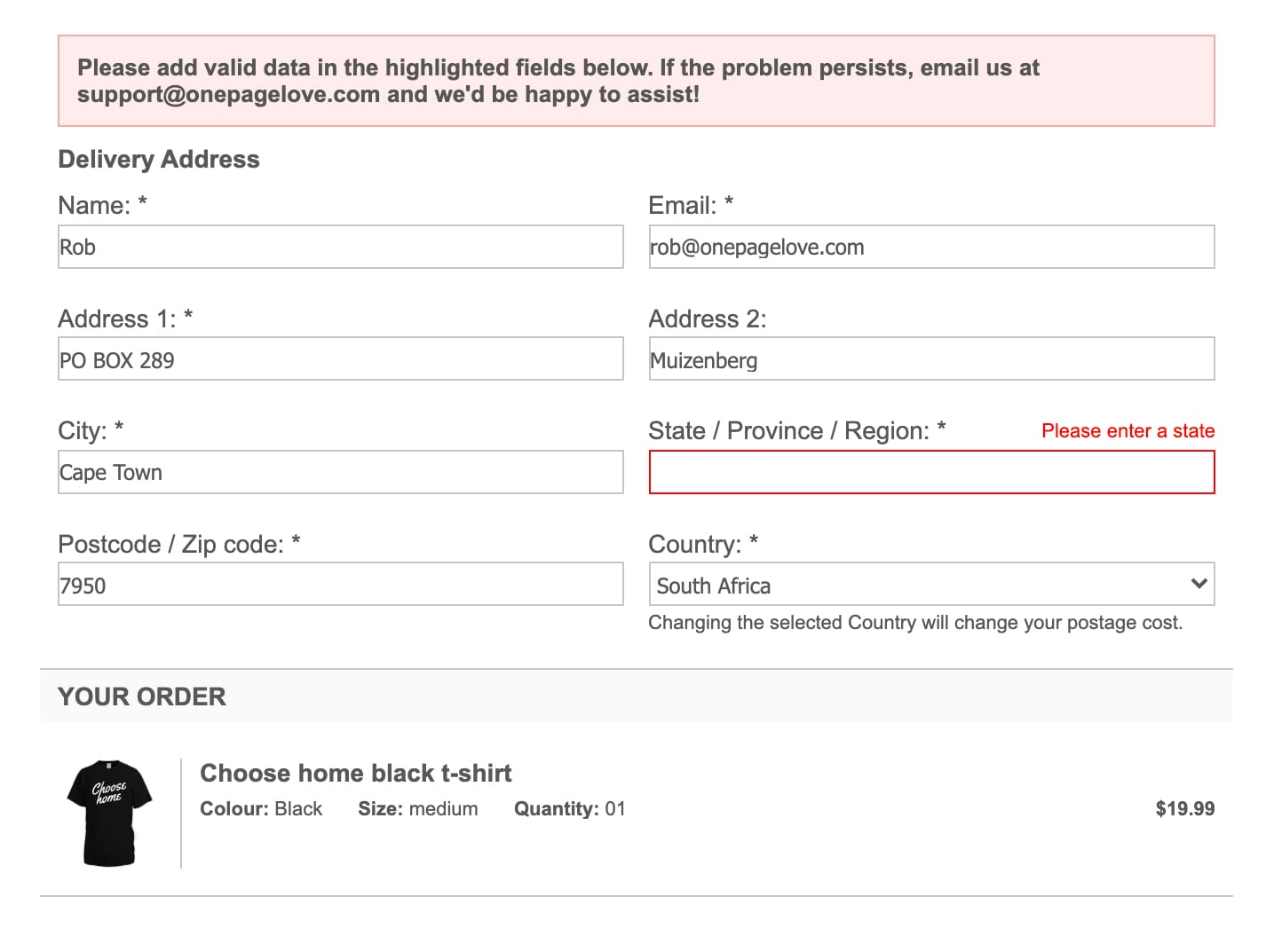
Hot Tip #62 is to include a support email address within your error messages.

If your Landing Page payment integration offers message customization, include a support email address for when a problem persists:

๐Ÿšซ


Error Reference
โœ…

Error Reference
This can potentially convert dozens of disgruntled visitors into happy customers.

Offer a demo down-sell

Hot Tip #65 is to offer a demo down-sell.

Phone calls aren't for everyone. If your Landing Page suggests hopping on a call to secure a high-end sale, offer an alternative info package download.

๐Ÿ“ฆ "Don't want to jump on a call? Download our buyer's guide"

Kevin Mead shared the above did wonder for additional revenue.

Offering a beautifully presented alternative, to digest in their own time, is a courteous play your high-end customer will appreciate.

Open non-essential links in a new tab

Hot Tip #66 is to open non-essential links in a new tab.

Set links to documentation, support, privacy, and demos to open a new browser tab, keeping the primary Landing Page within a tab's reach.

New Window Links - A strong Counterargument by Jesse including several use-cases and additional UX reads. Always healthy to question UX decisions. I still vote for opening demos, support portals and blogs in new tabs - all 3 in my experience offer poor navigations to return to the primary page.

Reassure during checkout

Hot Tip #72 is to reassure your visitors during the checkout process.

Nerves are high. Settle them with these small reminders, strategically positioned near the checkout form:

โญ๏ธ The average customer star rating
๐Ÿ A small stack of well-known client logos
๐Ÿ’ณ A payment-related FAQ
๐Ÿ’ฌ A short but comforting testimonial

Also, try to include anything that adds transparency to the experience. This can alleviate any lingering doubts the visitor may have.

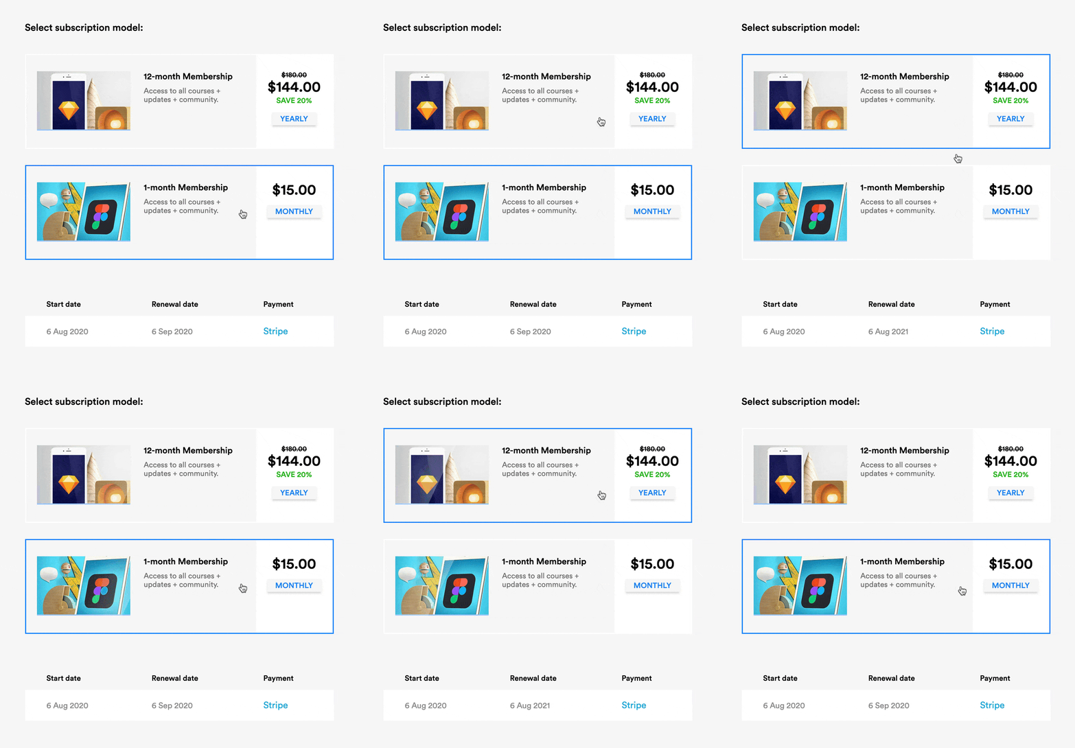
Note how LearnUX reassures by showing you exactly how the payment will appear on your statement โ€” including the renewal date differences between tiers:


LearnUX checkout
If checkout customization isnโ€™t possible in your Landing Page, the above would still apply to the area around your pricing table or final CTA button.

Boost confidence with payment method logos

Hot Tip #75 is to boost confidence with payment method logos.

Weโ€™ve come a long way with online transaction confidence, but some demographics are more hesitant than others.

An SSL certificate for your Landing Page is non-negotiable.

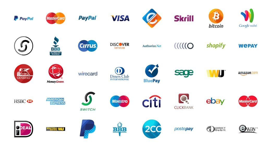
You can further improve your visitor confidence by adding all accepted payment methods near your pricing tables, main CTA buttons, and Landing Page footer. All three are not too much.


Payment method logos

Payment Method Logos - A brilliant free set (pictured above) on IconFinder in PNG and SVG formats.

Remove inactive social media accounts

Hot Tip #79 is to remove inactive social media accounts.

Launching your Landing Page with social media icons linking to new profiles with low followers is perfectly fine.

Linking to social accounts last updated 3 years ago gives the impression the product or service is either poorly supported or even abandoned.

This tip is particularly important for subscription pricing Landing Pages, where the potential customer is in a deeper research phase before the big commitment.

Prove you are established

Hot Tip #82 is to prove you are established.

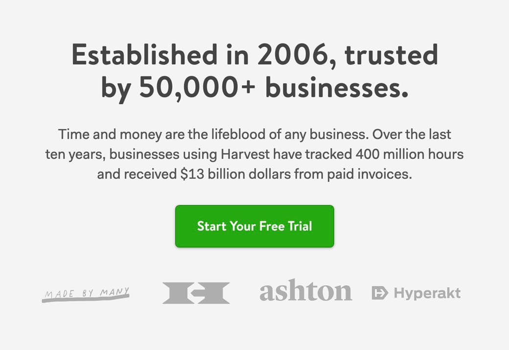
The Harvest invoice software LP includes these 4 strong figures:

๐Ÿ—“ Founded in 2006
๐Ÿ”‹ Powering 50,000 businesses
โฐ 400 million hours tracked
๐Ÿ’ฐ $13 billion paid invoices


Established stats
Years in the game with revenue/customer/operating stats thrown in is a powerful combo to reduce a sign-up risk decision.

Strategically position testimonials

Hot Tip #83 is to strategically position testimonials.

Weโ€™ve discussed curating testimonials to provide the most value to your Landing Page visitor. But where do we put them?

Start by positioning your best testimonial โ€” preferably from an opinion leader in your industry โ€” above the fold. This will strengthen your intro pitch and lower bounce rates. Now position other testimonials relevant to the Landing Page topic.

Example: If you are showcasing a specific product feature, try to position a testimonial mentioning that feature alongside it.

Note how the CleanShot X screen capture tool is talking about the ease of saving, copying, dragging, dropping, and then just below it a customer testimonial suggests the tool is like a Swiss Army knife:


Testimonial position reference
Finally, position a testimonial near checkout that mentions value for money or overall satisfaction.

Show them how it works

Hot Tip #85 is to show them how it works.

The first question most SaaS Landing Page visitors ask is How much is it?. This should always be answered with full transparency, no tricks.

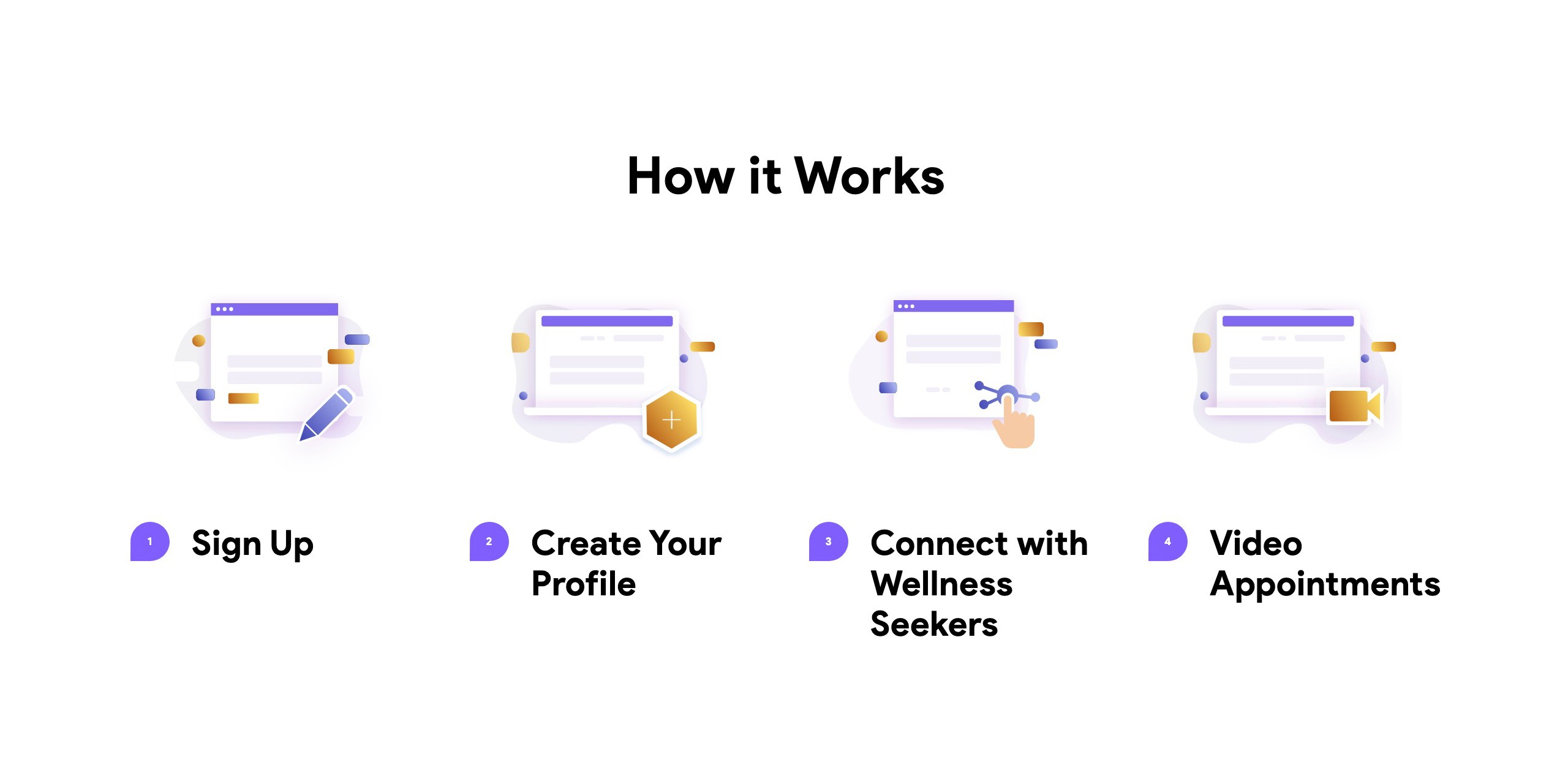
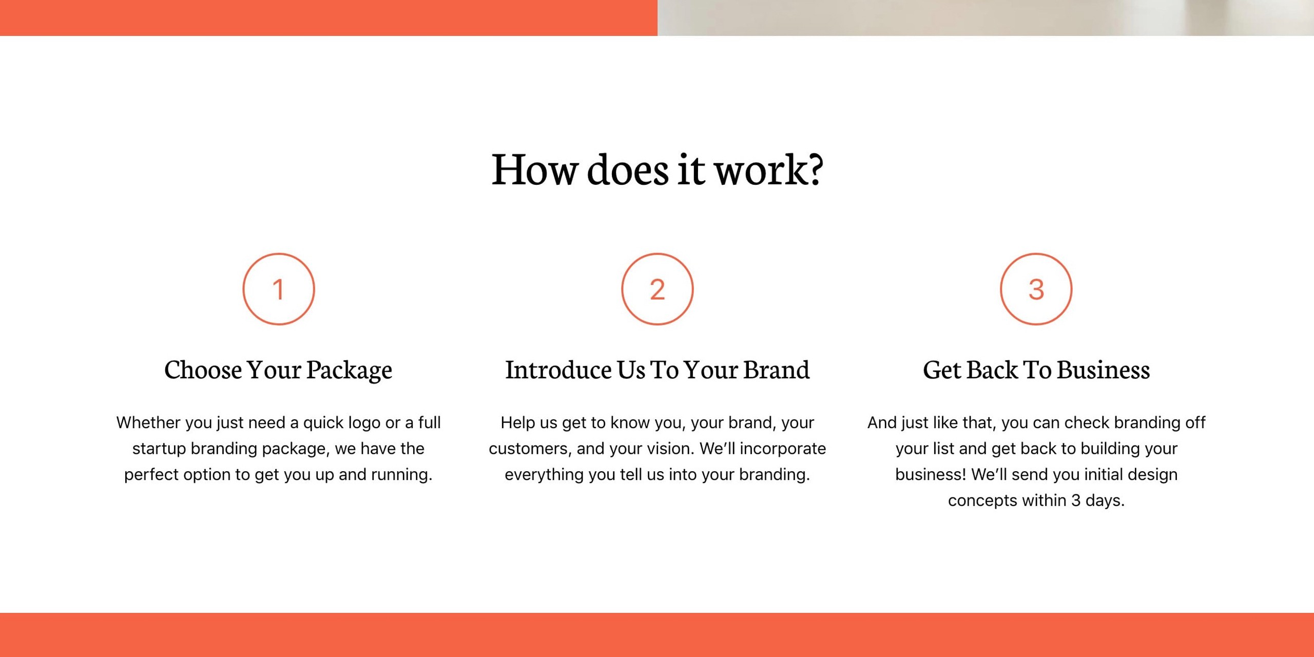
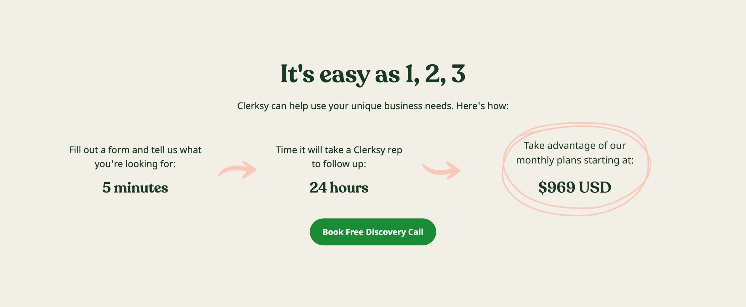
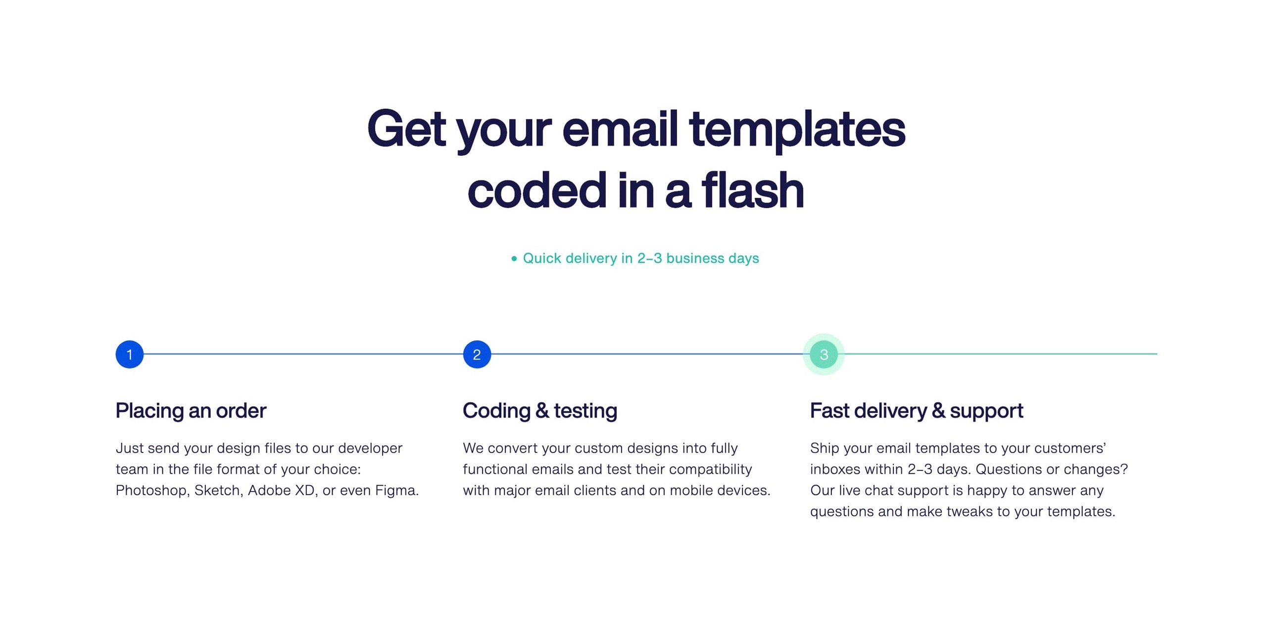
And the second? Iโ€™d argue itโ€™s to show them the exact steps needed to go from sign up to smooth sailing. Invest some time here. Use numbered lists. The more visual it is, the better.


Hot It Works reference
TelMD

Hot It Works reference
Logoswift

Hot It Works reference
Clerksy

Hot It Works reference
Crafting Emails

If you can show the Landing Page visitor just how easy it is to get started, theyโ€™re more likely to give it a try.

How it Works Examples - An ongoing collection I've put together of well-designed or interesting How it Works sections in Landing Pages
Landing Pages with How It Works - A collection of Landing Pages I've curated featuring how it works sections.
Include an explainer video

Hot Tip #86 is to include an explainer video.

Well-thought-out explainer videos can help improve conversions for complex products or services.

โณ Keep it under 30 seconds (longer can work, but only if brilliant)
๐Ÿ’ฌ Use subtitles
๐Ÿ‘† Don't forget the CTA at the end

Conversely, a rushed explainer video without a budget or refined script will hurt your brand and Landing Page conversions.

Artlist - One of the best video stock libraries out there. I used them for the explainer video for this Ebook. If you struggle with speaking clearly, they also have a very respectable AI text-to-voice generator. This could help give your video that professional edge you need.

Fiverr Explainer Videos - Great to outsource 2โ€“3 cheap concepts to help brainstorm the final product.

Landed - Video Editors - A service to help pair you with a great video editor. Pricing starts at $3k for a full month with a junior video editor. They could also help produce a full fleet of social media vids to align with the Landing Page.

Consider a lifetime discount

Hot Tip #88 is to consider a lifetime pricing option for your SaaS service.

If your running costs are very low and you have minimal support demands, consider a once-off pricing option for your subscription.


Lifetime Pricing Discount
Danny from Headlime said this pricing strategy significantly boosted short-term cash flow, which he immediately reinvested into his core offering.

Lifetime Access Deal Inspiration - A very young collection of Landing Pages I've kicked off featuring lifetime pricing deals.
Emphasize the value

Hot Tip #93 is to emphasize the value.

A "$79 Design Systems Course worth $249" doesn't offer much appeal, other than a monetary saving of $170.

What if your $79 Design Systems Course included a design systems blueprint for Figma/Sketch/Photoshop (saving you 10hrs) and a year's access to a private design community?

๐Ÿšซ You save $170
โœ… You get learning, assets, time-saving, and access.

"Price is what you pay; value is what you get."

- Warren Buffett

Reinvest your profits

Hot Tip #97 is to reinvest your profits back into your Landing Page.

Once your Landing Page is converting, and you're pleased with your solo optimization efforts, it's time for the specialists to step in.

There are many areas to outsource, but the first I'd recommend is copywriting. Let a copywriter be the officiator that marries your Landing Page tone and your target audience with linguistic flair.
Next would be your imagery. Commission a photoshoot of your product or service in action. We no longer want imagery that's merely good enough, we are looking for imagery that tells a compelling story on its own.

Your mascot illustration, constructed from an illustration kit, can now be designed to include your brand subtleties and visual cues.

Repeat the above throughout your Landing Page and before you know it you'll have a spectacular canvas for your offering.

Don't forget the why

Hot Tip #100 is donโ€™t forget the why.

Sure, your product/service looks great but why is this part of your lifeโ€™s journey?

๐Ÿ“– This is why I wrote the book
๐Ÿ–Œ This is why I design logos
๐ŸŽ“ This is why I teach Spanish

An offering positioned within a compelling story is easier to understand and support.

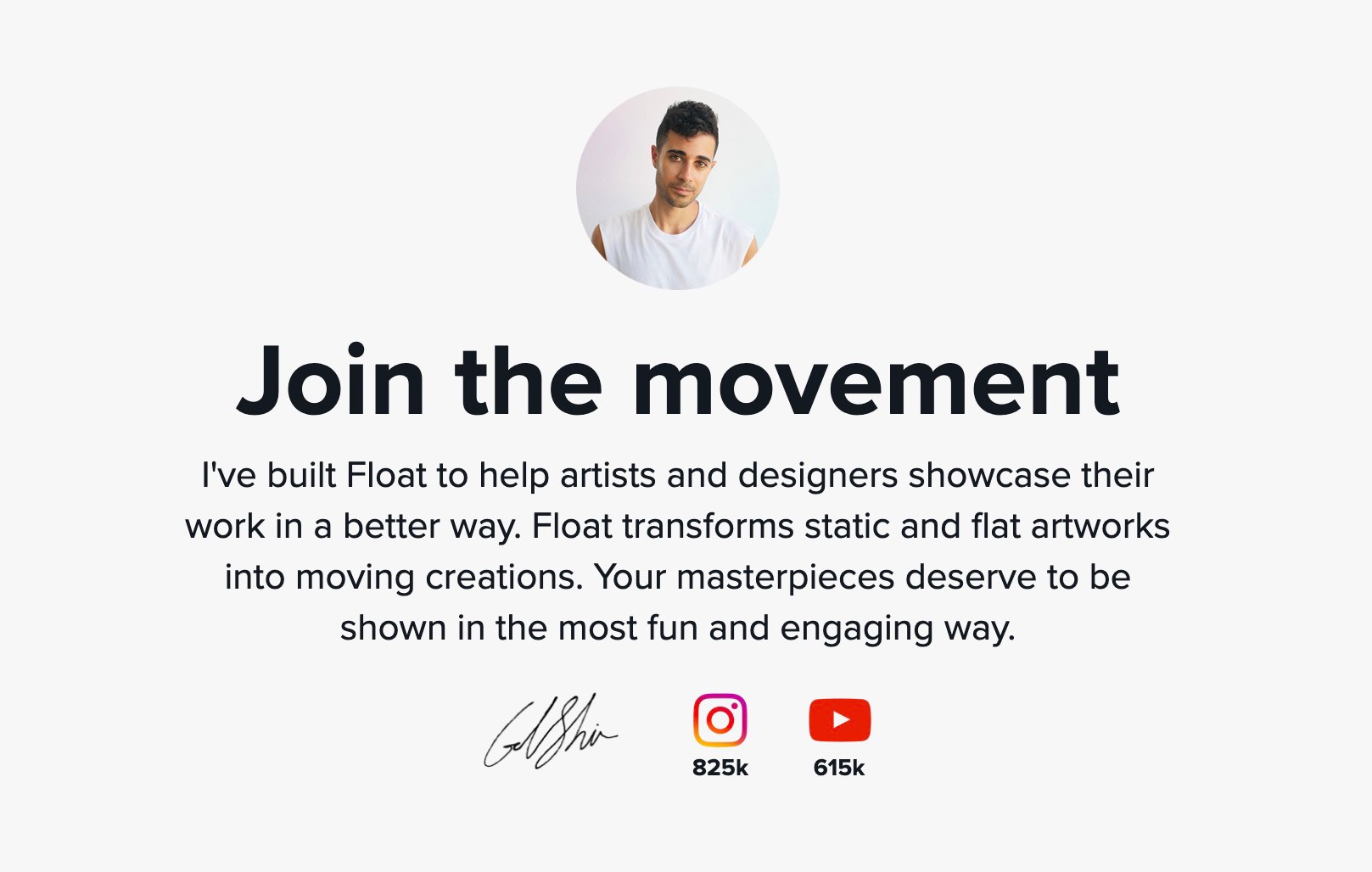
โ€œMy name is Alice and I wrote this mobile accessibility guide after years of watching my visually impaired mother struggle on her phone. Iโ€™m hoping this guide will encourage others to create interfaces that cater to people from all walks of life.โ€


Gal Shir - Float Landing Page
Gal Shir

When you share why you care, others start caring too.

Book Credits

Firstly, a big thanks to you.

Because of your investment in the book I can reinvest the earnings into making even better content. Next up for me is a series of Landing Page online courses.

Secondly, a massive thanks to my dear friend Manu. Without this guy my work online would resemble something alike Yahoo! GeoCities. Make sure to check our his unique blog he writes from a secluded corner of Italy.

And lastly, to Steve Schoger, Adam Wathan and Wes Bos for the Hot Tips format on Twitter.

These "Hot Tips" were meant to lead up to my online courses but they organically turned into this book and I'm glad it did.

What a fun chapter of my life - thanks for being a part of it!

- Rob