You are browsing:
Design Hot Tips
Landing Page lessons related to the overall page design. When you are further with your design, kick off the Landing Page Design Checklist.

Add a radial burst behind product imagery

Hot Tip #63 is to add a radial burst behind your product imagery.

With only a few additional lines of CSS code, you can add another dimension to your Landing Page design.

The CSS Gradient tool can help generate the code for you online:

CSS Gradient Tool

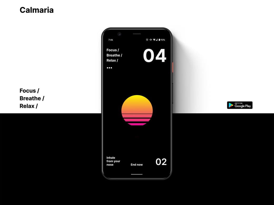
Here is the Hot Tip (Pre-Sale) Landing Page without a radial burst:

No Radial Burst

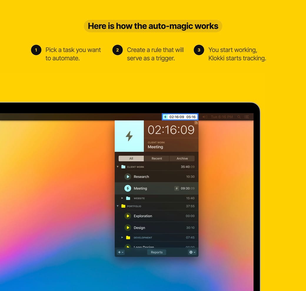
Here is the Landing Page with a radial burst:

Description

With the addition of a drop-shadow on the image, a background radial burst can really add depth to the design, bringing your product imagery to life.

  • CSS Gradient - Wonderful tool I use to generate all my gradient code for Landing Pages. Here is a 1-minute video walkthrough.
  • CSS Gradient Walkthrough - Wonderful tool I use to generate all my gradient code for Landing Pages. Here is a 1-minute video walkthrough.
  • Gradient Inspiration - A collection of 100+ Landing Pages I've curated featuring colorful gradients.

Seek hero images with negative space

Hot Tip #67 is to seek for background images featuring negative space.

Negative space refers to the area of an image surrounding the main subject or object. This can be intentionally shot and cropped to provide a beautiful canvas for your copy — helping prevent overlapping elements:

Negative space reference

If you know your way around Photoshop, start by expanding your hero image canvas to the left or right. Then fill the newly created blank space using the Content-Aware fill option. It’s honestly magic.

  • Unsplash - High quality, well curated free stock images.
  • Stocksy - My favorite premium resource for stock images. If you only need a single authentic image for your Landing Page, seriously consider starting here.
  • Whitespace Inspiration - A collection of 1000+ Landing Pages I've curated featuring healthy whitespace.

Define a visual hierarchy

Hot Tip #78 is to define a clear visual hierarchy.

Step back from your Landing Page, squint your eyes, and take note of the content that appears most prominently. Is this prominent content more important?

A visual hierarchy orders content by significance and also suggests the order to follow. If all content was of equal size and weight, we wouldn’t know where to start. Naturally, we want our introduction headline text to be the most prominent as it’s where the visitor’s journey begins:

Visual hierarchy demo

A visitor’s eyes are also trained to follow a Z-pattern:

1 – 2

3 – 4

Note how you probably followed a Z-pattern when looking at the above image:

Visual hierarchy demo

A good rule-of-thumb is to increase the prominence of your more important content while decreasing the less important.

Wrap it in a device

Hot Tip #80 is to wrap your screenshots in a device.

A device mock-up, with a subtle drop shadow, can really bring your digital product to life:

Device mock-up reference Device mock-up reference

If your software caters for multi-device usability, consider showcasing the screenshots within a family of devices. This emphasizes the remote-working possibilities too:

Device mock-up reference Family of devices

The end.

There are no more Hot Tips to load in this archive.

Next